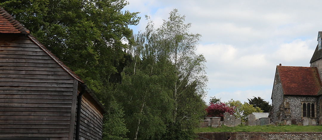
Sussex has many pretty villages, and Ditchling shows how many are being spoiled by traffic and their identities being subsumed into the metropolitan urbanity. The centre of Ditchling is the traffic jammed mini-roundabout, and of the rural lifestyle that attracted artists in the 19th century there is little sign. Instead its proximity to the Brighton city boundary has replaced the rural idyll with urban sophistication, and living from the land has become living from tourism.
The architecture is pretty and the sense of history strong, challenged by the promotion of Ditchling as the ‘Village of Type’. Capitalising on its place in history as the home of type face designers Gill and Johnston properties in the village are defaced with typographic lettering and the British Council has sponsored an International Typographer in residence.
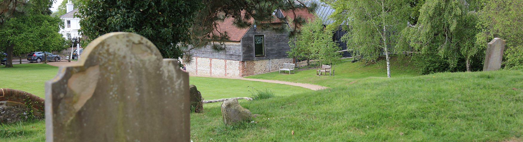
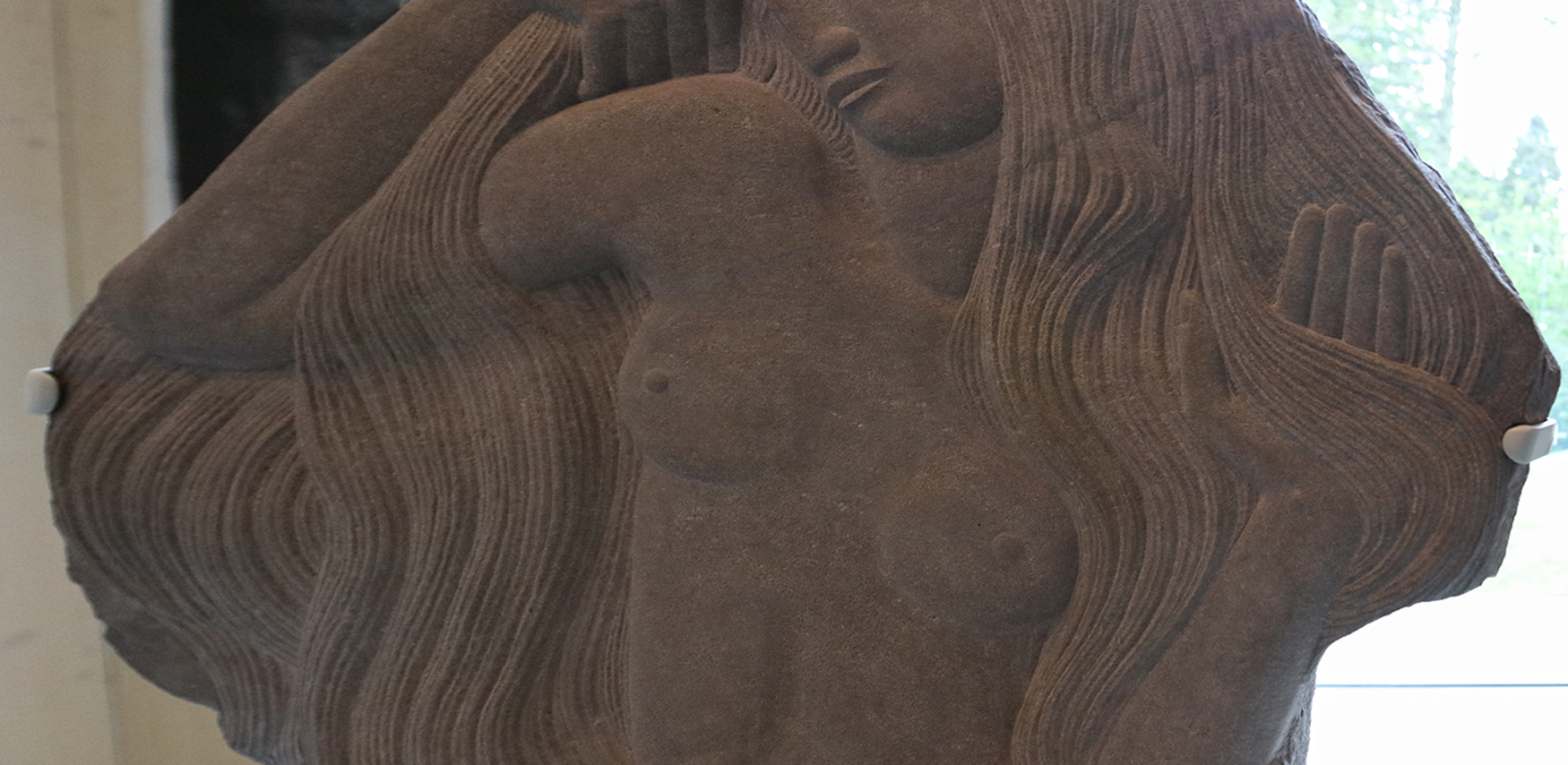
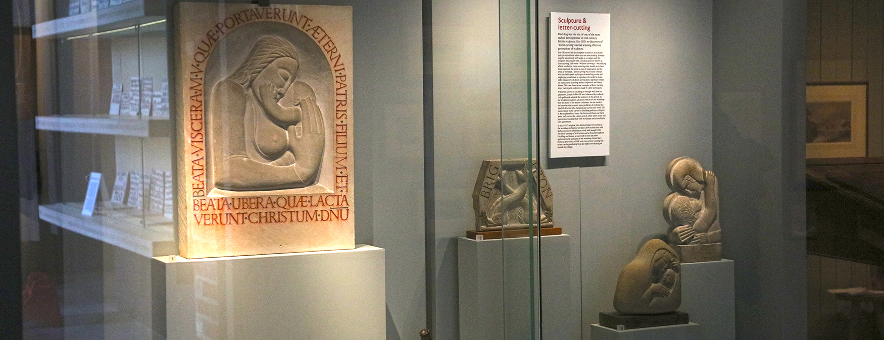
The Ditchling Museum and Gallery came close to winning major design awards for the conversion, and is a pretty charming building, sensitively converted and extended to form a fine small space. Endowed by the Sackler Trust the museum will feature a steady stream of shows devoted to one of the most famous residents of the village, carver and typographer Eric Gill. Centrepiece of the current show is the gloriously sensuous stone carving of ‘Nude girl with Hair’, on show for only the third time since 1925. The subtlety of the carving is difficult to see well, as the piece is set with its back to the light. The area facing the window is instead given over to a somewhat naff display of hand written sloganeering by the latest ‘cool art dude’, Bob and Roberta Smith, very out of place, it seems to me, in a museum devoted to the discipline and science of typographic design, and the care and attention to every mark shown by Gill.
In contrast the fascinating story of the timeless design of the London Underground graphics and typeface is portrayed in the adjacent gallery. Following Gill to Ditchling, Johnston was given the commission by Frank Pick, to be worked on with Gill. The typeface became known as Johnston Sans (or Underground) and was produced by Johnston as Gill was engaged on commission carving for Westminster Abbey. Gill was a student of Johnston at Central, and his Gill Sans face, produced for Monotype, which along with ‘Underground’ has become a long lasting typeface, clearly shows Johnston’s influence.
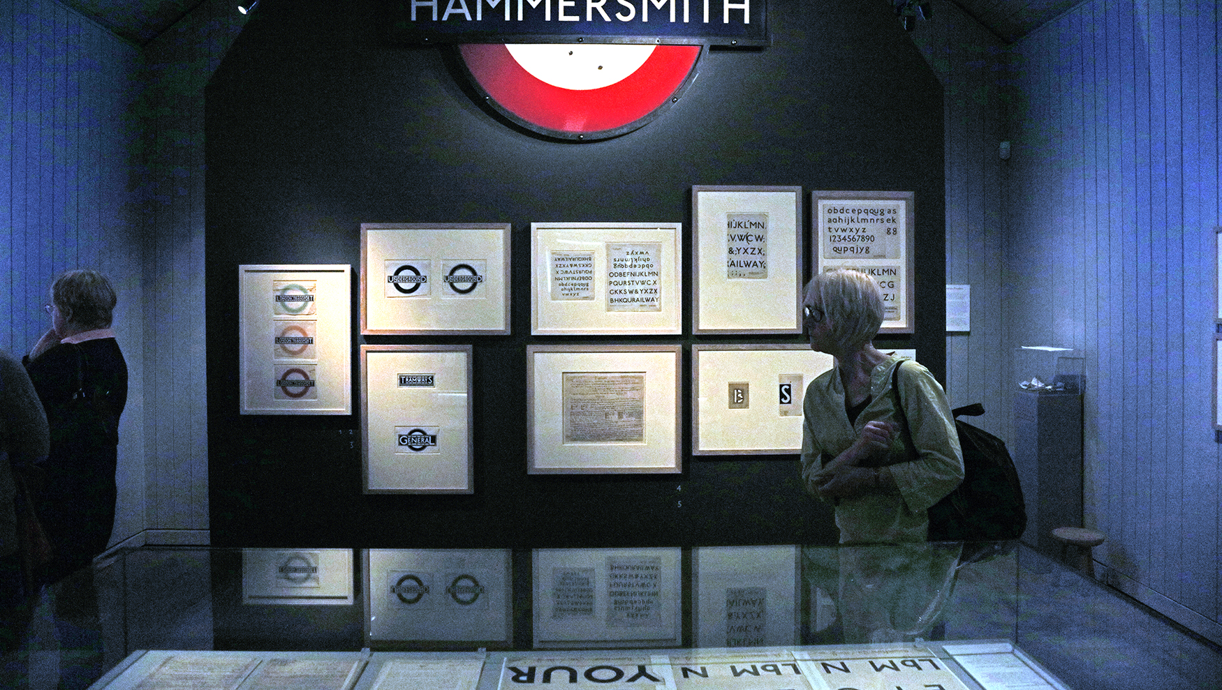
The show has the original hand drawn design pieces and selected examples of its application. The design sheets include Johnston’s explanatory notes The Museum has supplemented the show with a series of talks and workshops on typography and has its own press within the Gallery being used demonstrating process (on the day I was there by artist/typographer Clare Perkins). Intelligently the Museum has also linked the designs to evolutionary village signage from the rural past of Ditchling.
Village life is very different now from the times in which artist and designers like Gill and Johnston sought a placid haven in Ditchling, and I’m sure the occasional commute to London on the Brighton line was a great deal more pleasant then the strike prone overcrowded service of today. Nonetheless their appearance in the village history marks a turning point away from the life on the land to the expensive metropolitan retreat villages like this have become in the 21st Century.
The show makes an interesting contrast with the Sandberg at the de la Warr pavilion in nearby Bexhill. Both are well worth the trip.
I quite like looking through a post that can make men and
women think. Also, many thanks for allowing for me
to comment.