Many artists profess that the scariest thing they face is a large empty white canvas. I love it. A new playground of ideas.
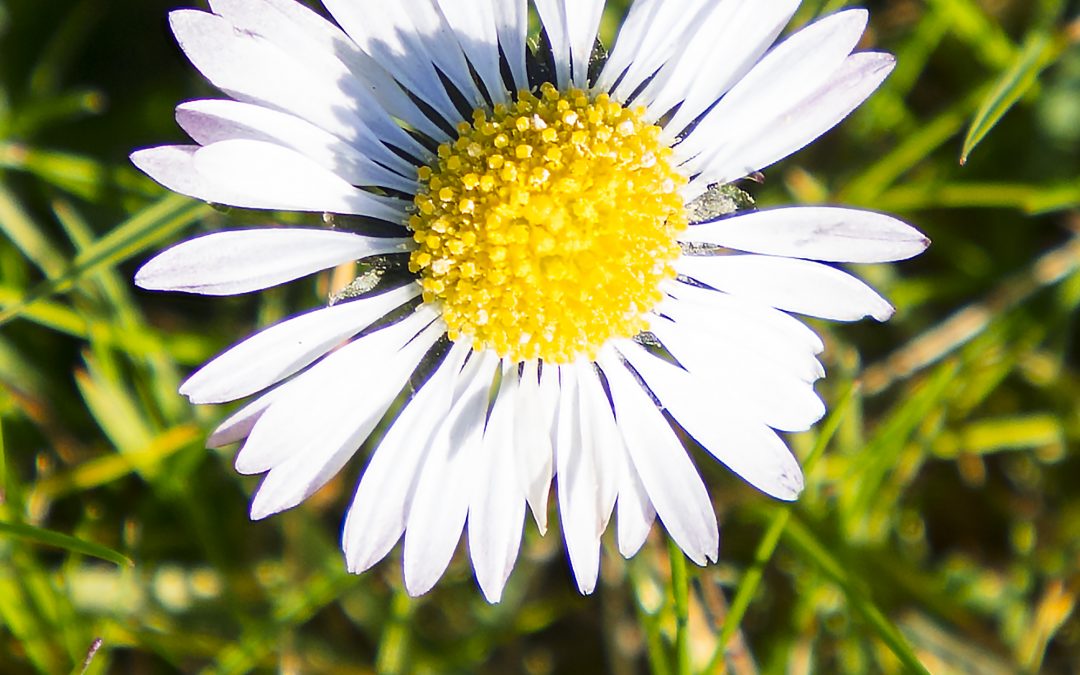
I start with the image I want to work with, in this next painting another daisy image but also involving a pot of crocus. If I had to guess I’d say the purple and dark earth of the crocus pot contrasted against the grass and daisy green gold and white symbolised light and dark, my victory over cancer perhaps. I certainly wanted another daisy image, but a native English daisy rather than the cultivated variety in previous paintings.
The proportion of the canvas comes from the image, but I have to admit to random chance too, as the canvas was found in the stack in the garage loft and seized on eagerly, even though the stretcher, 3’ x 6’6” was a little on the large size. But then I like canvases that you can almost walk into, that envelope the viewer (and the artist) in the painting. It makes for a more powerful experience, less controlled by the viewer.
Larger canvases also allow scale to work with the colour, increasing the intensity of the experience. The smaller canvases can be hugged to oneself, but a large painting does the hugging…. Like a Monet painting, the scale allows the spectator to become immersed in the painting as well as being able to stand outside looking in.
The first job is priming the canvas, three or four coats of primer. No short cuts possible as faulty foundations can undermine the effort from the start. I also clean the palette and brushes. One of the delights of acrylics is that they can be removed by very hot soapy water from the plates I use as palettes, a technique that unfortunately doesn’t work the same with brushes.
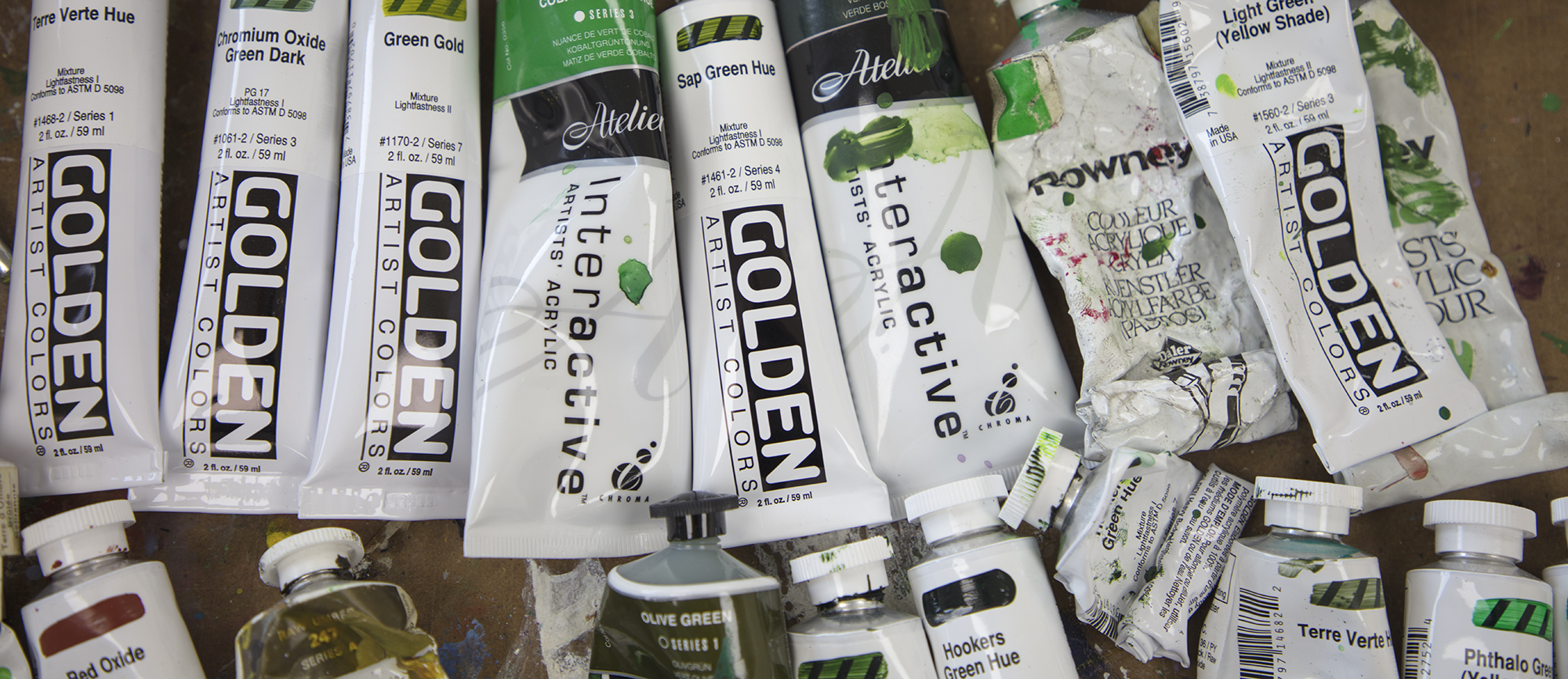
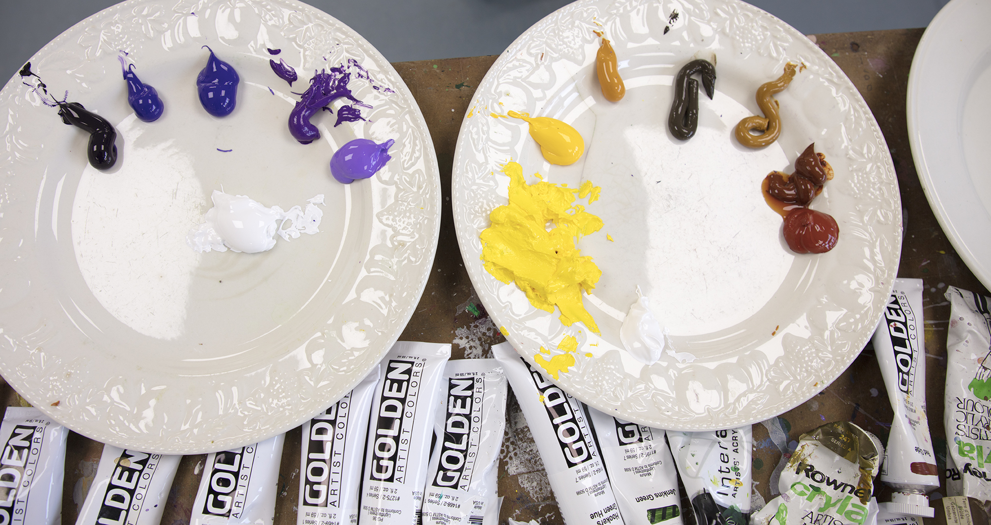
Once the palettes are cleaned, the paint table stripped and bin emptied, I look to construct the colour palette, building and extending on what went before. In this case I am going to use on one side the greens, gold and white, against the purple, violets and earth colours of the other side.
I took a trip into the art supplier after looking online for colour ranges. It is amazing the variation in different manufacturers paint ranges, Golden has 128 colours in its basic acrylic range, a far greater number than other manufacturers. I used to be a Rowney Cryla user, but their so-called ‘System 3’ series that replaced Cryla is, in my opinion, poor by comparison and the range of colours is limited. When I worked for John Hoyland he used Cryla in big tubs of colour, but Rowney seem to have bottled out of supplying compared to other (unfortunately overseas) suppliers. We even have Australian acrylics coming in now.
My palette decided, I draw up the canvas and start to paint, but best laid plans can fail in contact with reality. I try to set parameters of colour from the start on the canvas, and that tends to set the palette. In this case I have a range of earth colours, to be contrasted against a range of violet/purples. In turn these will work against a range of greens. Tones will create diagonals to compete with the weakened grid, contrasts will be stronger with more tonality. Well, that is the intention anyway
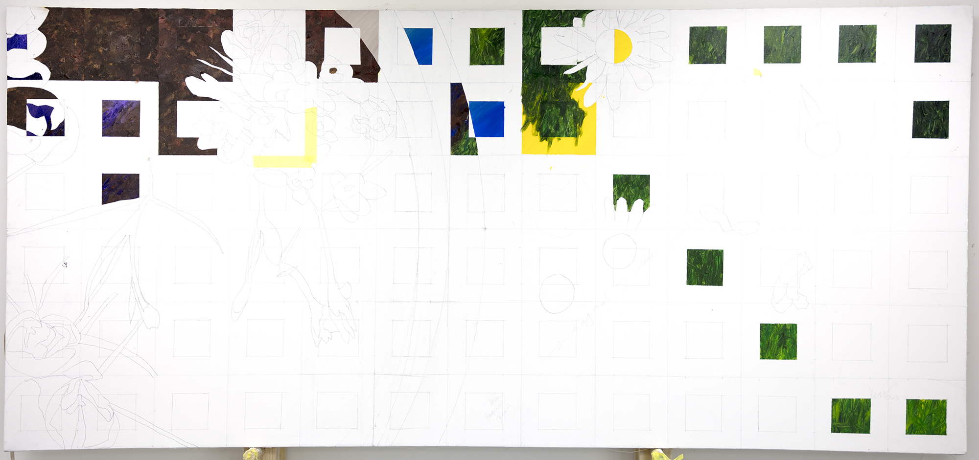
This time around I also want to change the nature of the brush stroke so that colour contrasts are more elusive than they have been. I also want to break down the grid a little more. It’s an adventure to see where it all goes.
Sing a long, ‘wish me luck as you wave me goodbye…. ‘. I might be vanishing down my own personal rabbit hole…
Recent Comments