So much art these days. So much of it derivative, so little advancing, surprising or extending our understanding. So little beauty. When Beardsley grubbed in the darker regions of the human mind he produced drawings of extraordinary power and elegance, beautiful black and white studies in human depravity. I don’t think an unmade bed advances aesthetic standards or the language of art much beyond R. Mutts urinal.
I am soon going to spend another day visiting Monet’s garden at Giverny, just a short drive the other end of the crossing from Newhaven. Despite failing vision and losing friends in WW1 Monet managed to awe with his search for beauty, not just making the paintings but also the gardens the paintings were made from. Much of his work is labelled ‘impressionist’ and for many that represents reactive splashing of paint in response to his visual experience of the gardens, hay stacks etc.. However underpinning this response is a sophisticated appreciation of the language of colour.
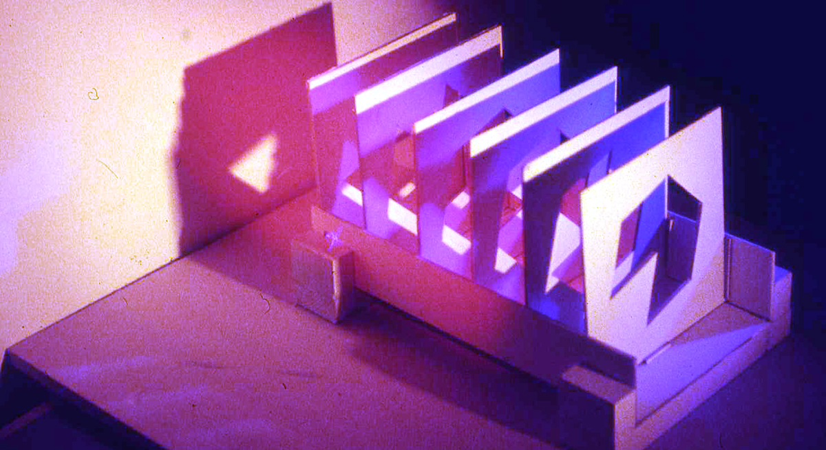
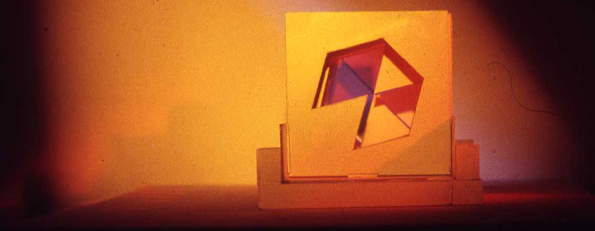
I made this little light modular, using a hexagram with one segment left in to catch light projected into it
When I first went to college (in 1965) I used colour intuitively. I understood the perspective of colour, knew something of the colour wheel, and nodded in understanding as tutors talked of colour and set us colour exercises. One exercise involved creating a three dimensional ‘light modular’ where colour was to help the object defy gravity, and to be atonal too. I think I failed to really understand that one, and began to question my own knowledge base. My use of colour became more primary and my life drawings were mocked by fellow students as ‘Paddy’s hot ladies’ as I tried to use colour to model space. (None of these survive as some bugger stole my portfolio of life drawing from my finals show).
I worked through a number of paintings where I looked at how colour and optical illusion worked. After all, much of painting is about creating illusion – whether as an illusion of reality, or an illusion of space. These illusions work because of the rules of pictorial language, in much the way that language works because it follows structural rules. The more I understood the less I knew when I started working this path – as a definition has it, being expert is “someone who starts out knowing a little about everything and ends up knowing everything about very little”.
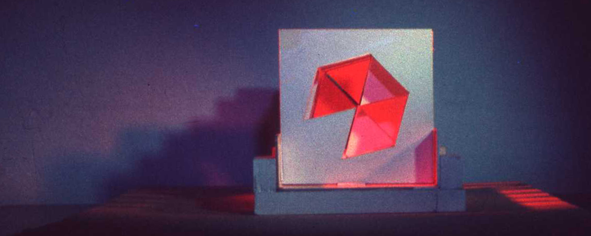
Just lit strongly from the front with white light
One area of continuing confusion for me was in understanding advancing and recessive colour. This was linked to discussions about what were ‘warm’ colours and what were ‘cold’ colours. I found these emotive terms lacking a coherent consistency, interpretations varying with tonal relationships and the emotional links of individuals to each colour. I set out to create an experiment to determine for me which of these colours was truly coming forward in the picture plane and which were moving back.
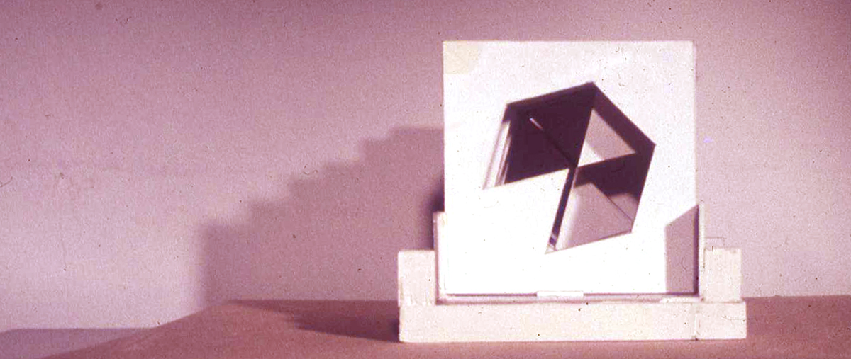
Light and shade contradict 3D reality
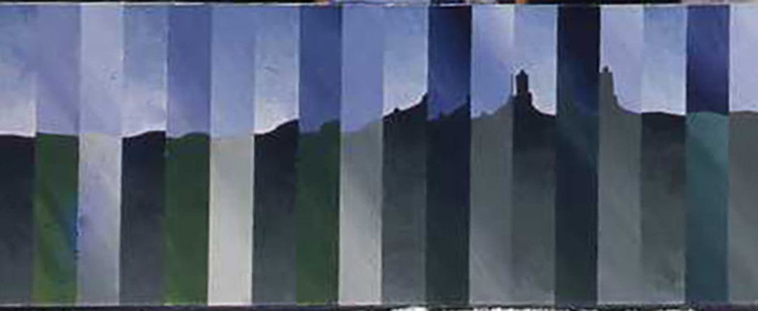
I noted that when art history staff projected slides of paintings out of focus some colours expanded on the screen whilst others contracted. This seemed to me to be a key to understanding advancing colour and receding colour. It seemed it may be that visually interpreting these colours could be done according to quite a rigid visual code rather than the emotive codes that seemed to be contained in the language ‘hot’ and ‘cold’. After some thought I devised an experiment to see whether I could prove which colours advanced and which receded and to also show that there was a physical reason for this, not just the intellectual or emotive reaction to the colour as some were suggesting.
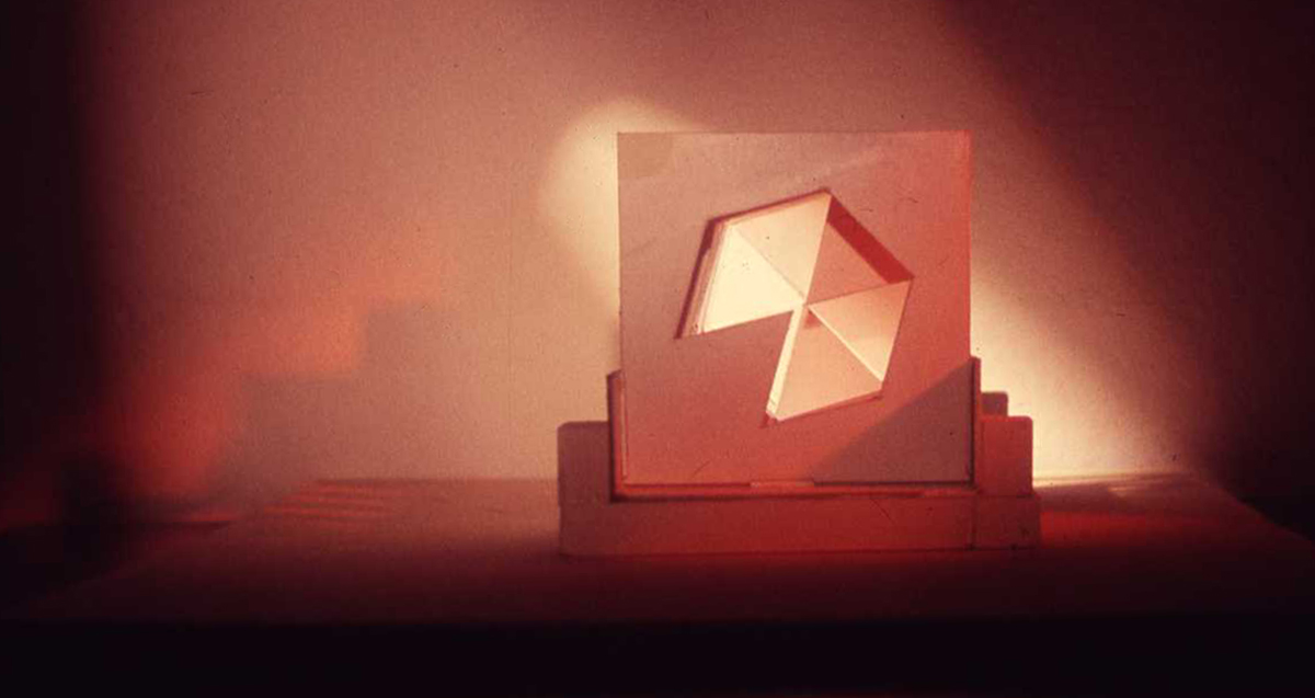
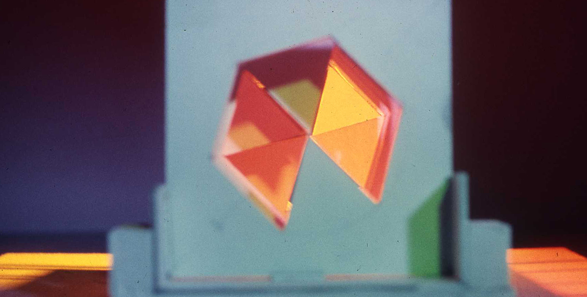
Yellow and violet light
The photos show the results, and they are printed from slides I took as a part of the experiment. The structure could be varied to remove any way in which the structure itself could determine the result, and it was photographed onto slide so that the projection could be used to show which of the colours ‘grew’ (advanced as larger is read as closer) in the eye when out of focus, and which diminished (receded as smaller is read as distant).
The light modular was simple white card, the light shone in with lamps and coloured gels borrowed from the college photographic studio. The result may scream to you that ‘it was obvious’ but I was happy that I had proved that what I saw had a basis in objective reality, could be codified and used intelligently rather than just relying on intuitive interpretation.
Shining red light into the rear of the modular makes space perception difficult , even the turquoise frontal plane’s physicality not holding it visually stable in position
It seems to me now when I look at work in galleries that too much is reliant on assuming that the intuitive and emotive hand movements of the artists are read by their audience without there being any intellectual rigour or intelligence in what is presented. Combine this with critics who also seem to buy into this intellectually feeble arena and we have an art world where the few true thinkers such as David Hockney, Tom Phillips or Bridget Riley stand head and shoulders high above a mass of dross.
See more of my work on my website
Intuition and intellect are very distinct. Intuition is needed for creativity while intellect is needed for validation and development. The two modes of thinking, on subconscious the other conscious, can work together either in destructive conflict or in mutual development
I wish I could get my head around the science side of colour and perspective but every time I look at a book or exercise with these things in mind, I become very anxious. I think it exactly why I have never had any confidence in my work as I cannot write reams of intellectual, what to my brain is, gobbledygook about my motivation and process, not that its stops me from writing about my work,LOL. It just not very intellectual. Strictly instinct, so I suppose I will never come up to David Hockney, Bridget Riley, Tom Phillips or Monet. Love seeing experiments like this though, just don’t ask me to write about.