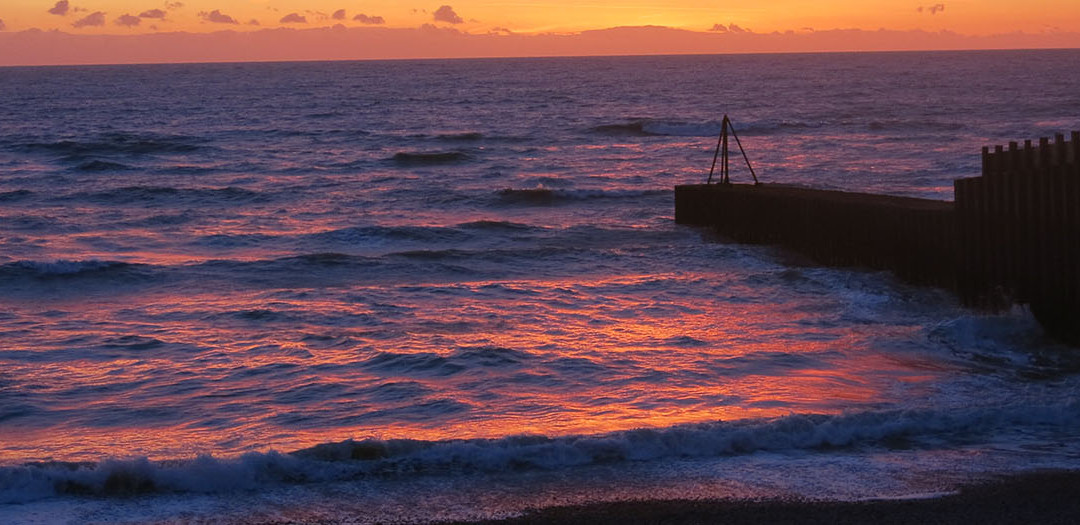
It has become such a global cliché. Around the world photographs by the thousand capture the glory of earth’s sunsets. I’m no exception to the happy snapper brigade, even though in Seaford the celebrations of this daily event tend to be moderated by cloud, rain, mist and the other aberrations of England’s fickle weather. When I finally was on the beach at the right time to capture the glory of the reds and golds, I was hypnotized by the reflections in the waves.
Similar format to previous collages, but the drawing works against the colour, or maybe its all too subtle
I had already interspersed the paintings of flowers with drawings of the sea, and so after the frustrations of the Honeysuckle series I turned to my images of sunset waves. Analysing the colour and starting to play with the digital photographs simultaneously it was difficult to avoid mimicking reality – unlike the flower images in the Geranium series, the waves generate their own directionality and order, competing with my normal gestural mark making. I was fascinated by the range of colour, quite different to the colouring of the earthbound geranium drawings, the waves reflecting pink and gold, deep shades of blue, purple and lavender, but struggling to find a way to abstract the colour whilst still maintaining a visual relationship to the photographs.
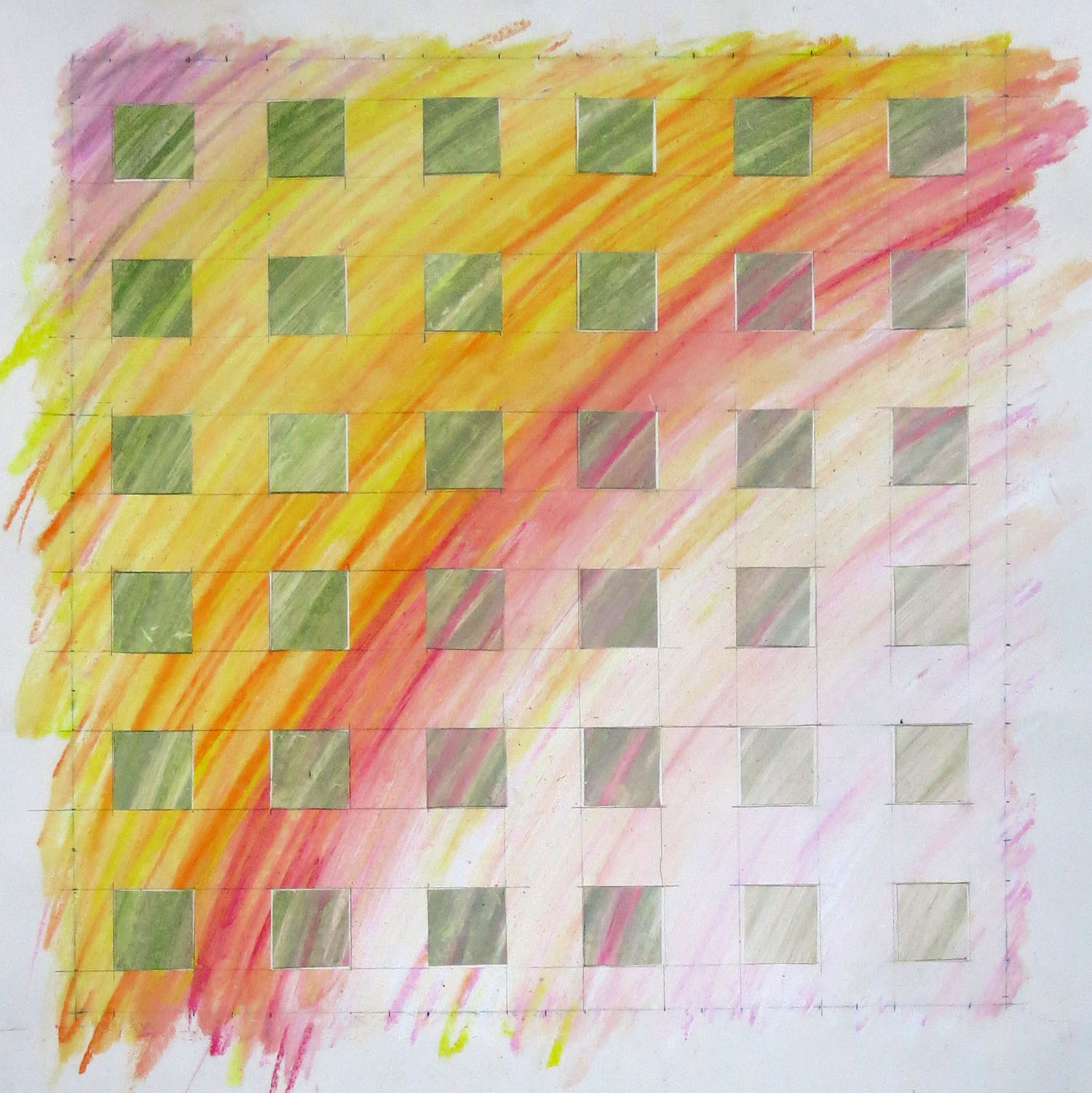
The first collage. Oil pastel and photograph. Size approximately 16 inches high by 32 inches wide
I have been exploring colour along with digital images for quite some time now, and creep slowly towards some kind of melding process through a mix of drawing, collages and paintings. The almost abstract colour quality of the wave images and the strong directional repetitive patterning of the swells themselves introduced a different set of peculiar problems. Whilst the collages here and the drawings previously featured in ‘A Riot of Colour’ have progressed I am still a way short of finding satisfactory visual solutions.
There has been a tendency to push the mark making towards an imitation of reality. Whilst I admire the work of Andrew Wyeth and the alternative realities of Hopper or the latest Hockneys this is not a path I want to go down. I am interested in the colour and pattern inherent in reality and the potential for this to make a statement rather than a literal imitation of observed phenomena. In the flower paintings the drawing of the flower provides a framework of cognition, allowing the grid to disrupt and hold the colour. But the sea provides no such framework so the grid alone makes an alternative form to hold the colour, the marks providing image recognition.
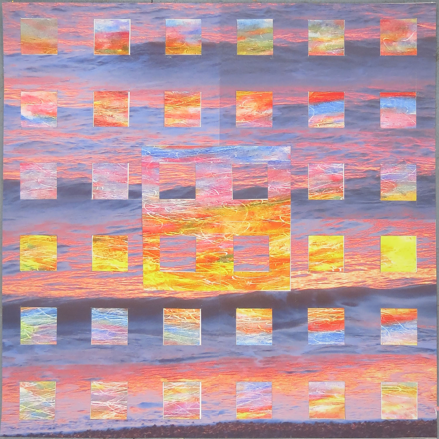
Wave 12. Collage of drawing and digital photography. Bockingford paper, archival inks 24 inches square
Using large prints of the photographic images I collage the sunset realities with my interpretations in oil pastels. In turn the oil pastels are also photographed to give a commonality of paper, size, texture and colour quality for the collages. This gives an integrity to the surface of the finished collage, but if I’m really honest also allows me to keep the original oil pastel drawing as I found myself liking it too much to cut it up! Too precious maybe, but it may still go ‘under the knife’!
I like the finished results even though they are not where I want to be with the imagery, so I am pushing on into painting with a series of small canvases to be completed fairly quickly just exploring the colour. At the back of my mind are recent Bridget Riley paintings (see the images from the de la Warr show) which show where total abstraction can go. I am trying to tread a careful line pulling together recognisable images with abstraction so that the shock of recognition should be part of the viewing experience. At the moment more people of course recognised flowers than recognise the sea. Moving quickly through multiple canvases may enable me to arrive at a recognisable rendition of waves without being literal.

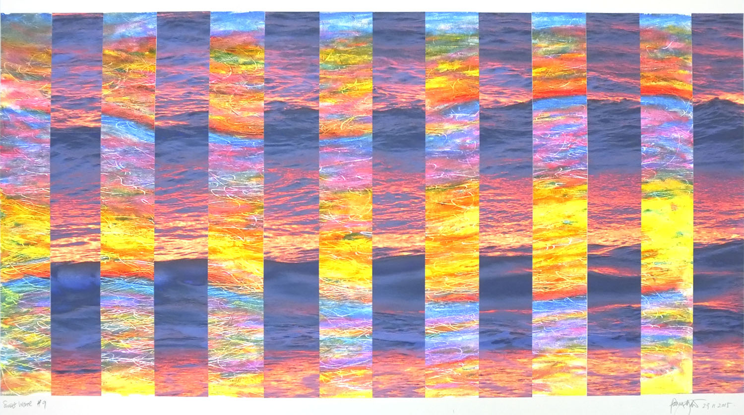
Wave #11. Drawing and photography collaged. Bockingford paper, archival inks . 24 inches square
The flower paintings will return simply because they demonstrate that in the battle to achieve the recognition of the image in a colour field painting it is, whilst a contradiction, also achievable. I’m not sure this is so with the sea imagery.
The other element of the sea images I am looking to consider is time as well, as this is a key part to the pattern repetition in wave patterns. It was also an element in the first wave painting. I think, like a swimmer in rough water, I may be getting in over my head….
Follow me on twitter
See regular updates on studio progress on my art Facebook page
Buy my art from my Gallery shop
I like the way you have created visual ambiguity by merging water and air through their shared dynamics. I think the vertical stripes is the most successful of the images, but I appreciate that you favor the grid as the main vehicle of your exploration and want to make it work it that context.