Working the squares to explore colour and texture has unlocked a way forward for me. The drawings for the Harbour Wall painting were building on experimentation from the poppy series as I outlined in ‘Moving Forward’. Whilst I looked back thinking the analysis showed where I was going wrong, in fact the pieces did give me a big leap forward. The drawing loosened up my technique and taking the experimentation with various scrapers, palette knives and brushes forward onto canvas produced a painting one observer linked into Impressionism. In my own mind I was playing a balancing game still between image and abstraction.
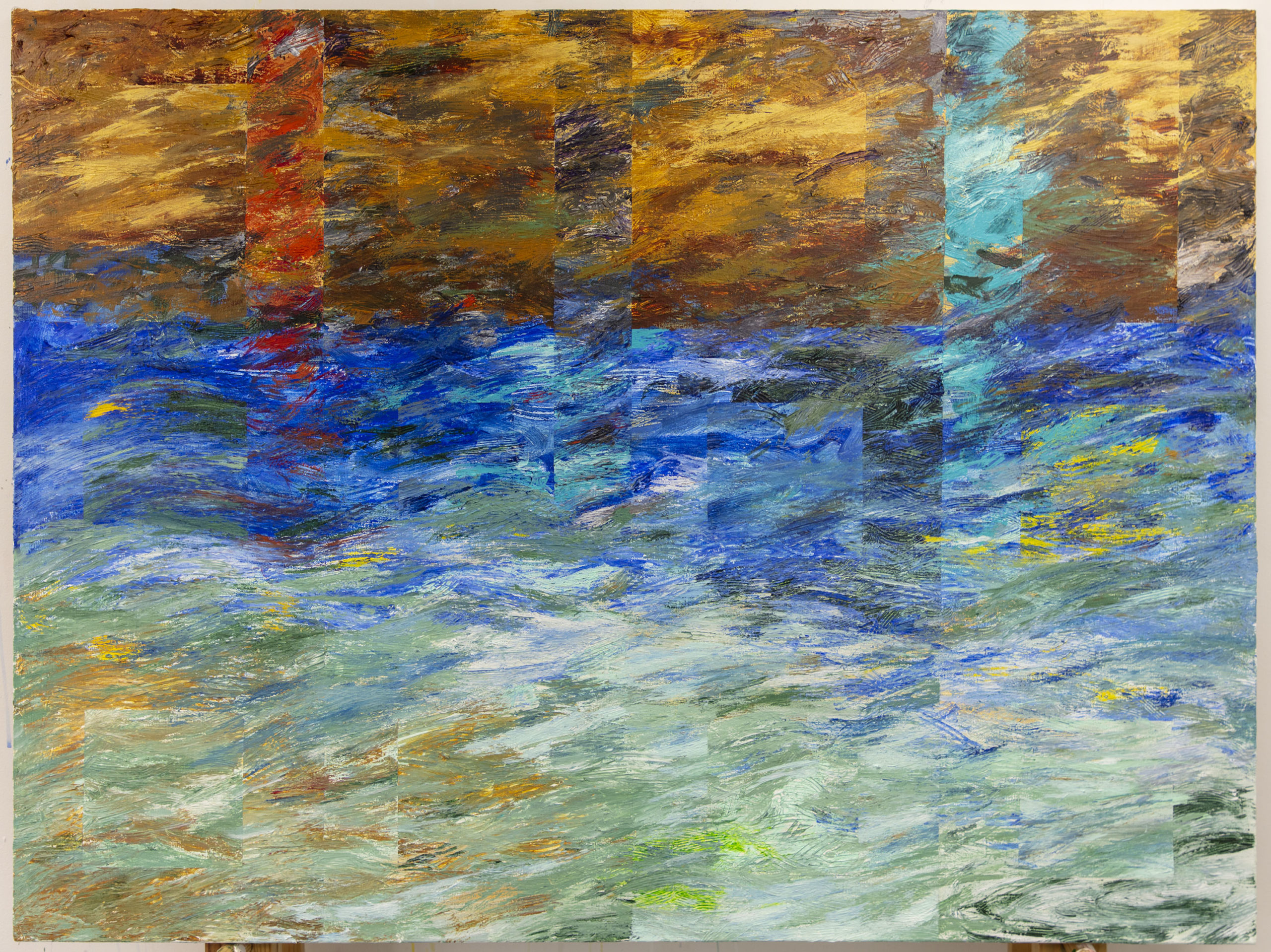
Bergen: Harbour Wall. Acrylic on Canvas. 4 feet wide by 3 feet high
In earlier work the flower paintings had allowed free mixing of colour on the canvas between narrowly defined lines linked to imagery. Now I was relaxing the imagery/drawing element and allowing full flow to the mixing of paint on the canvas, allowing underpainting to show through and by using scrapers and other tools to let under colour to glow through as it has done in the drawings for the Poppy and other flower images.
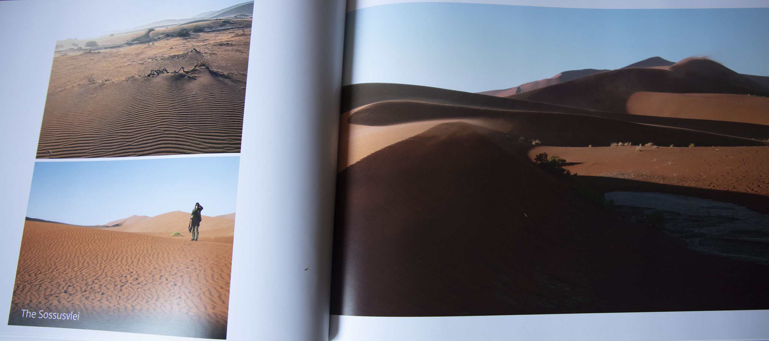
From my Namibia book
I have been using the square within a square since the 1970’s and in recent years have begun to break the square with colour. Now the square was becoming submerged in texture gradually disappearing. The painting that resulted gave a me a real thrill as so many things came right. The scale of the canvas fitted the scale of the mark; the texture the tools is used allowed me to work the colour freely with a rough texture allowing under colours to come through. The whole carried the feel of reflections and transparency of the water, its movement and subtlety. It was abstract but undeniable linked to the originating photographic image
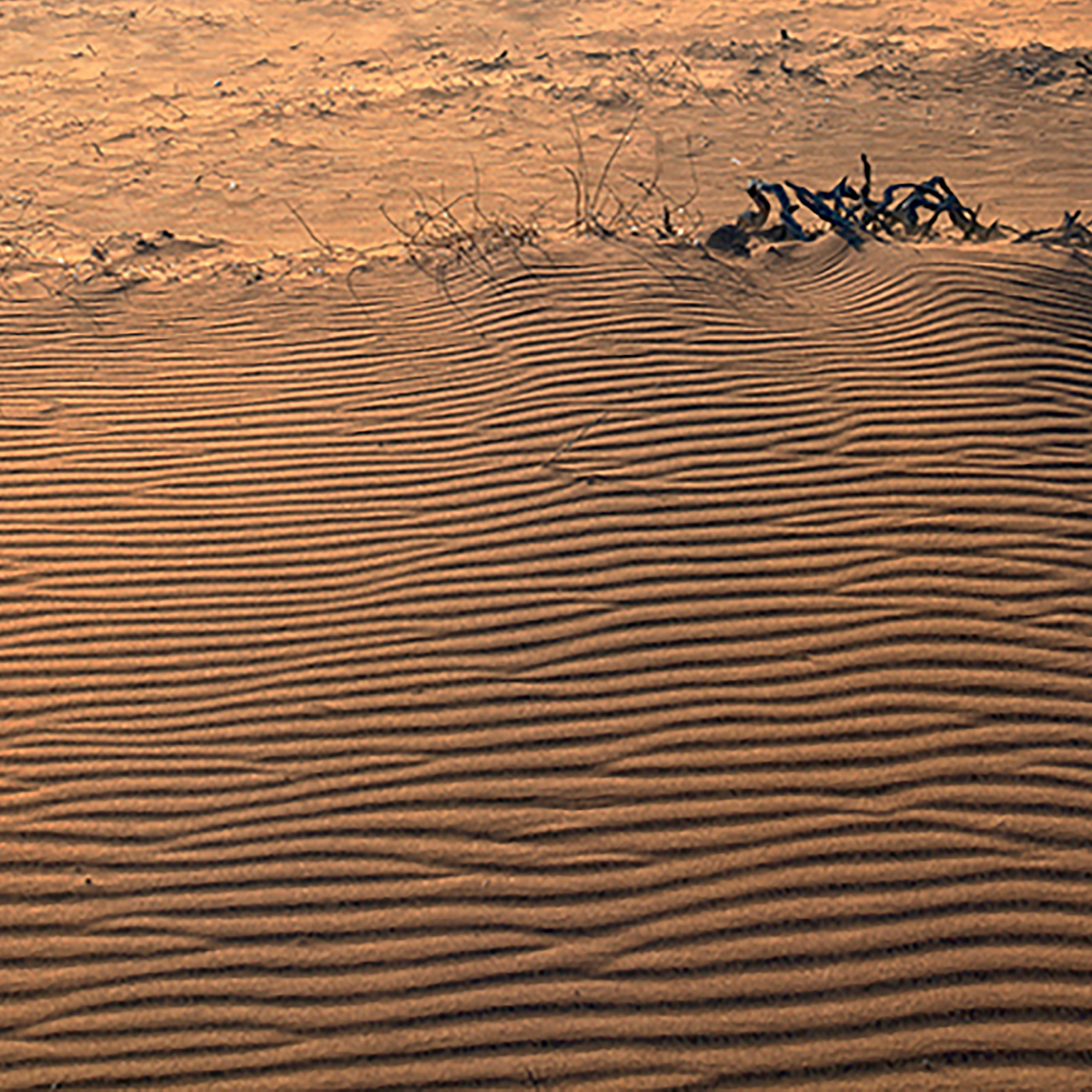
The dunes moved into a wave pattern by the wind
Working from the Bergen Harbour photograph encouraged me to go back to earlier photographic imagery, and I started with my book on Namibia, where the colour was so different and so contrasting with Norway. I thought of printing out an image large scale as I had done with Bergen but instead worked from the book images and memory. The ripples in the sand again reminded me of Riley’s ‘Wave’ paintings, more so as I worked through the drawings of the Sossusvlei, their ripples of wind driven sand making a dry set of waves. Thinking about the photographs made me think again about the imagery I have compulsively collected from Seaford front.

Namibian Dune. Oil pastel on acrylic. 20 inches square. On gesso primed paper
My mind turned to the dozens of photographs and pieces I have written about Riley, both through the ‘BRotS’ and the vineyard images. I have struggled with working out how to respond to the imagery of the shingle groyne, but as I worked ideas began to coalesce in the back of my mind. So no painting came from the Namibia pieces (although I may yet return to them) but I commenced a new set of drawings looking at the colour and textures of the rusting seafront structure that forms my ‘Bridget Riley of the Shingle’ – BRotS.
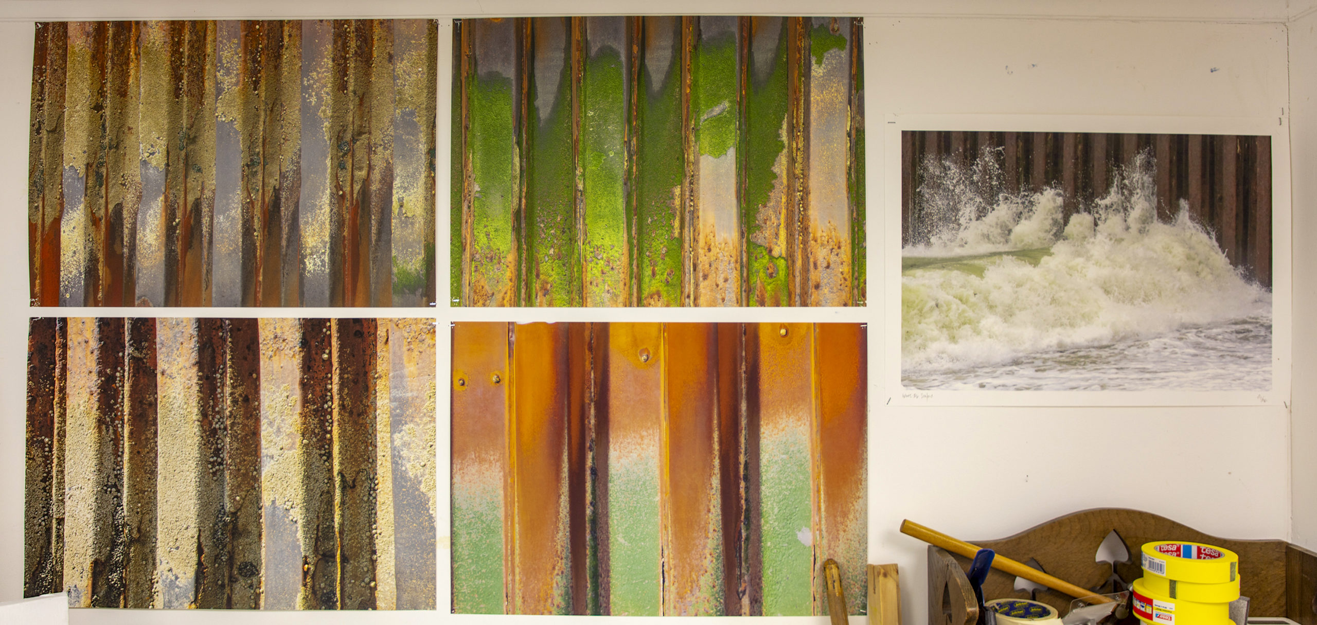
BRotS photos added to the studio wall
The squares in the drawings hint at structure, organisation. The colour is non-organic, contradictory, breaking down the square structure. An Homage to Albers. Reflect the outside world intruding. The square enables me to play games with visibility/colour relationships, tonality whilst maintaining a comparability between pieces. The square has/represents powers beyond the image, stability (security?). The contradiction between the gestural mark and the rigidity of structures has life parallels.
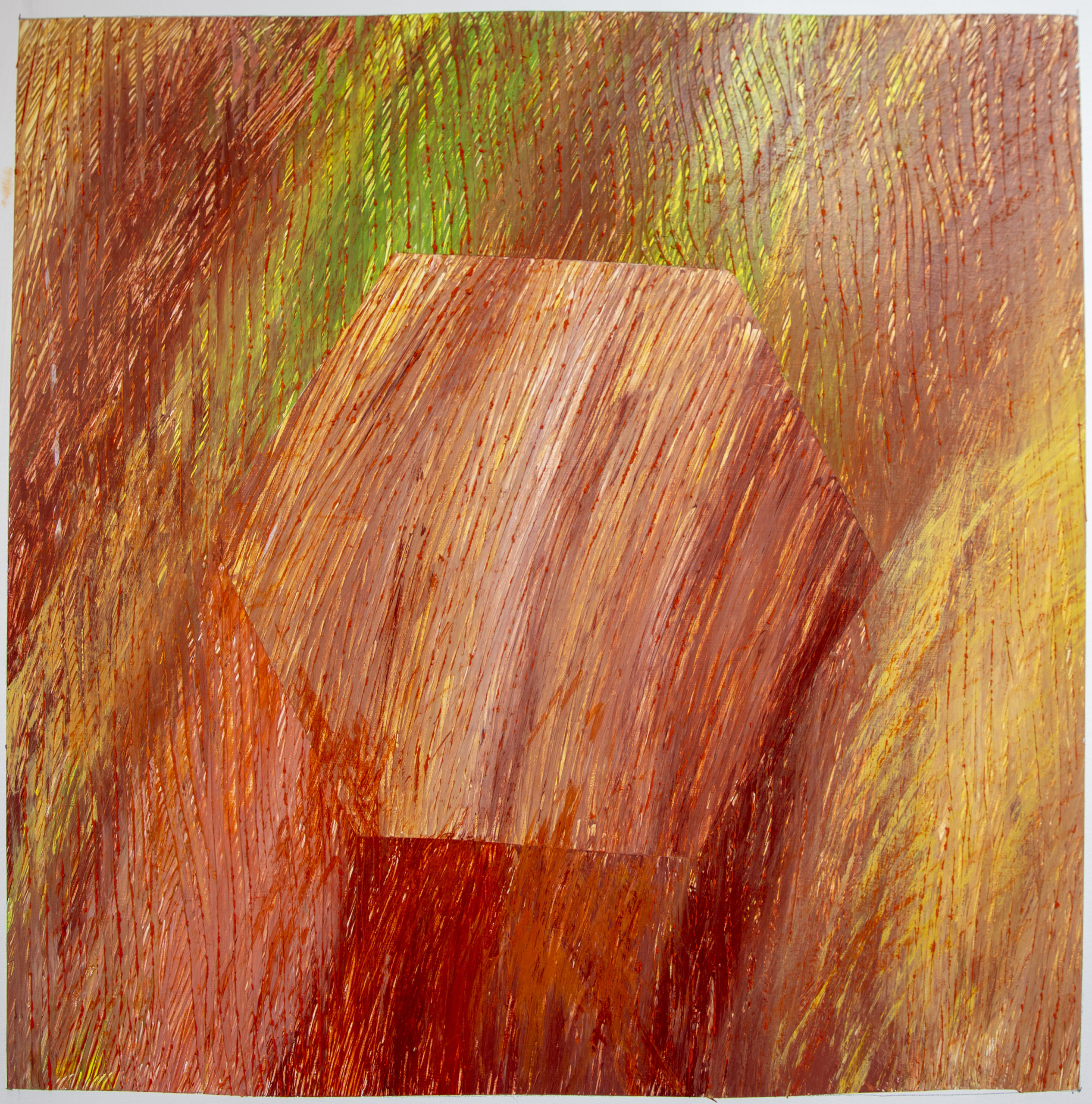
Drawing with the hexagonal bolt
Sparked by some uncomprehending comments, I teased a critic with a different shape linked into the BRotS photographs, substituting an unsatisfactory hexagonal bolt from the metal plates for the internal square – unsatisfactory because its unstable shape suggesting potential for movement stopped the eye resting easily within the drawing, making the whole unstable. It did however release me from the thrall of the square.
Still using the same size and the single 20-inch square on paper as an exploration tool I began to break the BRotS down into its constituent stripes more. I broke the square down further when it became apparent that it was itself ceasing to be a tool and becoming an inhibitor, breaking it down into the stripes that are such a strong part of the photographic imagery. The photographic enlargements I have been playing with for the last few years had already done this and I have been very slow, almost reluctant, to turn to using such a hackneyed artistic form (see other examples).
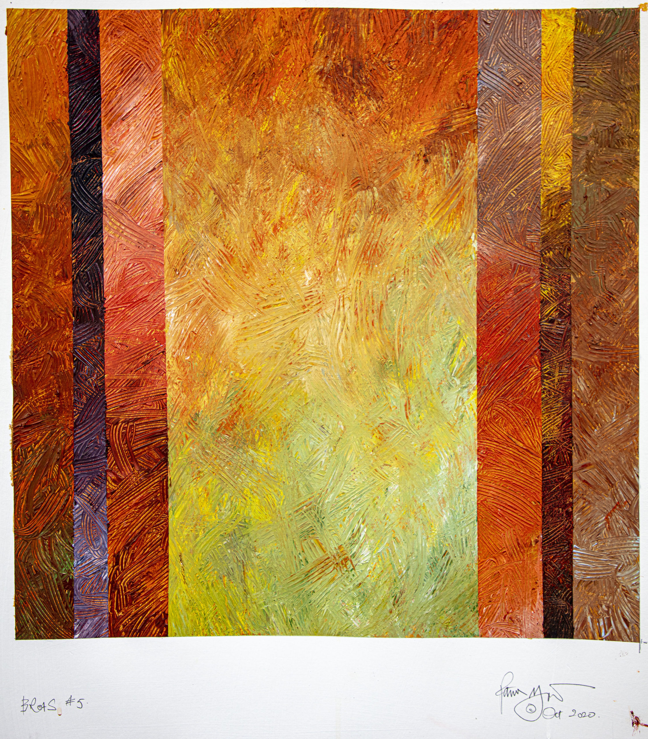
Acrylic paints on gesso primed paper. 20 inches square
The drawings became analytical in terms of the strong vertical stripes of the structure, and the colours of rust and weed, molluscs, wear, light and shade began to appear. The first two drawings were far too literal but the latest have begun to work in a way that I can take onto canvas. In the ‘Harbour Wall’ painting the square has almost vanished and maybe in the painting that results from this work the square will disappear again as it did in the ‘Peg’ series.
Occasionally I think back to the first ‘squares’ drawing I did in the late 1970’s and think where I might have taken them, but in truth life experience is giving opportunities to develop ideas now where I might have been compromised by other factors in the past. I haven’t found things so exciting since then as I now become bolder in taking things forward
Recent Comments