Right at the beginning of this series BRotS#1 had a vestigial wave pattern at its base, partly, I will admit, simply to hide the fact the drawing wasn’t quite square. See how intellectual the process can be? Ha! Throughout the remaining explorations and paintings, the sea has largely been the missing element as I have explored the colour and texture of rusting metal and cement.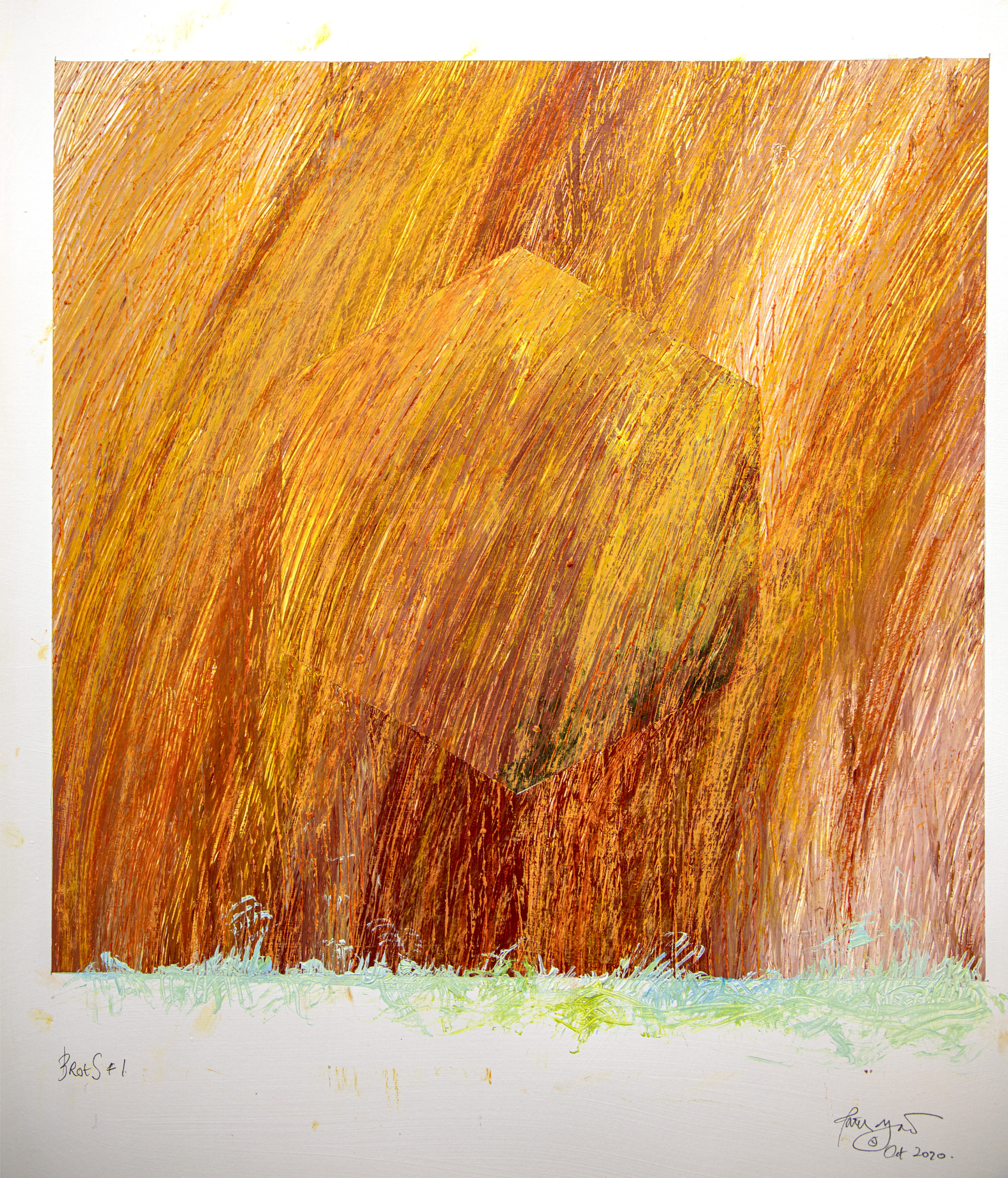 The bolt that holds the panels in place became the featured point instead of an ‘Albers’ square
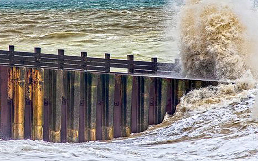
Hokusai showed waves frozen, graphic, but I see them as shape shifters, mixing movement and time with random variations in scale, colour, and form. I have looked at them both through drawings, collage, and the camera, resulting in some interesting pieces of work but nothing that lit my fire, until maybe the Bergen Harbour sequence. I have been making drawings seeking the destruction of the square for a while, but with the water in Bergen Harbour all the work finally came together resulting in a successful finished 48 x 36 inch painting.

Bergen Harbour Wall. Acrylic on Canvas 48 inches by 36 inches
The looser treatment of colour and more expressive mark making spurred me on through a range of works, building on the photography of the sea defences in the Cuckmere and Seaford. It took until the 30th painting of these before the sea became a part of the work, and I didn’t like the result, so it disappeared for the next ten pieces. Finally, in BRotS #41 it made a reappearance. No one drawing works anymore than one painting works to draw a conclusion, so in BRotS #42 I explored it further before taking it onto canvas.
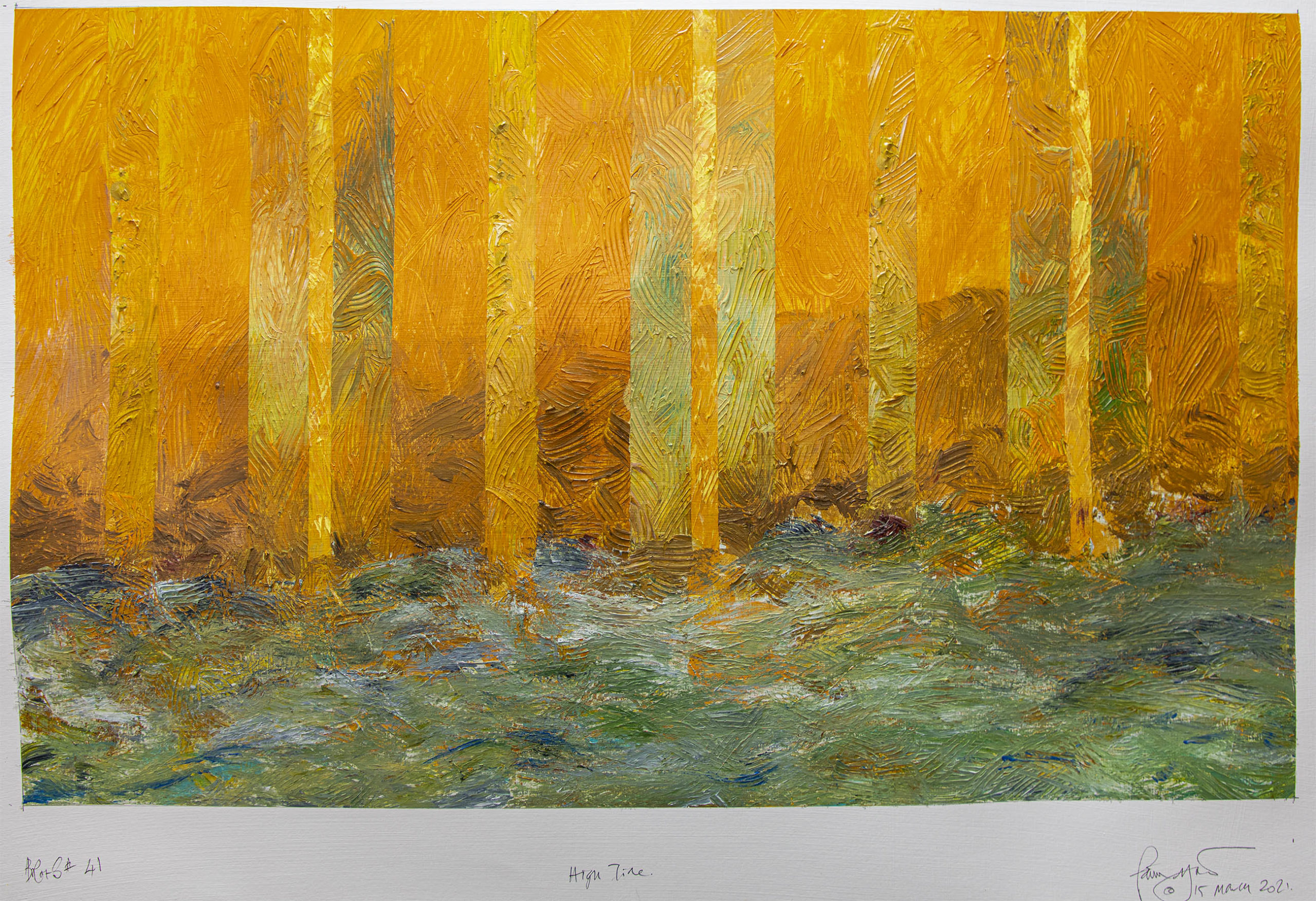
BRotS #41 High Tide. Acrylic on paper 23 x 16.5 inches on A1 300gsm sheet
Mentally I need to make more of an adjustment to the scale change from 23 x 16.5 inches to 48 x 36 inches. I need to put more paint on the palette (kerching!) and use a different tool. I failed to do this and then found myself firstly racing to get the paint across areas and then localising the colour too much with too small an applicator, so I worked across the top, then found I was overworking. It took the addition of the sea to pull me back from disaster.
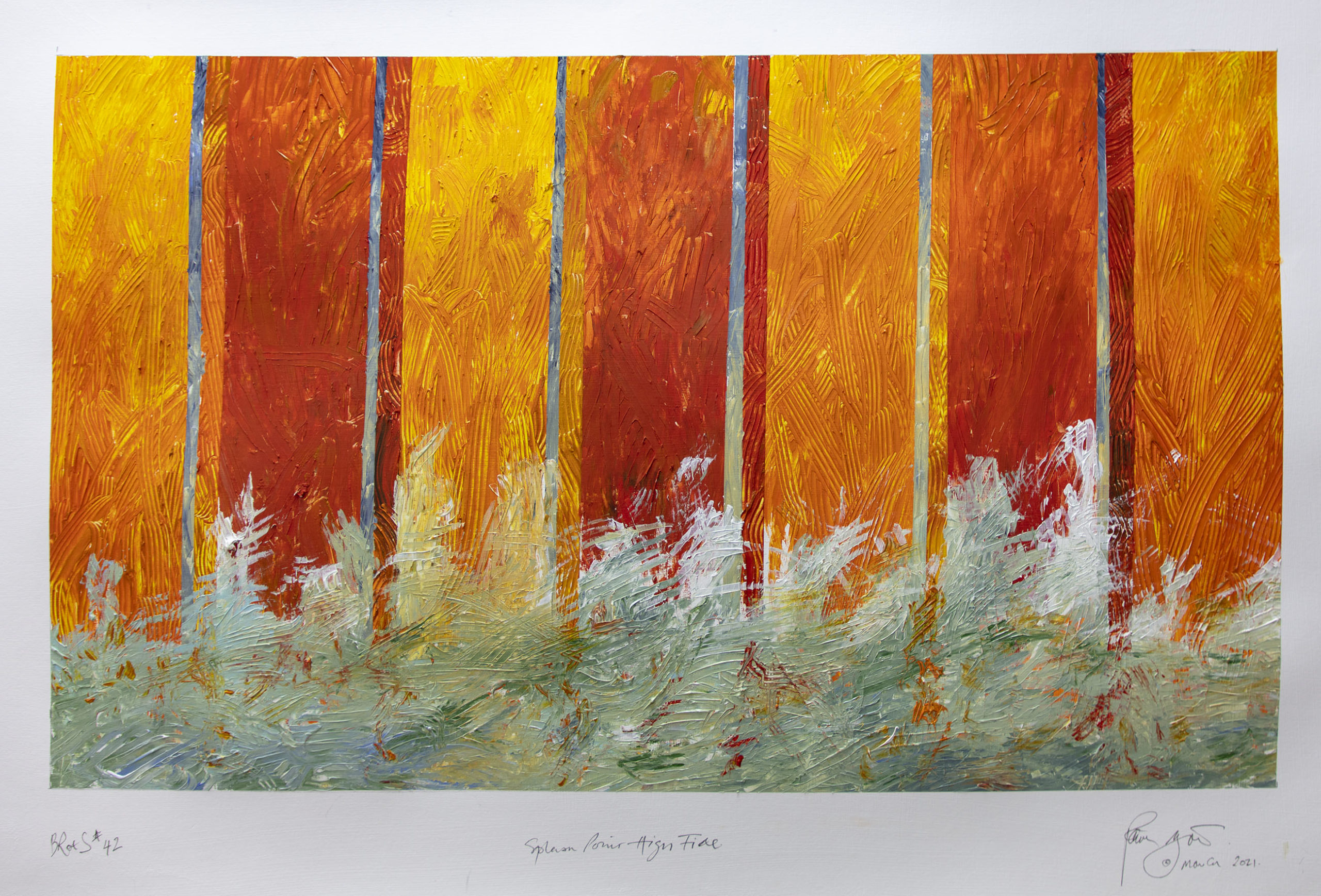
BRotS 42 Splash Point High Tide. Acrylic on paper 23 x 16.5 inches
Many artists say knowing when to stop is a problem. Cezanne reputedly always left a small area of primed canvas showing as he was supposedly afraid if he removed this from his colour relationships they would stop working. I don’t really believe this, and it certainly doesn’t seem to have been a problem for Monet, but it does get me standing in front of Cezanne’s work looking for that bit of bare primed canvas every time.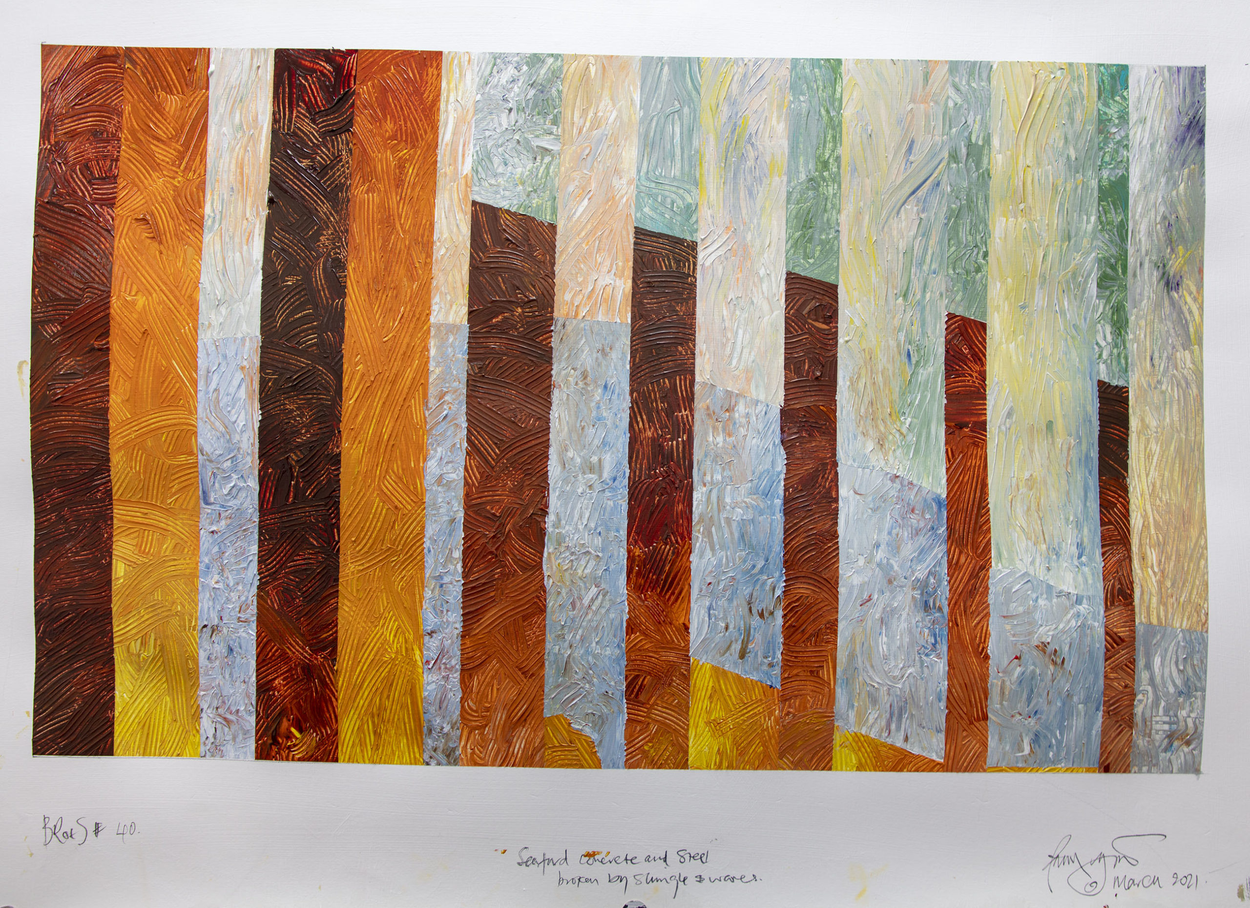
I started this piece with some basic underpainting but, because I was ineffectual in the way I put paint on to start with, much of that work has been lost. I thought of going back and roughing up the panels further, but I made the judgement that they were strong and seeing them against the previous works on paper helped confirm this decision. Then with the addition of the chaos of waves at the bottom in largely complementary colours they became much stronger – maybe with the removal of the colour washed/primed canvas – as the sea defence metal plates do against the waves.
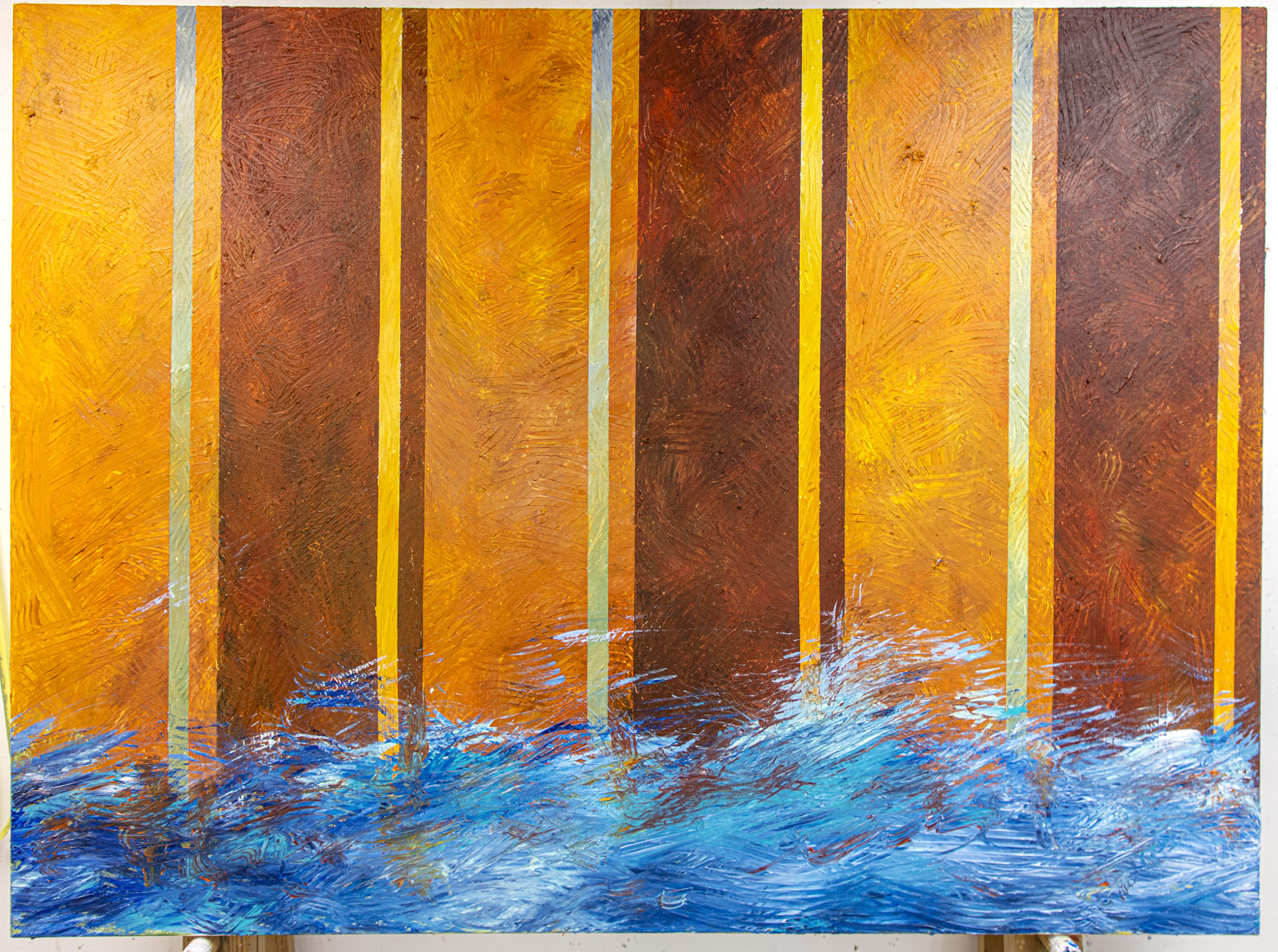
Descent into Chaos – High Tide BRotS painting no. 11 Acrylic on canvas 48 inches by 36 inches
Not overworked and now successfully pulled back from doom the painting works and is called ‘Descent into Chaos (BRotS canvas #11). I also now think that like the works on paper, I need to do a second at this size to get back some of the vigour overpainting removed. Watch this space for the result – and come visit the studio if you want to understand the process more, email via this site to book an appointment.
A serene series of images. I’m always taken aback by the blend of colours and textures and the endless combinations mirroring the sea, seasons and breakwater.
As Tom Philip’s did with his book you’ve done with the time and tide at Seaford.
Wonderful stuff can’t wait to see the real thing in your studio.
Thank you John Liepins for the beautiful comment on the end of this article. A previous buyer said I handled colour like Monet, you compared me to Tom Philips, my two heroes. You made my day….
Art reflects life.
It’s only as one ages one stops, looks, really sees and begins to reflect that around them.
How often do we stop in our ceaseless comings and goings to contemplate the very stuff around us.
They call it mindfulness now but looking and really seeing is what life/Art is all about.