Working through the ideas around the imagery of the lavender, I realised that the way I was approaching the colour and the way I was approaching the structure of the painting I was sliding into a second version of the border ‘Geranium’ painting from some years ago. All the while the five-foot-high photo of Bergen Harbour dominated the end of the studio and started to demand attention to take it forward. I had some scribbles of it in the sketchbook but finally admitted I could not ignore it any longer and started playing with the colours in the 20-inch squares format. It was like a door opening.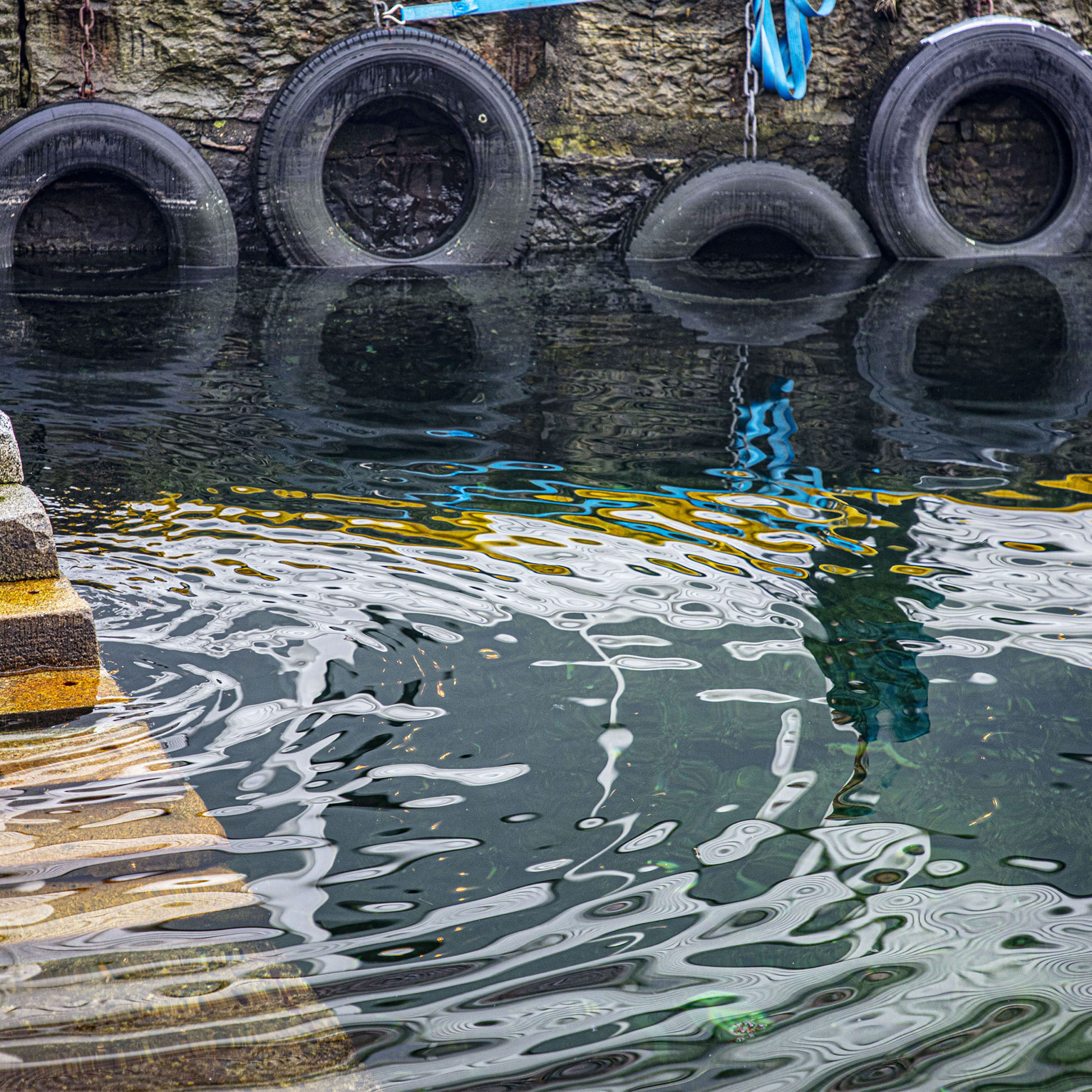 Bergen, Norway
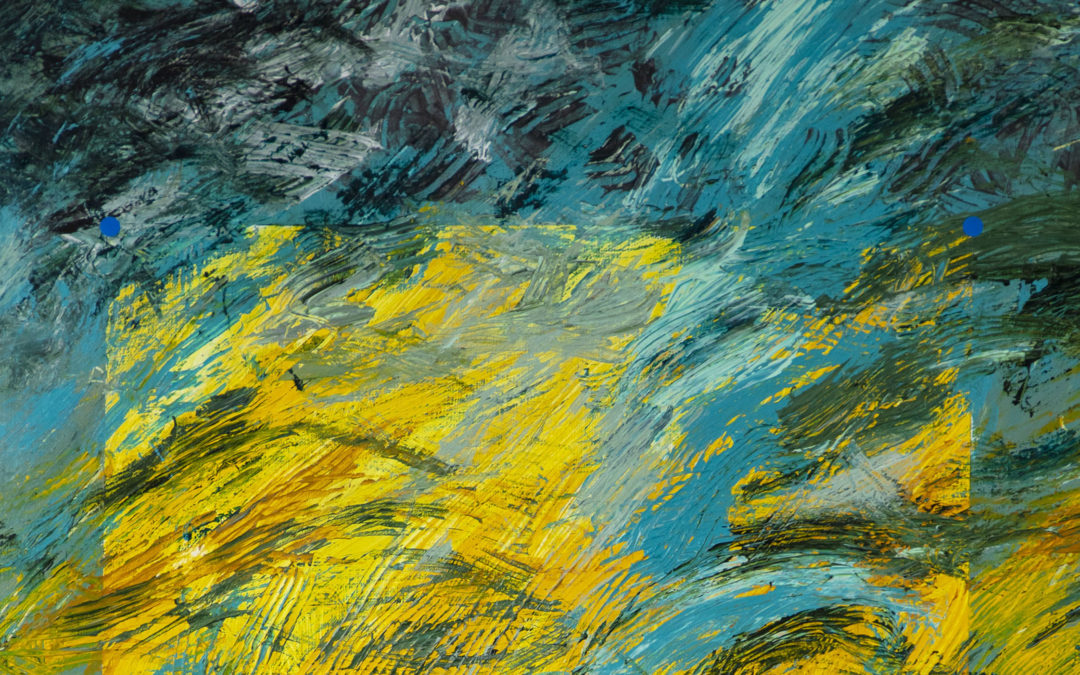
How blind I have been for the last few years. With the poppy images the door opened but I focussed on the image rather than the colour and pulled it shut so moving on became a stumble. The door opened again with the images of Tacoma harbour geraniums but once again I misread my direction indictors and turned away, obsessed with the imagery. So, I turned to the ‘peg’ series, conscious this time that it was the plastic colour of the pegs that was dominating my thinking. Again, the imagery started to divert me down another path, but by now I was starting to understand where the concerns for the gesture, pattern and texture were calling me to go, so Whittington-like, I turned again.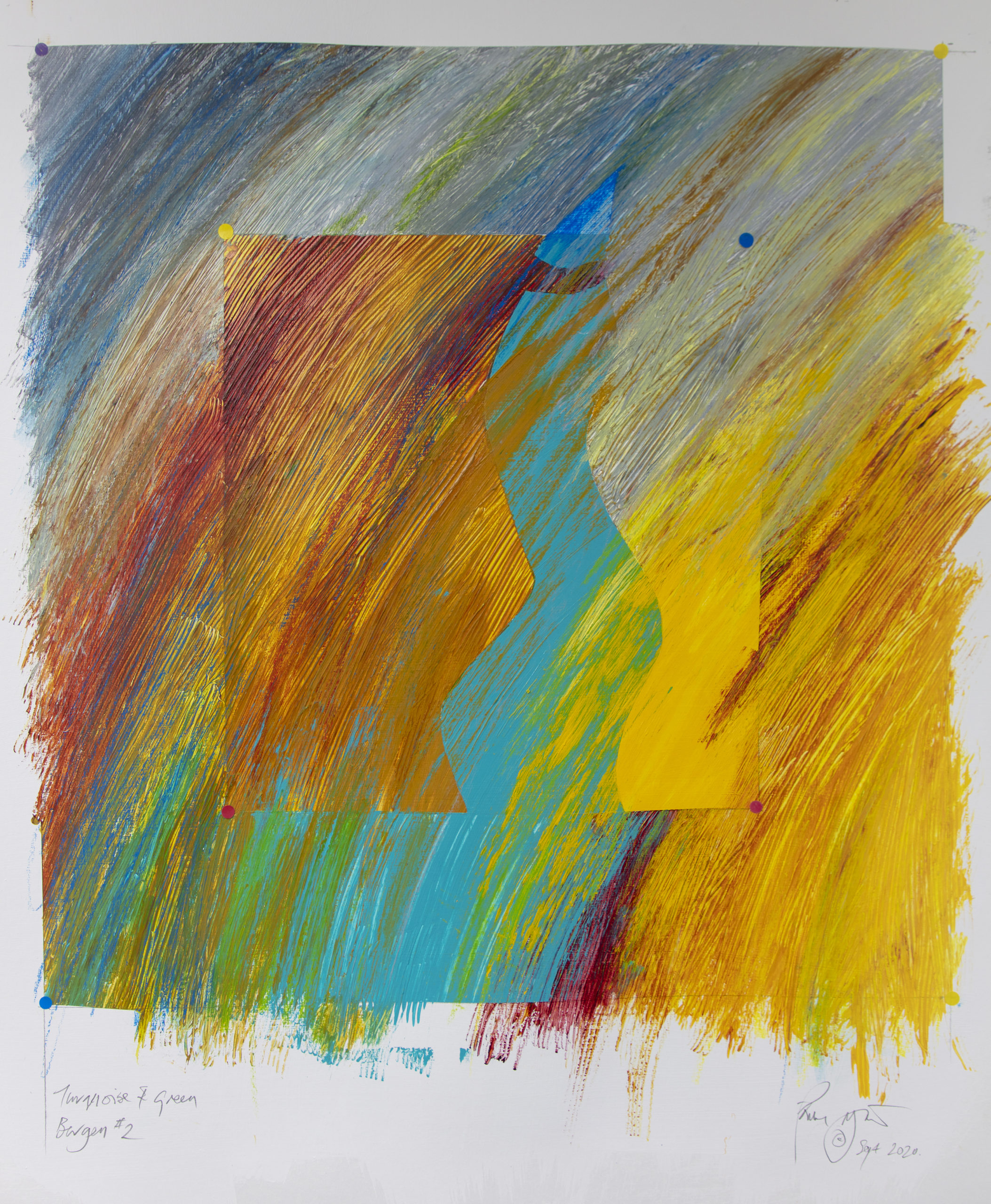 Bergen #2
In the peg series I had started to look at the mark as expressing fabric texture, patterning, light and shade, even representation. Although this was the concern in the ritual of painting in the freedom of the mythmaking on paper things were going in quite a different direction. The obsession in the works on paper with the mark expressing speed and the natural swing of the arm was being modulated, and the look at pattern had also made me consider the manner in which I was applying colour. In the works on paper it was directly using oil pastels and oil bars that were more like pencils than brushes. Now I began to play with lifting colour off with solvent wipes, scraping through colour and changing the way the gesture put the mark down. On paper exploring the peg imagery I even used real pegs in the work.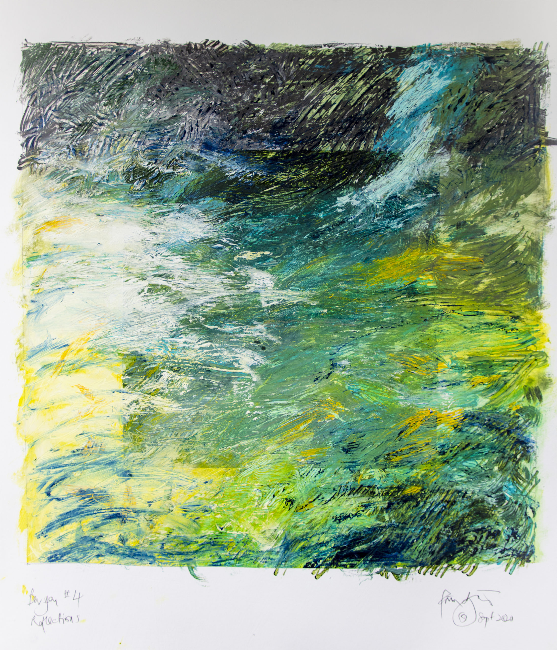 Bergen #4
The waves in the Tacoma paintings had imposed a different sense of movement and drawing in the paintings, and now the waves and depths of water, with its constant movement and transparency offered further ways to use pigment. I began applying paint in thick textured dollops, scraping with toothed scrapers to texture the paint, and then working across the resultant irregularities with brushes and paint sticks to create depths of colour exploiting the pseudo-pointillism of the poppy drawings to create colour relationships and echoes of depth. Bergen #5
As I work through the structures and mark making processes on the squares, I begin to see how I can make them work on the canvas. I need to avoid timid prevarication and press on into the canvas…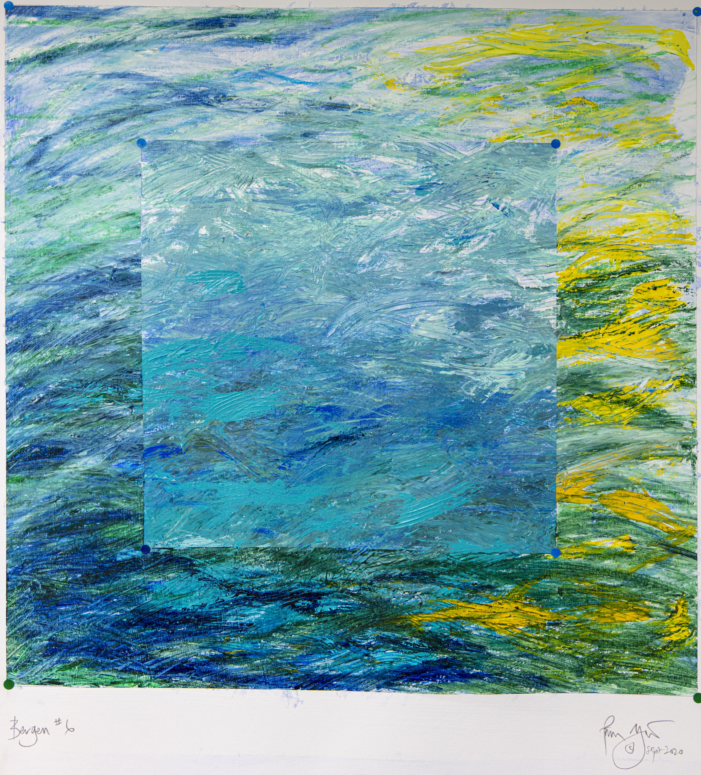 Bergen #6
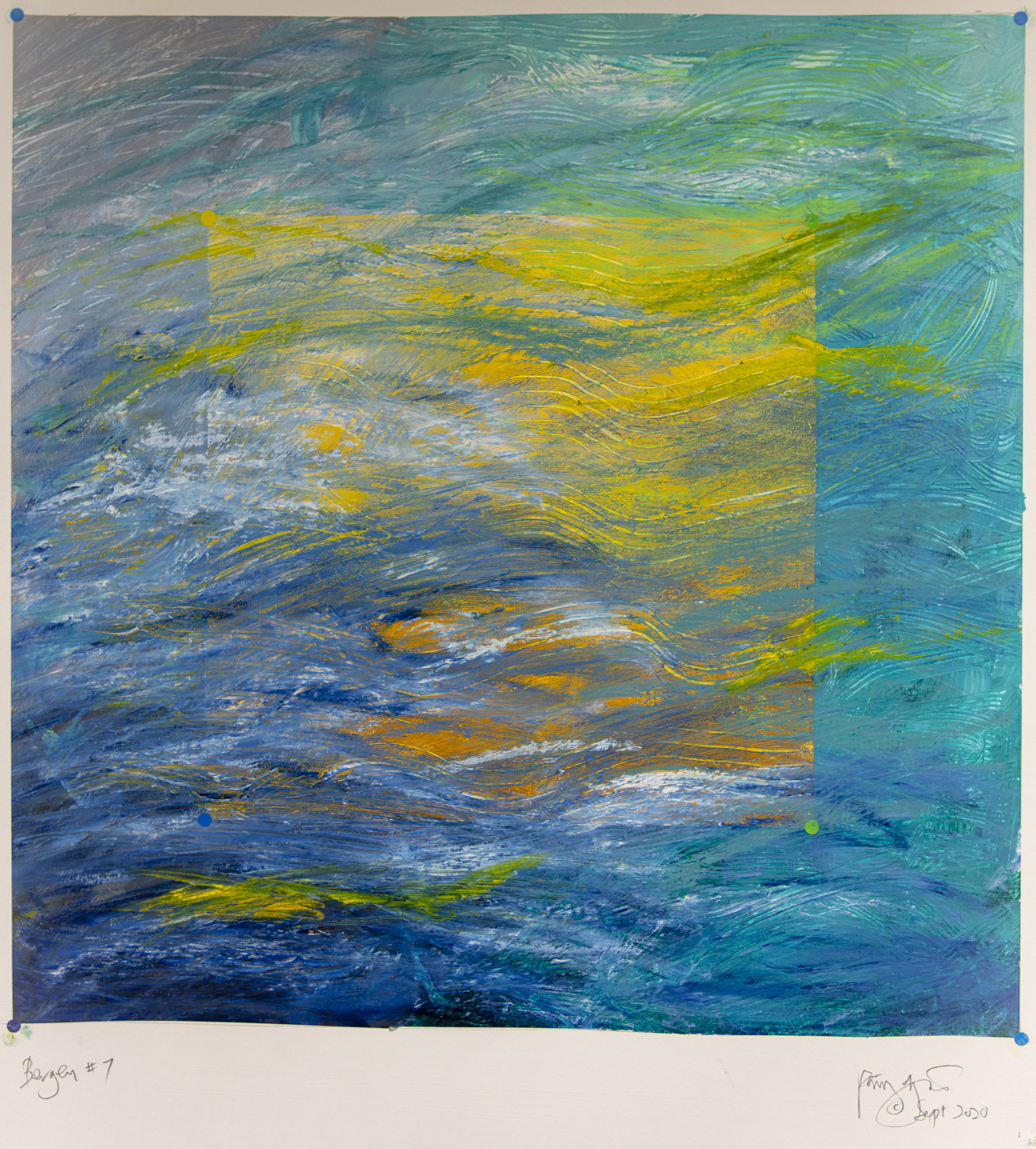 Bergen #7
All the drawings are on 300 gram paper primed with 3 coats of gesso. The all use acrylic paint as a base them oil bars or oil pastels or a combination over the top. The acrylics are applied partly by brush, partly by using various tools to give deep texture. With the oil pastels loosely applied over the top the layering allows colours to peep through from below. Additional acrylic/graphic stickers are applied on top at the interstices of the squares. All are varnished with a matt varnish
Follow me on twitter
Recent Comments