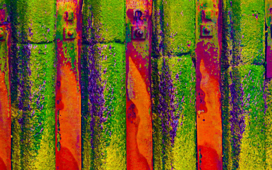
As a first-year degree student I found myself in a small group being challenged by Michael Kidner and his partner in crime Adrian Heath to create a ‘light modular’ in which pairs of colours of the same tonality would, when photographed in black and white, show as a simple grey panel. Colour pairs should include complimentary pairs making achieving the same tone a considerable challenge and this use of colour remained for several of us a part of our practice after graduation. So it is that this week I find myself stapling strips of canvas to my worktop and trying pairs of colours in a way that quite takes me back.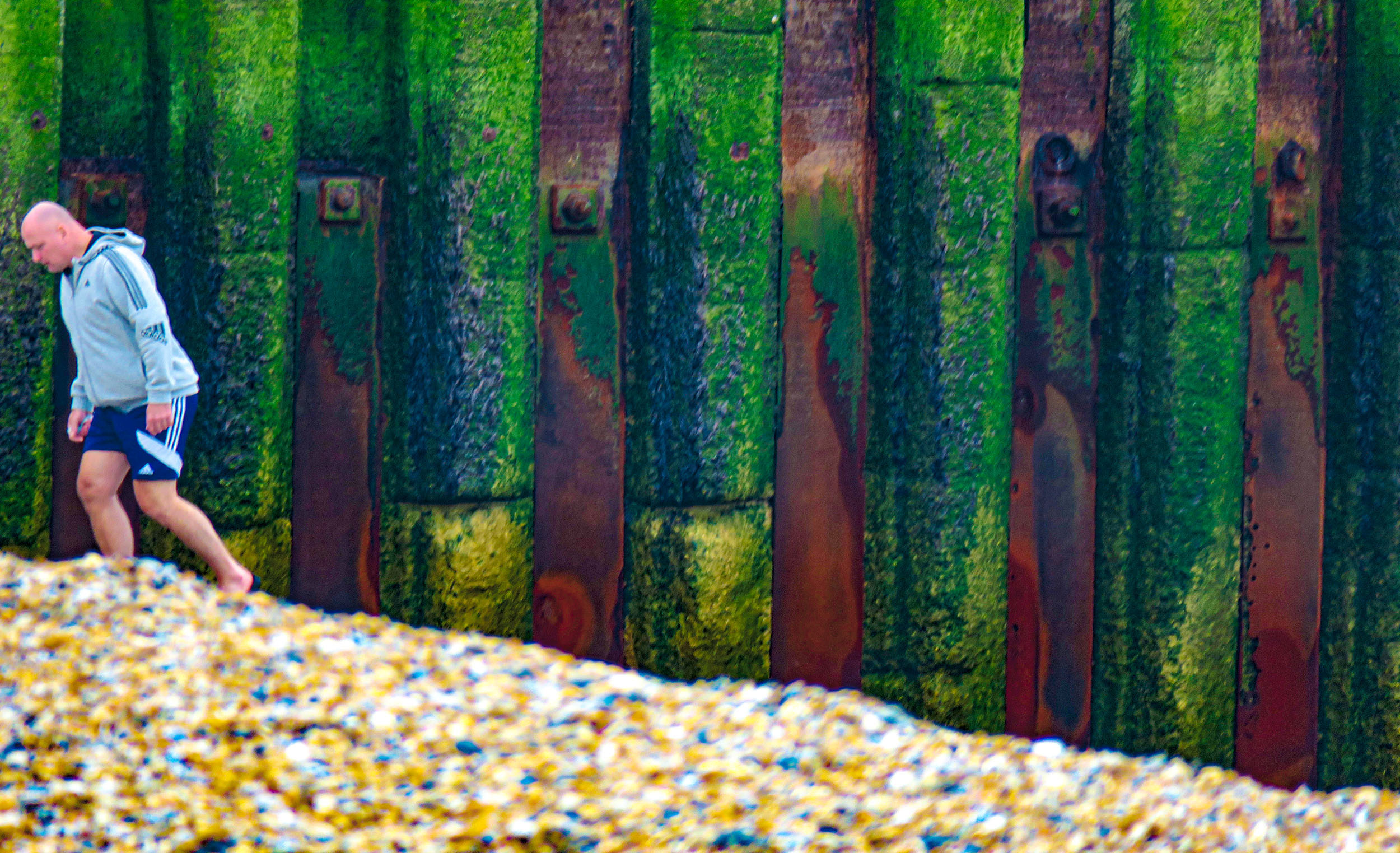 Intensifying existing colour can change perception – judgement of colour veracity is cued by the male figure, who also gives scale to the panels (my ‘Bridget Riley’ stripes)
Again manipulation in the processing exaggerates the colour content. Different light, different time of day, different weather conditions (we could be talking minutes not days) all result in a different perception of what is there. Note here the power of the sea in creating the destruction you see in the ‘Chocolate Teapot’.
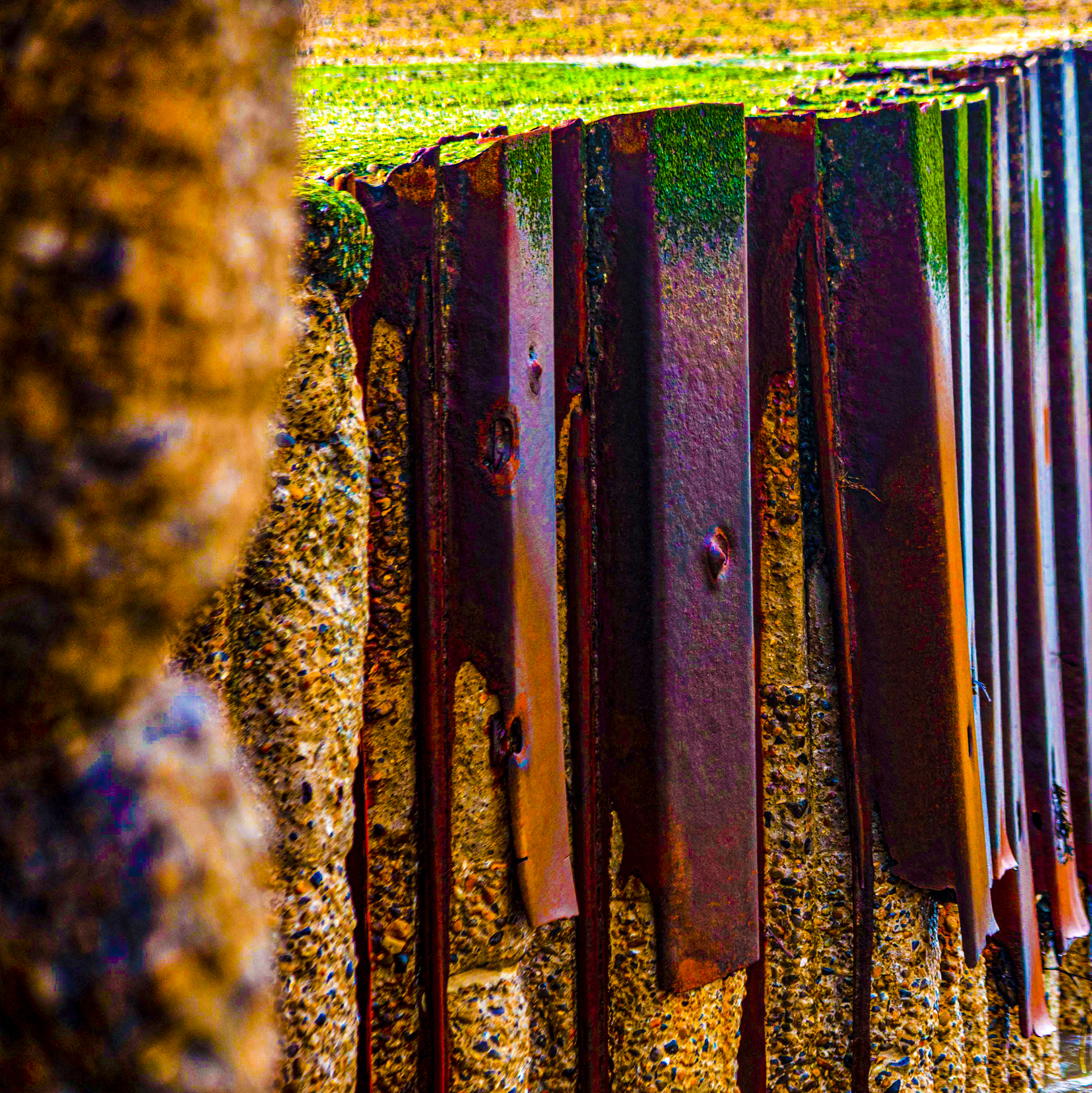
The work on the BRotS has been going along nicely and from the 55 works on paper now produced a number have moved onto canvas whilst a smaller number are framed up as finished pieces in themselves, including the ‘chocolate teapot’. Much as the break away from the square that led to the Bergen Harbour breakthrough piece came from a casual observation so too did the focus on colour. My partner commented that I was getting through a lot of orange pigment, and it came just as a series of photographs taken in mist and late afternoon sunshine produced some startling magenta colour images.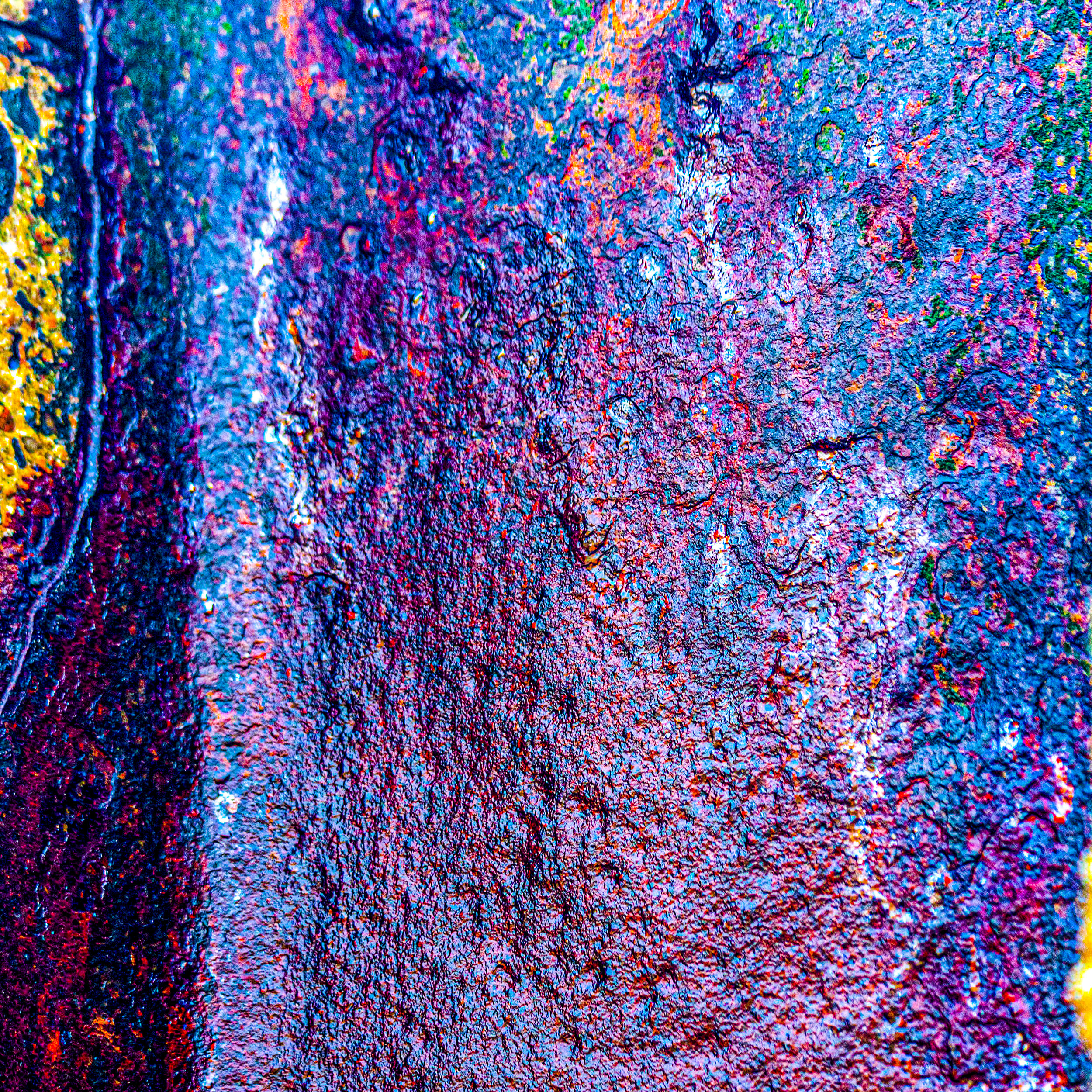 Changing light changes perceived colour and then it is exaggerated in post image processing. Here sea-fret filtered sunlight altered how colour was ‘seen’ both by my eyes but also by the algorithms in the camera itself – never forget what you get is filtered electronically according to the aesthetics of the technicians employed by the camera manufacturer. Nothing new here as those who remember the different colour caste that came with using Fuji or Kodak films/slides
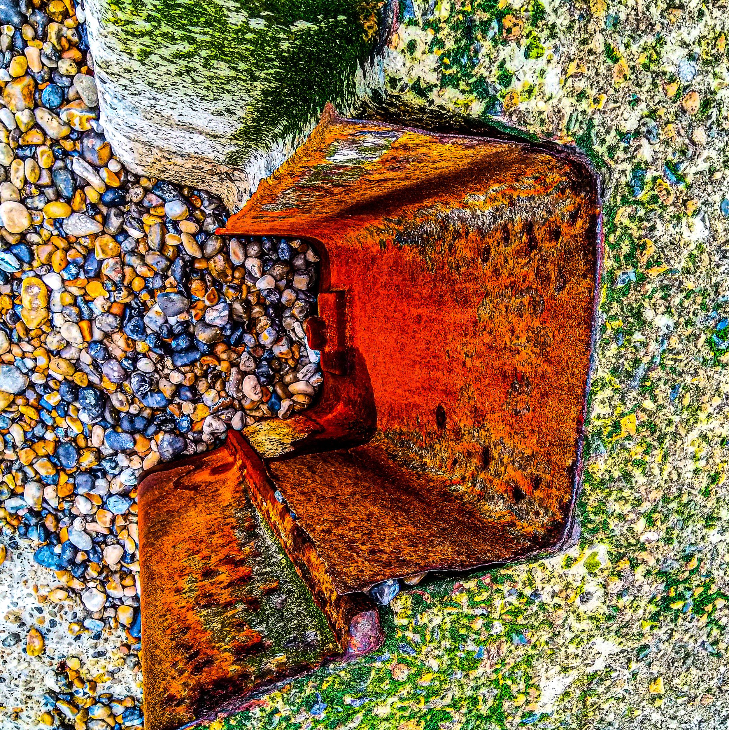
Looking down on one of the metal sheets – the colour is there but the camera and my processing of the image exaggerate. intensify, until it becomes, perhaps, a work of art in its own right
I began to play with the photographic imagery, not something I like to do as it moves away from truth as I see it into a world of Disney. Psychedelia one colleague said. It is fun but your screen won’t have the same colour settings as mine so I have no real control over the colour you see, unless if print it out (and all my images can be printed out at a price). There is plenty of natural colour to see without having to exaggerate it, however seductive the result. My camera takes large files so in theory these images can be printed out many feet square without losing definition.
Much more meaningful to reveal a reality than to indulge in a fleeting piece of theatre, surely, unless of course the revelation is of lasting beauty or changes perceptions materially. But then that is what painting is supposed to do…and I love the autographic quality too.

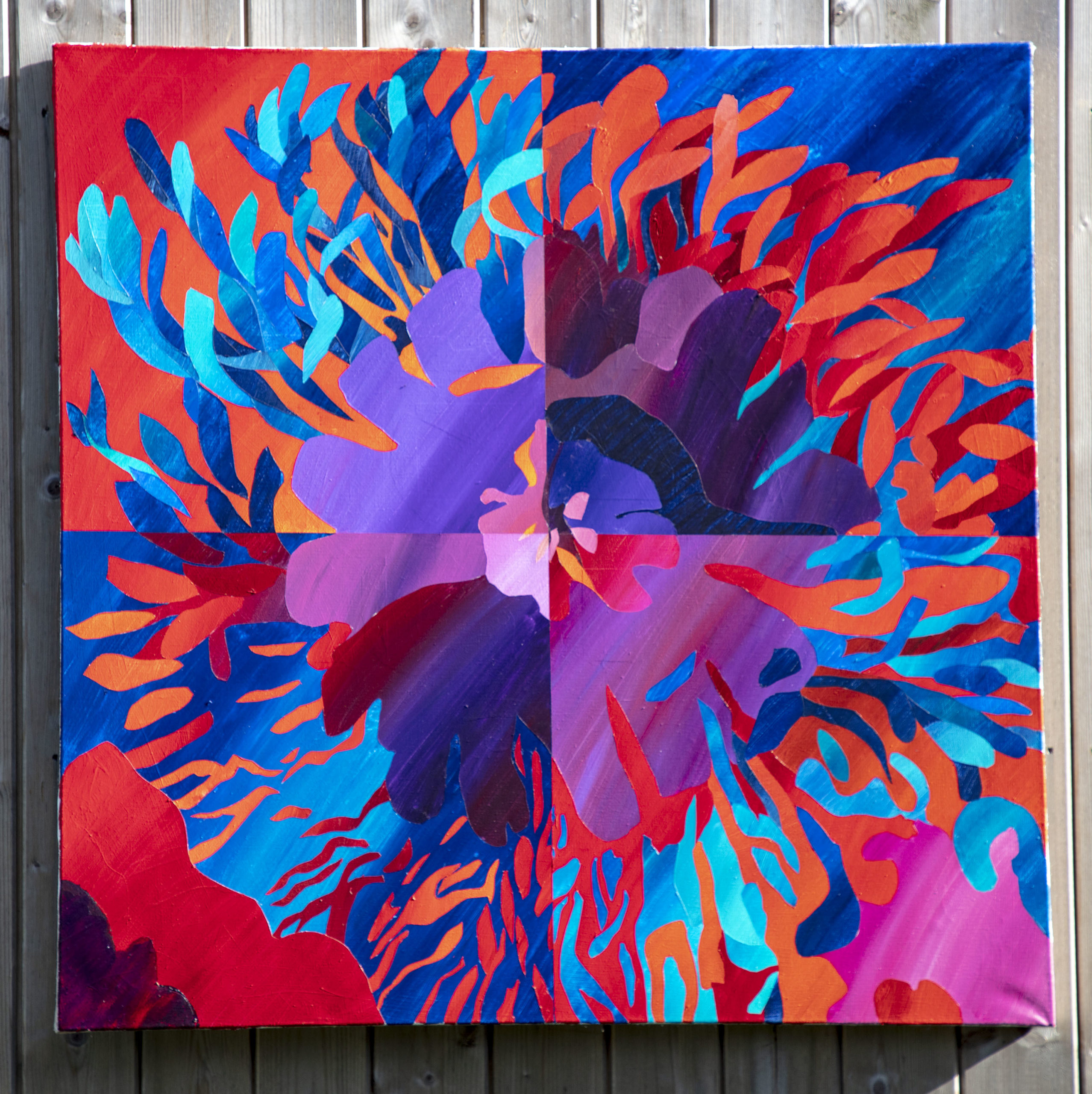
Not a new concern then, maybe a dawning realisation – yeah, I know, slow, but I get there in the end. Sometimes I think with my hands. This pair of Poppy images are still available
Thank for popping by my blog – its a work in progress as always and I need to redesign the while website before it looks as beautiful as yours.
Reading this piece I’m more interested in the texture than perhaps the colour tones, I love a good bit of sea rusted metal. I too am revisiting some previous work that I produced at Uni – #ebbandflow. http://reflectionscoaching.co.uk/reflections-blog/uncategorized/ebb-flow-revisited-again having been back to Porthleven my original inspiration.
Hi Paddy,
I read you piece on colour with interest.
This whole business of finding contrasting or even complementary colours of the same tonality is what we have being playing with for a long time now.