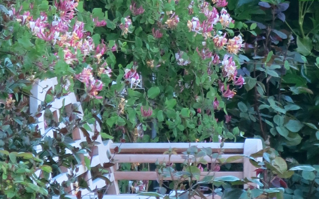
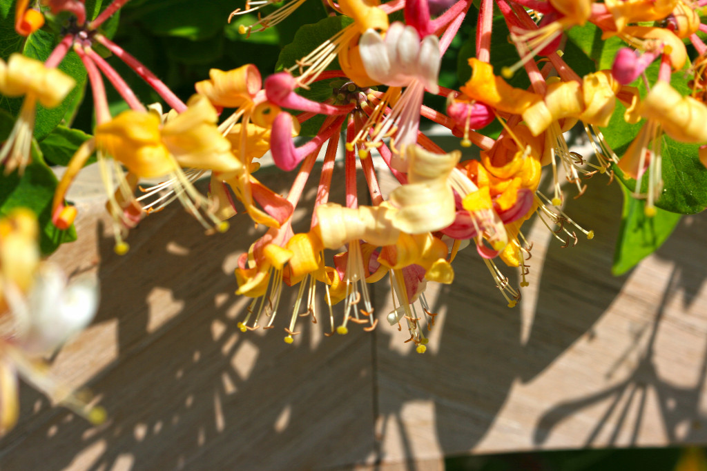
It started with sunshine tempting a sojourn on a garden seat surrounded by honeysuckle. I had been watching it coming into bloom, and a couple of day’s sunshine brought it out in full colour. First step always these days is the camera, which I use instead of drawing. This image was taken with a Canon 100mm macro lens, which is stunning for flower pics.
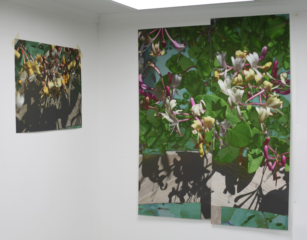
The range of colour is wide from the bleached pale ochre of the bench though the pale yellows, pinks, and reds of the flowers into the deep turquoise and dark green of the foliage. Starting point was playing with tonality and cropping the image. It seems at the moment as if for some scale is enough to make a photo art, so I printed sections off to create an A0 image for the studio wall to work from.
Somehow the machine is not good enough as an interpreter of reality for me, although great photographers definitely have an artist eye. I have started re-reading Pat Gilmour’s ‘Mechanised Image’ from the 1978 Arts Council survey exhibition of printmaking, and although technology has marched on swiftly her insights are still keen and relevant. For me the photograph is an exciting artefact but remains, still, as the medium that is the message.
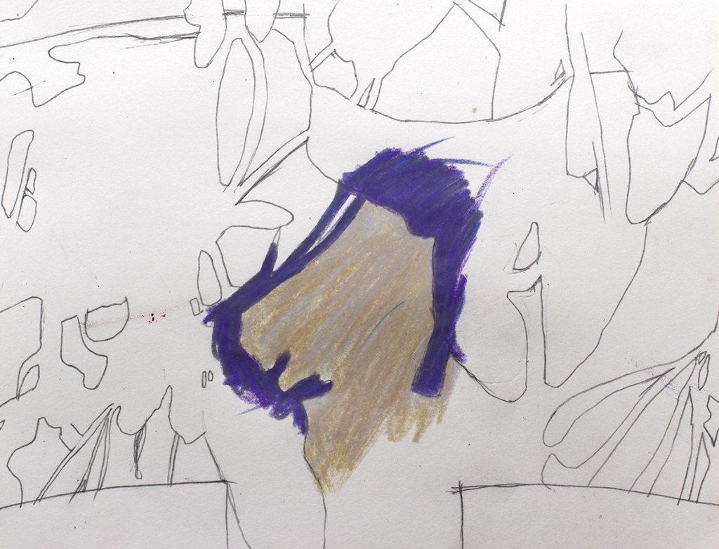
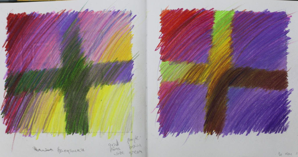
So my first drawings are explorations of the language of colour in making my art. I make line drawings to understand the forms and how to make the composition work, and then play with colour, using both large printed photo images and oil pastel drawings to explore the colour and to set in my mind the kind of palette I will use in going forward into a painting.
I use oil pastels, coloured pencils and the colour printer. The latter of these is still a bit of a novelty and there is a lot of experimentation with paper types, thicknesses and colour rendition going on. I am beginning to think back to my screenprints and have ideas about how multiple passes through the printer might work. There are problems with maintaining the correct sizes of images in Photoshop and how to register multiple images with the flaky roller system Epson use in their printers, so I can see a lot of fun ahead trying to produce consistent repeatable results.
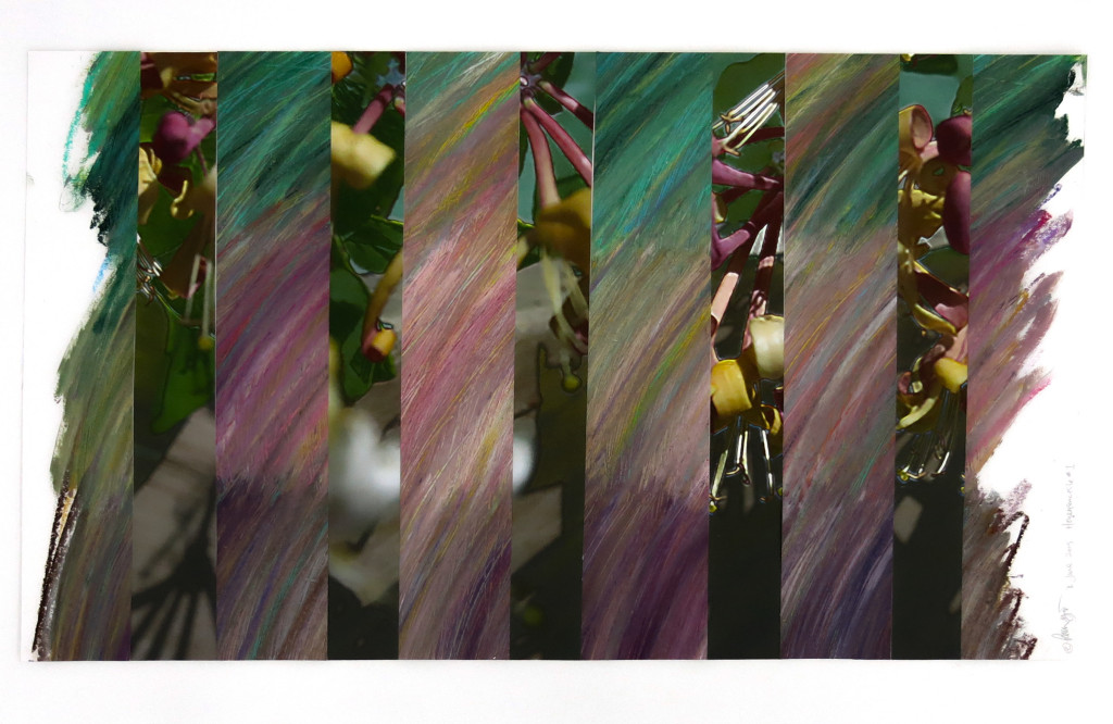
More successful in defining the colour is the oil pastels, which is sliced up and mixed with the photo imagery to ‘test’ my colour mixing, making this drawing
Even the oil pastels are presenting unwelcome problems with the consistency of the pastels themselves. My favourite make, ‘Piano’, doesn’t seem to be made any more, and the current ranges available (such as Sennelier) I have found are very soft by comparison, smeary and not giving me the definition of colour I want as a result. It’s a long time since I worked in this concentrated way in the studio, and I feel I am having to do a great deal of new learning to come to grips with my materials, but progress is rapid.
Any tips or pointers are of course always welcome… use the comment section or email me through the site contact page
For more follow me on Twitter
