In recent years there seems to have been a resurgence in pride in creating quintessentially English interiors. At all levels of the hospitality market interior design practices have been producing design solutions that are recognisably within an English tradition. Whilst I have been used to seeing interiors in South Africa that have married a recognisable South African aesthetic to international influences (Bushmans Kloof for example), the generation of an English aesthetic has been less identifiable in my homeland.
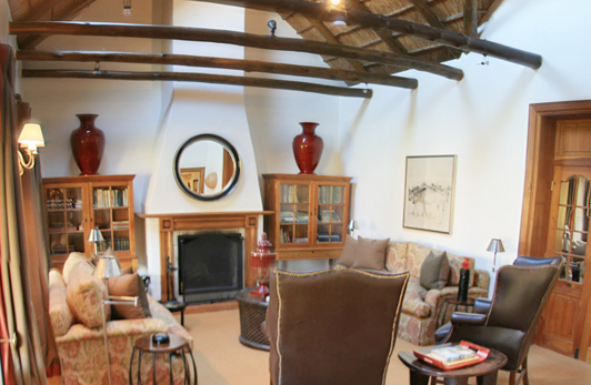
Lounge to a bedroom in South Africa’s Bushmans Kloof hotel which marries European sophistication to local architectural construction
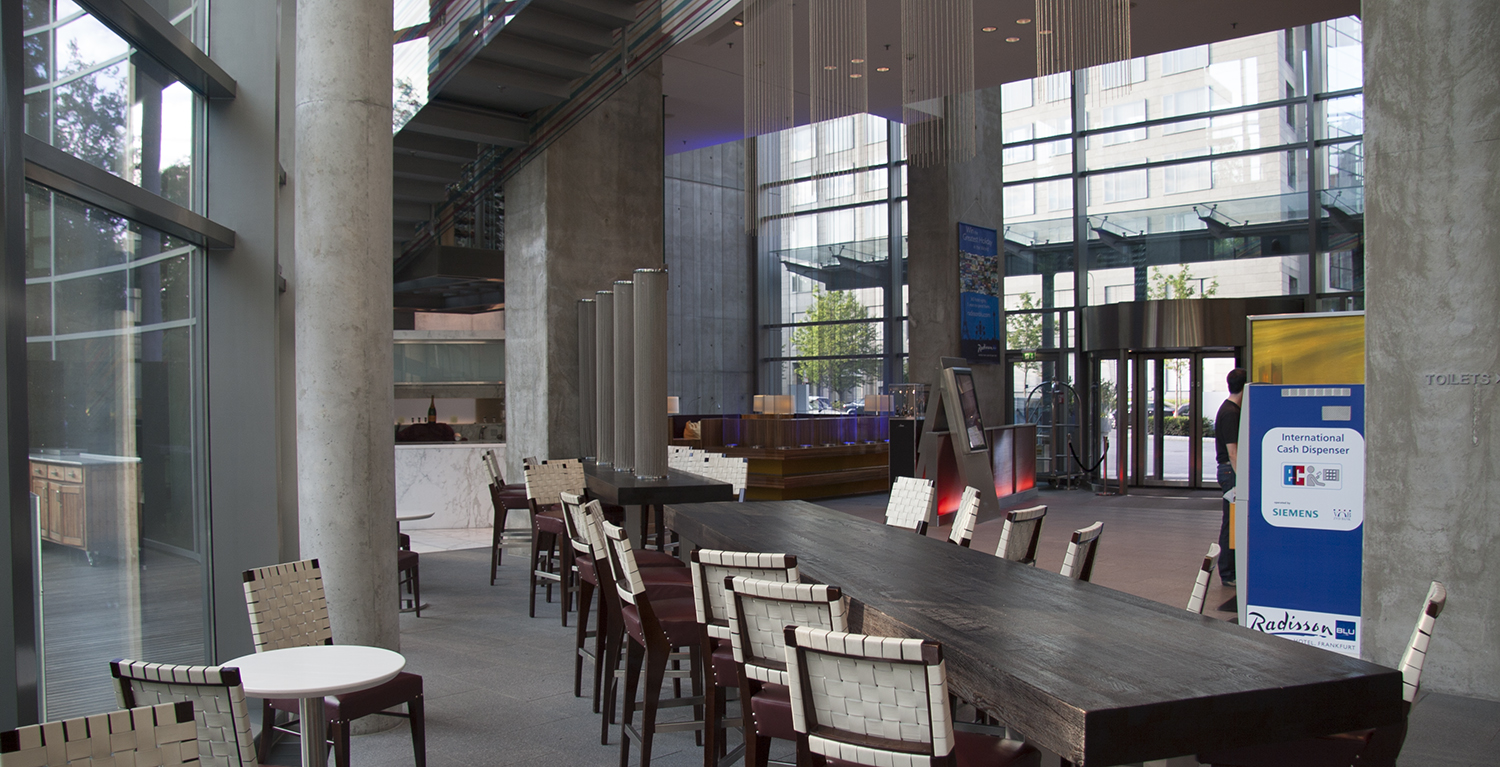
Interior designers nightmare. The Radisson Frankfurt designed as a vertical wheel has interiors which are badly spoiled by structural and architectural nasties resulting from the nature of the architectural vison
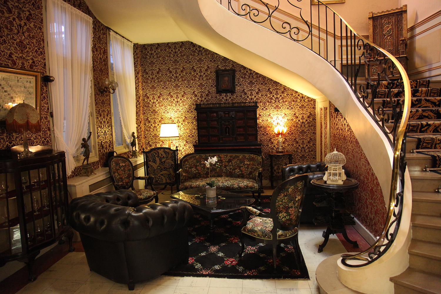
Englishness is a difficult style to nail down, unlike French styling epitomised for me by the discovery of the Hotel Meurice – no not the one in Paris, but the one in Calais. In Germany too I have found many Gasthaus properties that stylistically could not exist elsewhere. So it goes on throughout Europe, whereas the local English equivalents have been less stylish and more (not to put too fine a point on it) twee, with many just run down, seedy, knackered.
Meanwhile ‘starchitects’ continue the trend for new builds to be architectural styling porn at the expense of cities having a local identity, with their interiors dominated by their structure. They generally fail to acknowledge location in favour of an androgynous ‘international style’, and are designed from the outside in, the reverse of a good interior, which should always focus on function. This leaves the interior designers attempting the architectural equivalent of putting lipstick on a pig.
In recent years the English regional market has picked up and we are now seeing the regeneration of identifiably local trends. These when taken together are, for this observer, beginning to create an identifiably localised English design style, which I like referring to as ‘a new English Vernacular’.
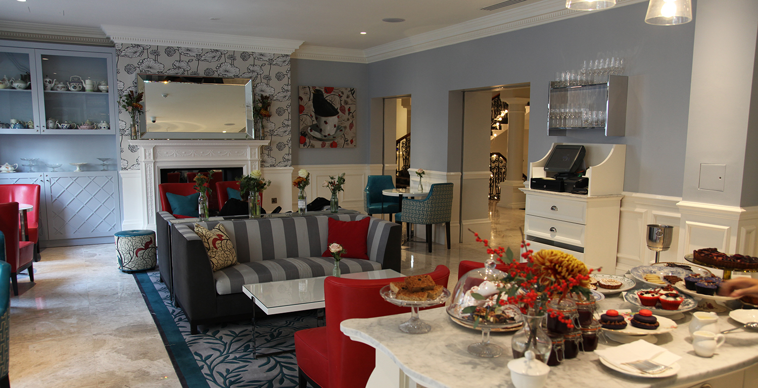
The style is emerging not just in the independent small local hotels either, but also in franchised chains. It can be seen perhaps most eloquently employed by Accor. In both the Mercure and the ‘M’ Gallery branding’s I have found delightful example of ‘English Vernacular’, but surprisingly it can also be seen in more pretentious hotels such as the five star Beaumont Hotel in London.
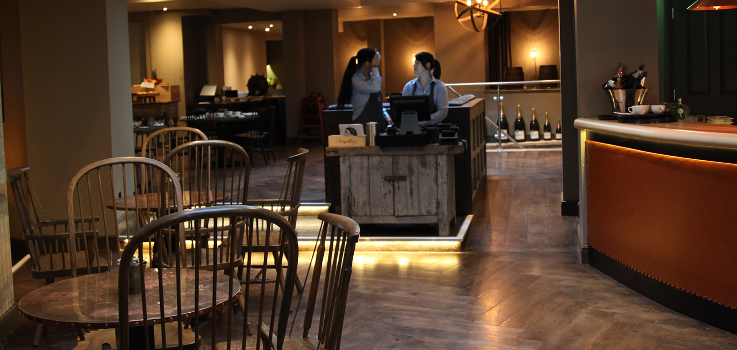
Re-using buildings from Saxon to Georgian times, the interior designers of Cirencester’s Kings Head Hotel pulled together a successful melange of interiors in true English style
Of course the style is strongest where there is already a strong sense of local identity, and I have seen it strongly in the increasingly well designed pub hotel sector, but also in strongly designed local hotels such as the St. Michaels Hotel, that oozes the English seaside in Falmouth. The newly recreated King’s Head in Cirencester carries the history of England in its DNA and the designers have cleverly and stylishly revealed it throughout the building.
Suppliers too are mining this seam, not just through the resurrection of historic patterns by companies as diverse as Brintons at the Lyceum in Sheffield or in the growth of sales of relaunched William Morris designs by fabric company Walker Greenbank but also in the growth of home grown producers like Morgan Furniture and Panaz, forging their own modern versions, their own inimical English style.
To say a new English aesthetic is emerging may appear a little premature, but I believe it is here and strongly influencing many designers.
Where previously many owners have wanted an ‘international’ look, increasingly instead a sense of place is being developed. From the top five stars such as the Beaumont or Kit Kemp’s group of London hotels through to the pubs such as the Cary Arms or the Shibden Mill Inn interiors are being developed that are sophisticated and modern but with strong English feel. This is not all about historicism, although that too plays a part. Good design acknowledges the past because as the saying goes, those who forget history are condemned to repeat it. Some gorgeous interiors have been created using historical references whilst not mimicking historic appearance.
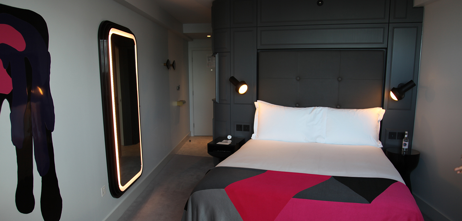
Hotels such as the Beaumont or the Stafford can be seen as backward looking, perhaps too retro for many, but I believe hotels of this quality are actually signposts to a more comfortable future in hotels in England. The move away from poor minimalism has stumbled in many cases into boring greyness. Hopefully this may simply be an undercoat for a more thoughtful use of colour and timber in the English tradition.
I hope we see more of it as our Englishness is something to be celebrated, bolsters our tourism appeal and returns pride to a nation that badly needs its self-confidence restoring.


Recent Comments