“Another example from the average surfer’s perspective: imagine a 20-inch thick wave lip, only 3.2 feet wide, in a summer three-foot wave. Total weight? A solid 1100 pounds.” From ‘SurferToday’
The waves start in the Atlantic. They sweep up the Channel picking up and pushing sand and shingle before them in a ‘longshore drift’, crashing their stone reinforced water against the soft chalk cliffs of Sussex. All along the coast shingle shovellers bolster sea defences, the flawed thinking of those responsible for budgets and coastal defences having decided it is better to spend a few hundred thousand every year rather than a one multi million instalment sea defence plan with a bigger bill for a year but peace thereafter, Dutch style.
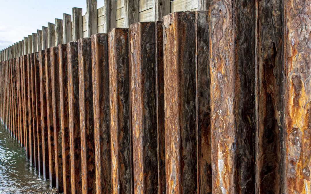
Splash Point is an end stop to shingle drift across the Seaford bay the last iron clad concrete ‘groyne’ masquerading as a short jetty but in fact covering and protecting a sewer outfall installed in past times, replacing an earlier one from the 1880’s. The metal protection on the groyne pounded by this mix of waves and shingle has become my inspiration for a series of works.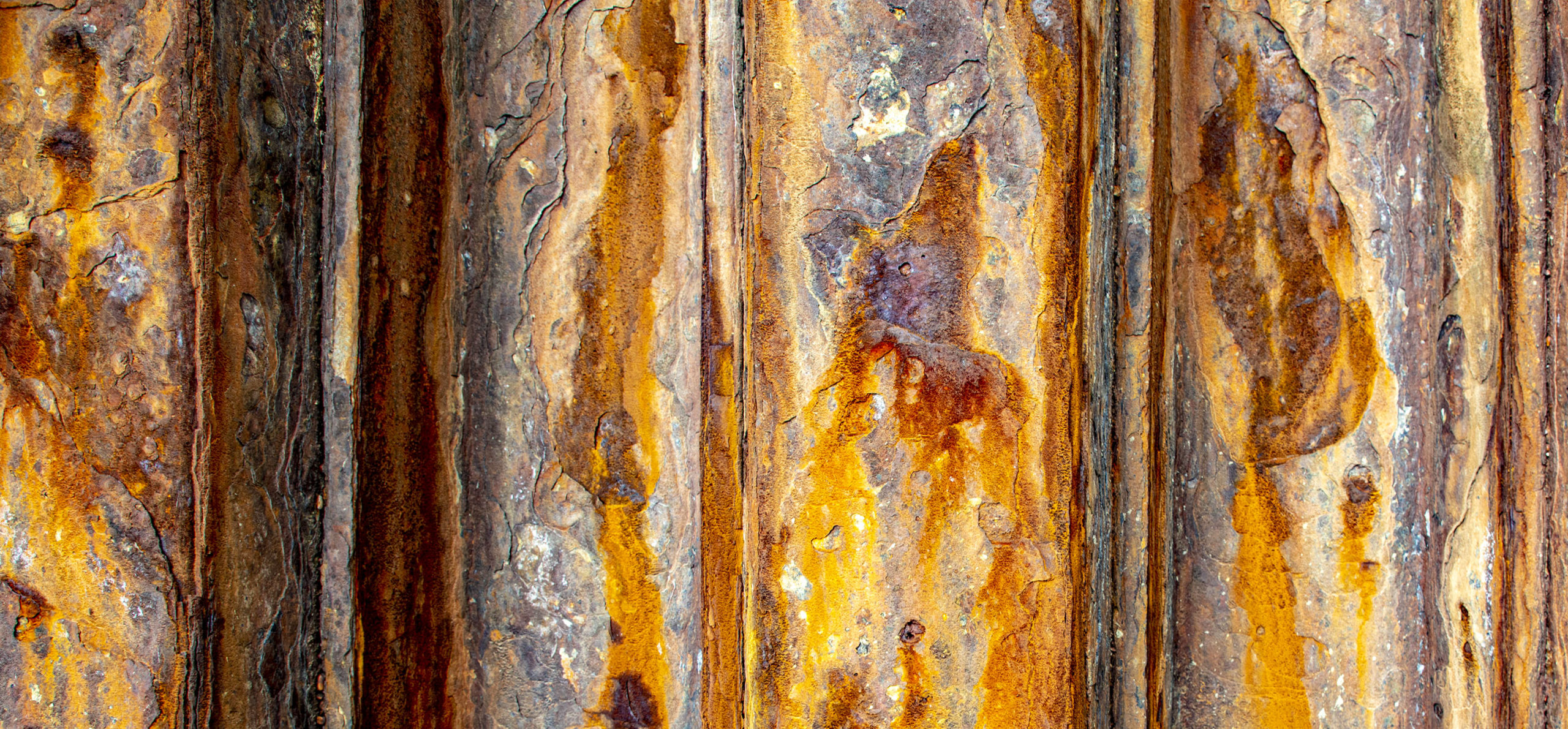 The jetty
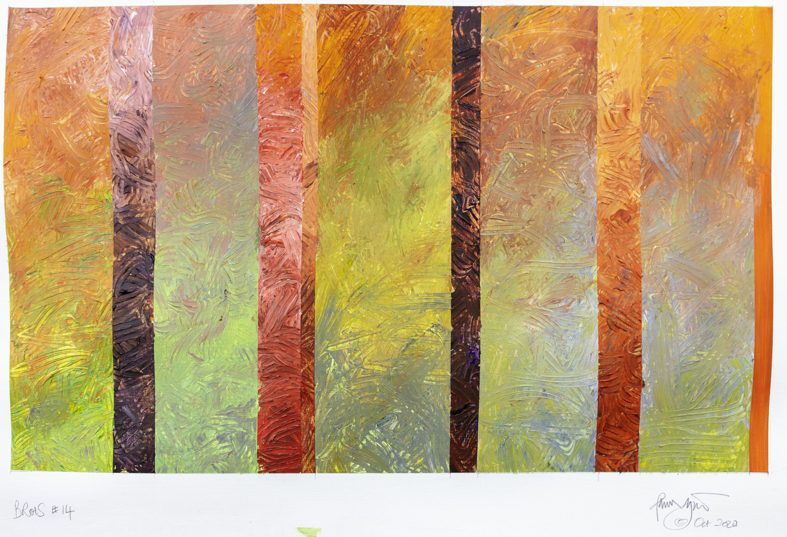
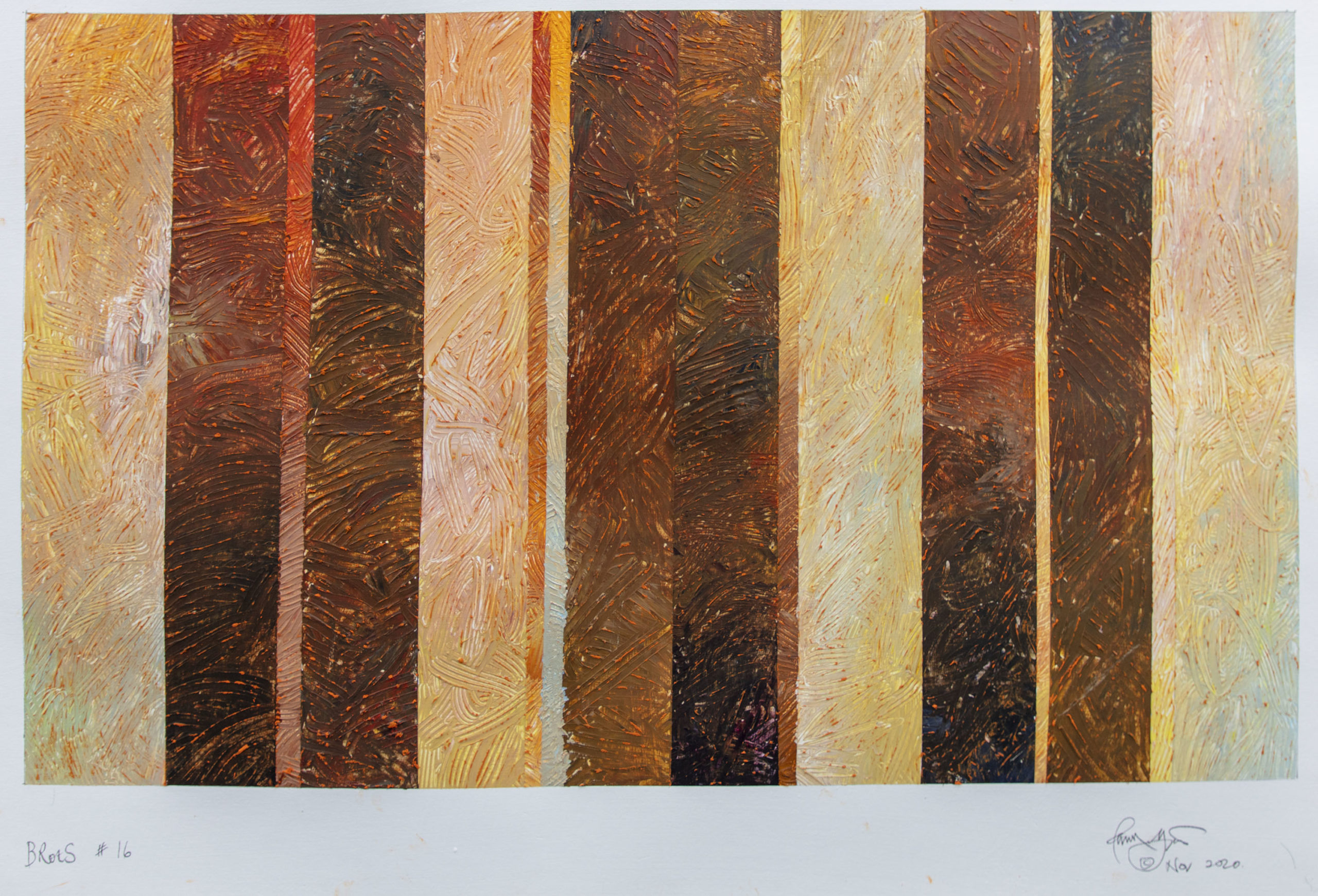
BRotS #14
In my last post ‘Trust in Rust’ I described how this series started. Now it continues and the more I delve the more colour there is to explore. I have dozens of photographs of the jetty, and have been collecting more recently, along with metal shards from the rusting surface. The rust is evidence of the passing of time, another concern in my work periodically. The metal is a preformed interlocking set of thick plates protecting the concrete beneath from the pounding, the force of which is demonstrated on the westerly side by pebbles rammed into any opening.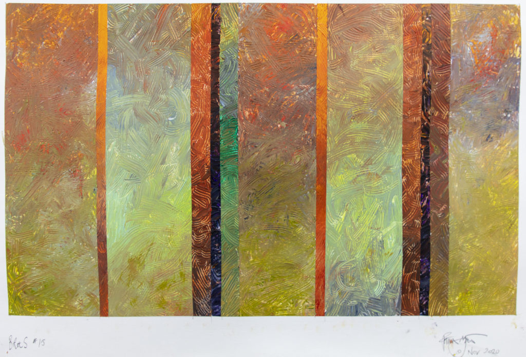 BRotS #15 Acrylic on paper primed with 3 coats of gesso ground 23.5 inches by 16 inches
On the easterly side, more protected, the erosion and rusting is gentler and because the beach that side is lower there is a much greater height of metal subject to tidal effect, allowing molluscs and algae to colonise and colour the sheet metal in a riot of oranges, browns, greens, greys and pinks.
The stripes I use are determined by the structure so as before I tread a line between abstraction and realism in exploring the colour. Someone described one of the resulting canvases as ‘impressionistic’, and maybe that is a fair comment, but my overriding concern is not to present reality but to show how the colours intersect and the visual richness that this ageing structure presents for our delectation and delight.
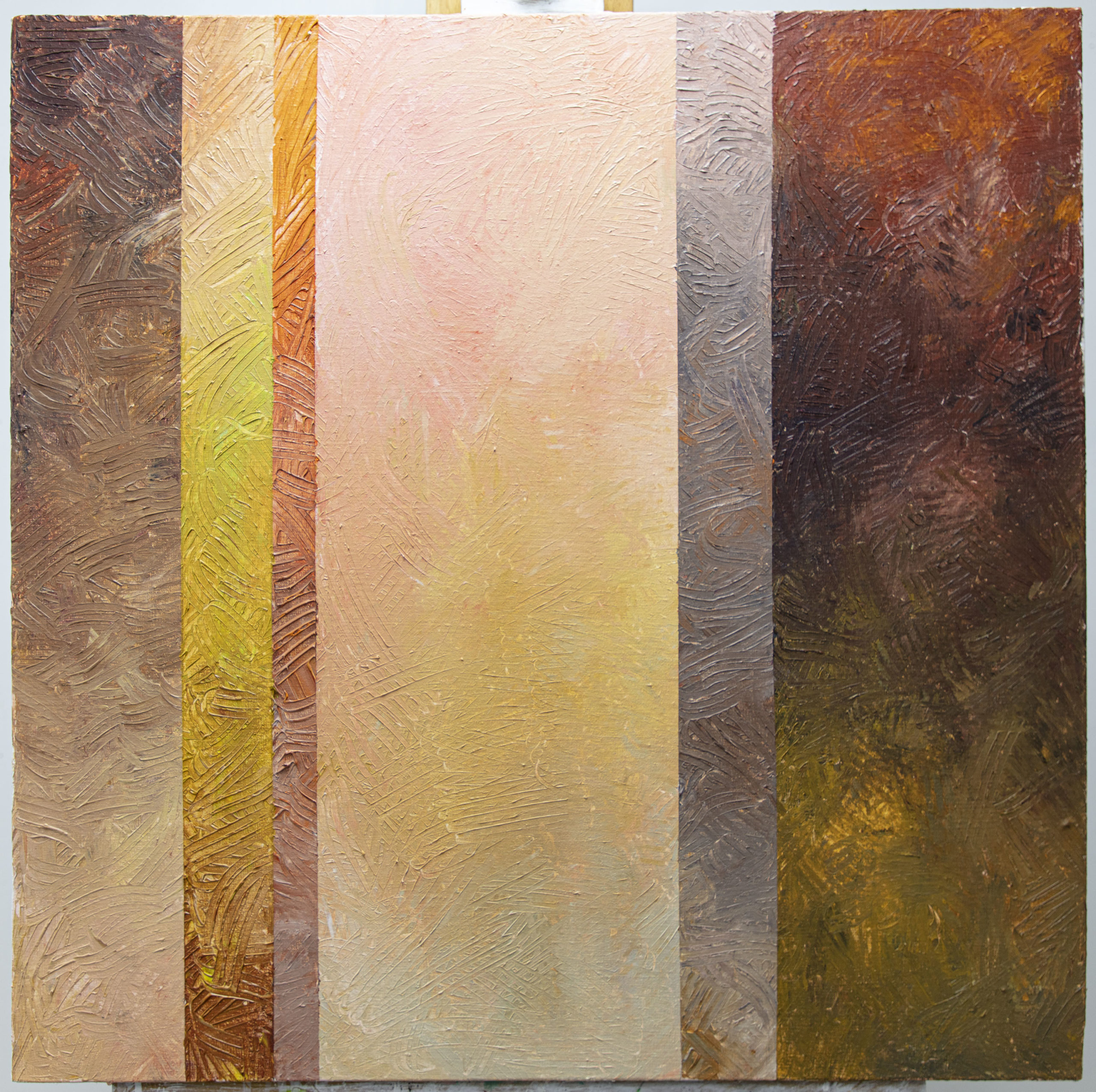
The pink is proving surprisingly difficult to manipulate – maybe because of childhood memories of pink blancmange but makes for some interesting battles on the canvas. Varying underpainting too is creating some issues, and I have tried splitting canvases in two colour priming; I have tried using a grey primer coat and tried using a pink primer coat before the surfaces are created. Slowly I am beginning to find ways to make all these devices work.
 Close up of a part of the ‘jetty’

Seaford BRotS #3 painting. Acrylic on canvas, 2 feet square
I am a slow learner, and each canvas is a summation of a number of steps made and a tester for a larger canvas to follow. Currently I am introducing stronger greens to balance the pinks and it may be that I will produce some stripes with brush and flat paint, although I think it has been done before. When students said that to me my response was always ‘yes, but not by you’. My own spin will appear.
Recent Comments