Going up to town from Seaford, where I live, is relatively easy, letting the train take the strain. There are only three direct trains a day though, and the last of these gets in to town at 10.00. As I often do now, I make my meetings mid-afternoon so I can pop into the Tate. Not the modern bit , which seems to me to be mainly froth, but the Tate Britain, the original Tate that I first visited in 1967.
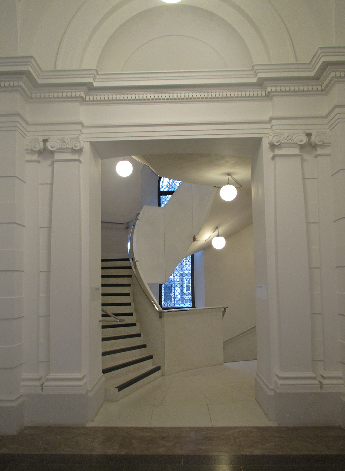
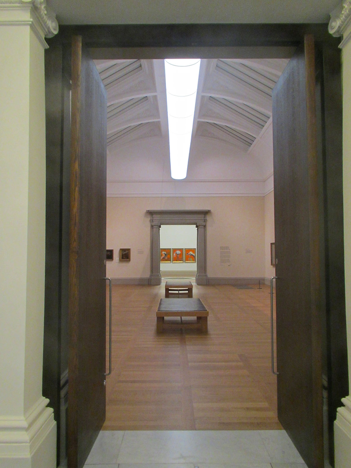
The Tate has followed various foibles of various Keepers through deep green walls etc., but the latest incarnation for the first time respects the original building. The architect and interior designer have allowed it to speak, holding their egos in check with quite splendid results. This is a lovely building and the subtle paint colours used allow its form to sing, whilst the modern alterations don’t hide but are done with great sensitivity yet power. The results are a delight.
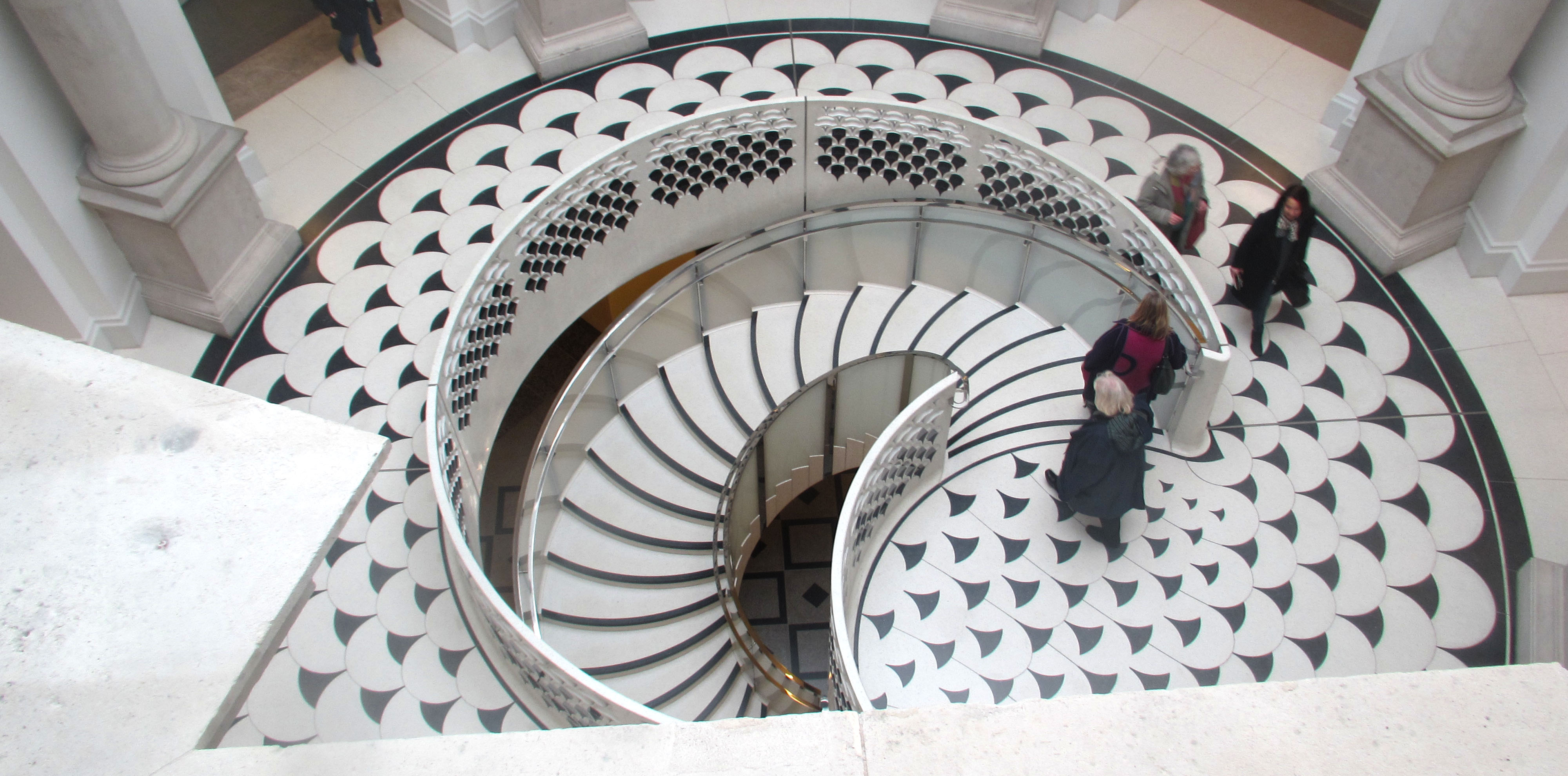
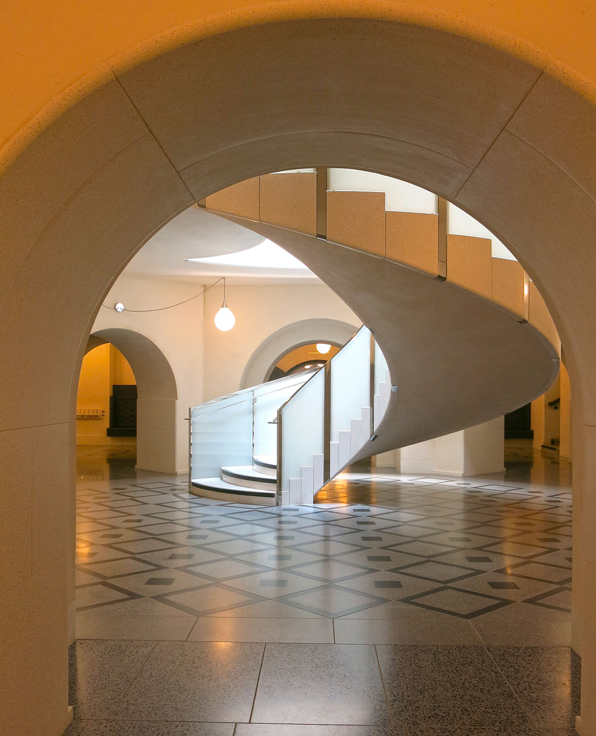
The new staircase should be called a ‘starcase’ as it is undoubtedly the star of a lovely sensitive redevelopment that enhances and respects the lovely interior details
It is not just the Friends that gain a new room, although it is not really a room, more seats along the sides of a corridor (not quite as functional as previously although roomier) but the whole circulation area that gains a feeling of space and grace. Maybe it was because I was early on a weekday morning and there weren’t many people around but the ground floor around the side entrance seemed a calm oasis, with corridors to the library and the restaurant looking the part as the areas serving the premier gallery of 20th Century art in Europe.
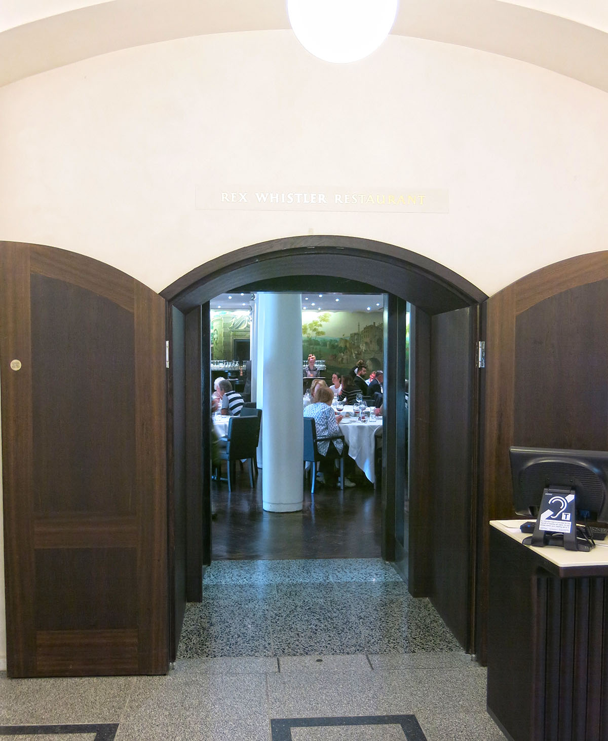
The basement off which go the restored Whistler restaurant (great for afternoon tea my OH tells me, especially with champers) and the caff, which now spills onto the outside area
The central atrium gains a staircase down and two up, all handled with a remarkable understated effectiveness. All three staircases are beautiful, especially the original one up with its beautiful mahogany handrail, whilst the central stair down to the new Clore Centre both removes school kids from the lobby and gives them a dedicated space. Additional spaces include a Grand Saloon – an event space overlooking the Thames, again with original Victorian details in the ceiling restored.
I have been a Friend of the Tate for many years and in recent years the building works have made visits frustrating. New floors and an unfinished rehang of the main galleries meant a bitty experience but the rehang is now complete and the results are splendid. There are always going to be paintings, like Bomberg’s ‘In the Hold’, that as favourites will be missed when not hung, but the show now is intelligently put together, logical and includes showing at least some of the major English works of the 20th Century.
New roof floors and walls, new ventilation and environmental systems have both improved the visitor experience whilst apparently reducing energy consumption. For once lighting on the artwork is superb to the point where it is, as it should be, not worthy of comment. Daylight is brought back into play too so light is more variable although on the day I was there it was dull and overcast so natural light variation was limited.
The architect, Rod Heyes from Caruso St. John (all praise) says “the galleries are a noble kind of background” and a background they remain but a glorious graceful and elegant foil to the art.


