I started to look at definitions of ‘Blue’ in writing the previous blog on the colour. My 1954 dictionary (a thick tome I grew up using after dad bought the dictionary and the 8 volume ‘Book of Knowledge’ from a door-to-door salesman) states
“Ancient colour words are very variable in meaning when distributed among the different tribes of Aryan speakers. Nothing as a rule is more difficult than to ascertain the precise shade of colour intended even in modern descriptions unless there be some comparison with a natural object whose colour is more or less fixed, but even that may vary in different lights”
In Old English (should that be ‘olde’ I wonder) the word blǣ occurs in the compound blǣ-hǣwen.
Another dictionary, a dictionary of colour (not illustrated of course) defines blue as ‘the colour of the sky or of the sea…’ hmmff, not exactly definitive, is it? It does go on to say it describes ‘any colours’ (note the plural) ‘having wavelengths between approximately 480 and 445 nanometres’ which in turn has little meaning for me as an artist, other than there are many blues.
Back in the 1980’s U.S. company Quantell introduced the first colour paintbox for the computer. I was a college lecturer, invited to the BBC to see one of the first few imported, and given a chance to play with it colouring the graphics for ‘Top or the Pops’. There were several tall towers containing the memory, one for each colour set – I think some 8? altogether, closeted in their own air-conditioned room. Now the whole lot comes free contained within your operating system. But defining colour is no simple task even for modern technology.
I was told that the research into perceivable colour took place where there was the highest concentration of young fit people at the time, the University of California campus with some 80,000 students, all conveniently close to ‘Silicon Valley’. These tests apparently revealed that there are over 2 million separately perceivable and identifiable reds alone. Joseph Albers observed in 1963:
“ if one says Red and there are 50 people listening…then there will be 50 reds in their minds. And one can be sure that all these reds will be very different”
Still it’s all simple now we all use screens, isn’t it? Well, er, no… There are many sets of colours used for design on the web, many different syntaxes and methodologies including:
- VGA 16 colours (aqua, black, blue, fuchsia, green, grey, lime, maroon, navy-olive, purple, red, silver, teal, white and yellow)
- X11 Color Set with140 colours
- Colour-Safe palette with 216 colours
- RGB with 4,096 colours
- The RRGGBB syntax using over16 million colours which for practical purposes I would describe as a ‘infinite number’
So how many colours can your screen handle, and how many does your eyesight manage? Maybe then the ancient definition of blue as the colour of the sea and the colour of the sky is as good a way as saying there are infinite variations that may all be called blue.
In addition to the variations in the basic blue there are of course the visual ‘interferences’ of phenomena such as simultaneous contrast. What counts though is not the so-called ‘knowledge’, but vision – seeing. Just as a knowledge of acoustics or musical notes does not make you a composer so no colour system will develop your sensitivity to colour or ability to produce art, but an understanding and visual sensitivity to colour will enrich your understanding and experience of art. You also need to have good eyes…
The Ishihara test is a colour perception test for testing your colour deficiencies, and it is the first test in a successful colour vision detection class called pseudo-isochromatic plates. It was named on its designer, Shinobu Ishihara, a professor at the University of Tokyo, who first published his colour blindness tests in 1917. My old college, Bath Academy, tested us all on entry despite most of us having done foundation courses, post A level, and found students entering the degree programmes with some form of colour perception deficiency. You can test yourself via your screen, see how you do.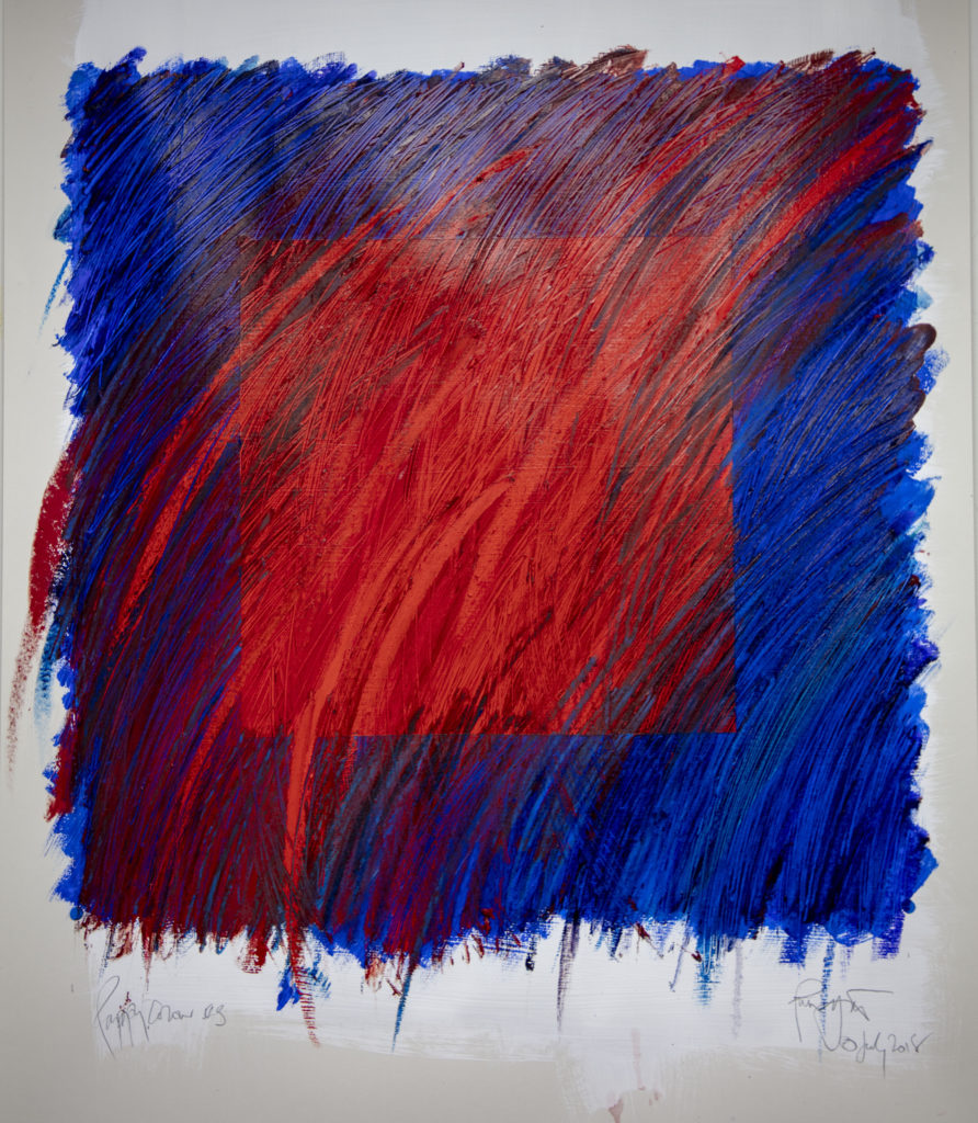

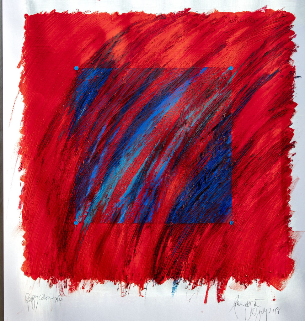


Blue is ‘blá(r)’ in Norse and there is general consensus on it as far as there can ever be consensus about a word for a colour. On the other hand there is less agreement about reds and yellows. An egg yolk (yellow) is an egg-red (‘eggjarauða’) in Norse. Pink ‘bleik(ur)’ also means pale or sickly as well as the colour of ripe corn. But show people two similar colours, and everyone (providing they have normal vision) will agree with great accuracy whether one colour is bluer or redder than the other. As long as you provide a starting point, we all see the same thing. So was Albers right? Only halfway there, I think.