Part Three – Colour and Albers
In addition to Schlemmer’s rules on the body through his life drawing classes ( and Griselda Pollock presents a coruscating analysis of this in feminist art history), there are other guidelines that create constraints to kick against, including the proportions game laid down originally by Greek writer Vitruvius and further contained in Leonardo da Vinci’s ‘Vitruvian man’ diagram (or a Vitruvian woman too?), the famous figure inside a square and circle. I devised my own variation used in teaching my life classes, and I show it here for your “delectation and delight” – try it on yourself, you only need a piece of string! Understanding of human proportions is such an important element of design, ergonomics, interior architecture, fashion, etc., and this rams it home in an amusing personal way.
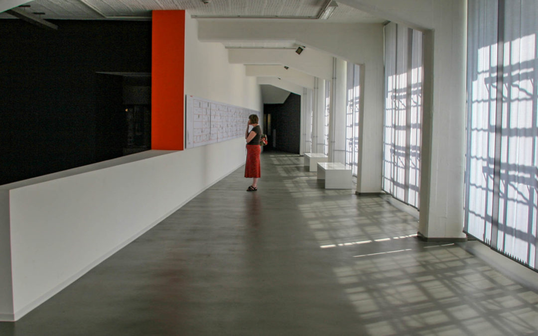
The first life class for students is always a mix of amusement and embarrassment, although maybe less so today than in the 1960’s? Young people seeing a nude for the first time become frozen on their donkeys or easels, too afraid to venture away to pick up a dropped rubber (stop sniggering you Americans, that is English for an eraser, not a condom) or pencil, not knowing where to look. Once the initial shock is over the task of creating accuracy of recording and sharpness of eye/seeing become a part of the bedrock of every artist and designer’s vocabulary and can be inculcated, it seems to me, only within drawing challenges or the life room. The life class was central to the preliminary course both in the Bauhaus and in my early art college days, and in my degree programme it continued.
“I think it is too late to do it (drawing) at the beginning of an art school course. It should be done as you do mathematics or English or geography in general education; as a lesson”
Peter Blake, Artist
Schlemmer himself was a ground-breaking costume designer so knew how important the understanding of human form was in his work. Similarly, much of architecture, certainly until Georgian times, was based on an understanding of human proportion, rules that unfortunately are much ignored in today’s technologically enabled architectural imaginations. Even art college in the 70’s in the UK removed life drawing as an element of teaching programmes leading to post graduate institutions introducing ‘remedial’ drawing programmes. In my teaching at Morley College I picked up many graduates from London art colleges attending my life class because they felt they had a lack of drawing skills, never having had an intellectually rigorous taught programme.
“in the teachings of Itten, Kandinsky and Klee drawing is freed from its reliance on describing the object or body and becomes part of a series of programmatic exercises posited on a natural equilibrium between the body, the eye and the brain, which embraces all of art and design.”
Deanna Petherbridge, Professor of Drawing at the RCA
In 1923 the Bauhaus, like many a college in the 1960’s (see the Hornsey affair for example), aroused concern amongst local politicians in Weimar. Germany had been in turmoil and had seen violence and insurrection on the streets so any area of challenge to authority was to be abhorred. The college was forced to leave Weimar. Gropius reached agreement with the administration in Dessau and designed the now-famous college and meisterhaus buildings, as well as the Kleinring housing district for the town. The opportunity was taken to redesign the workshops and to extend and introduce more weaving, for example. Pressure became evident for the workshops to work more closely with German industry to produce income – the period saw rampant inflation and the Wall Street Crash impact on Germany was as bad if not worse than elsewhere in Europe.
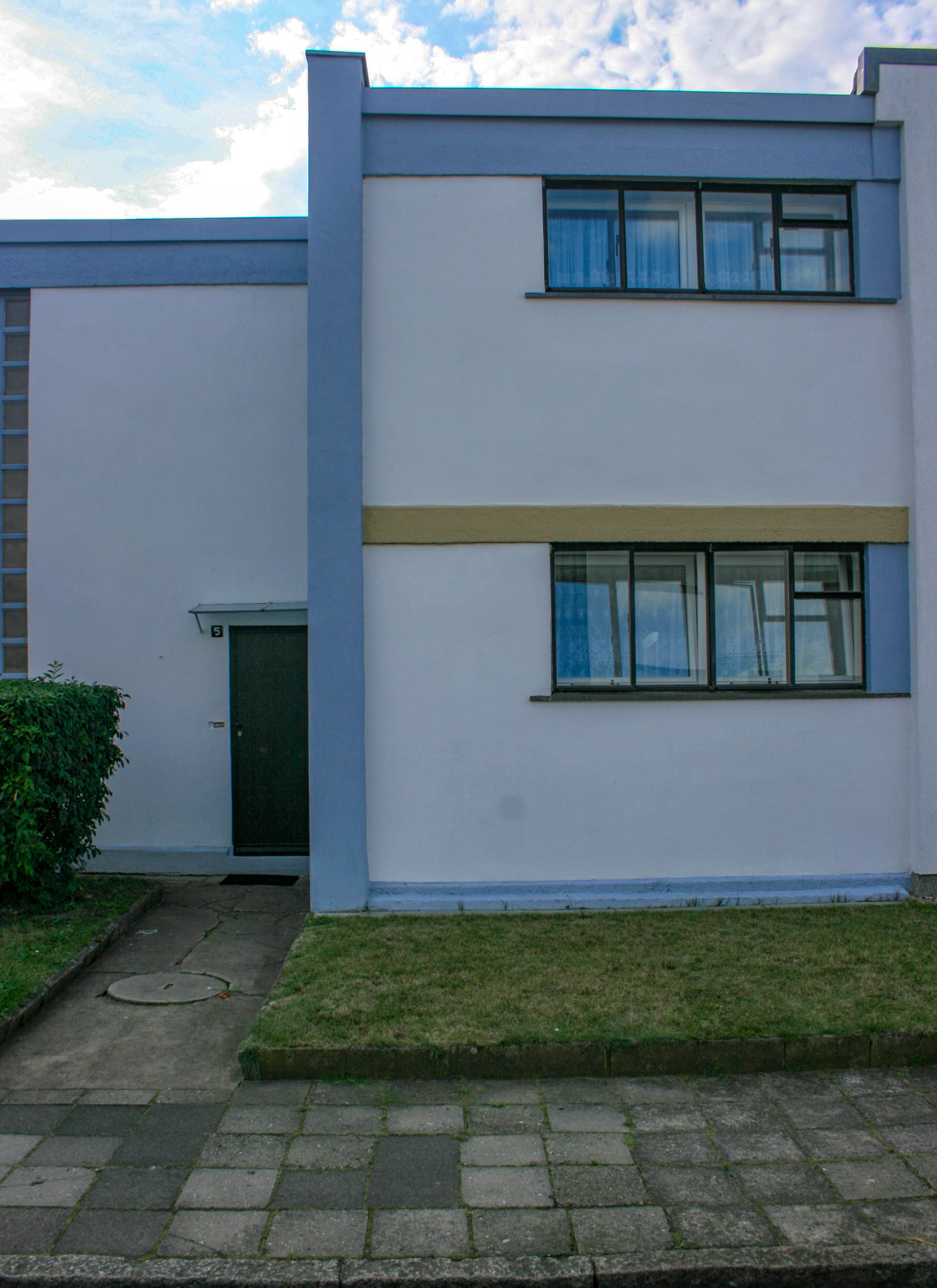
Kleinring house, Gropius designed, on the estate in Dessau. Available to rent as a b&b
One of the longest serving and influential members of the Bauhaus teaching team was Josef Albers. He started in the college as a student on the preliminary course and in 1922 graduated to become part of the staff, being appointed alongside Moholy-Nagy to run the Vorkurs or preliminary course, obligatory for all newly enrolled Bauhaus students. Eventually married to weaver and Bauhaus teacher Annie Albers he complimented Schlemmer’s life drawing discipline with his similarly intellectual approach to colour (Moholy-Nagy oversaw the Metals workshop although a pioneer of photography). It is interesting to compare his colour works with Annie Albers woven work and drawings to see how closely they collaborated. His abstract colour painting investigations show a strong affinity with her weaves, still to be seen in the restaurant designed by Gropius in Dessau today.
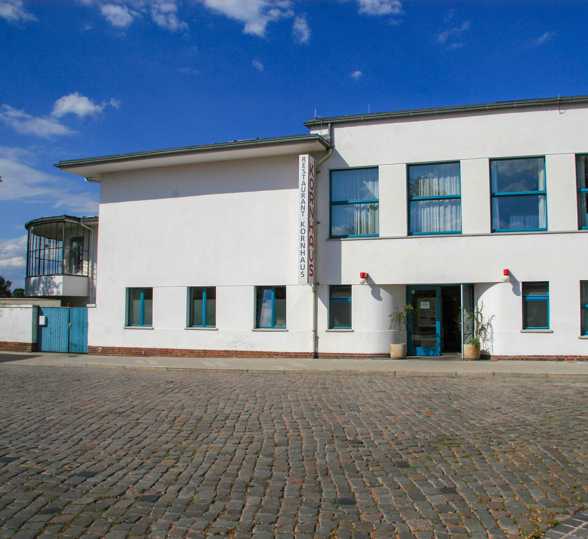
The Kornhaus restaurant with fabrics in the interior by Anni Albers, photographed in 2009
In the second half of my foundation and through the subsequent degree programme my own obsession with colour began. I attended a college set in a sylvan environment of an Inigo Jones house in Capability Brown designed landscape, chosen because as my preliminary course ran in a college with no higher programmes, I had to move on elsewhere. Much like the Bauhaus my ‘new’ college environment outside big city life focussed minds on art, working in studios that were open 7 days a week from dawn to dusk and often beyond.
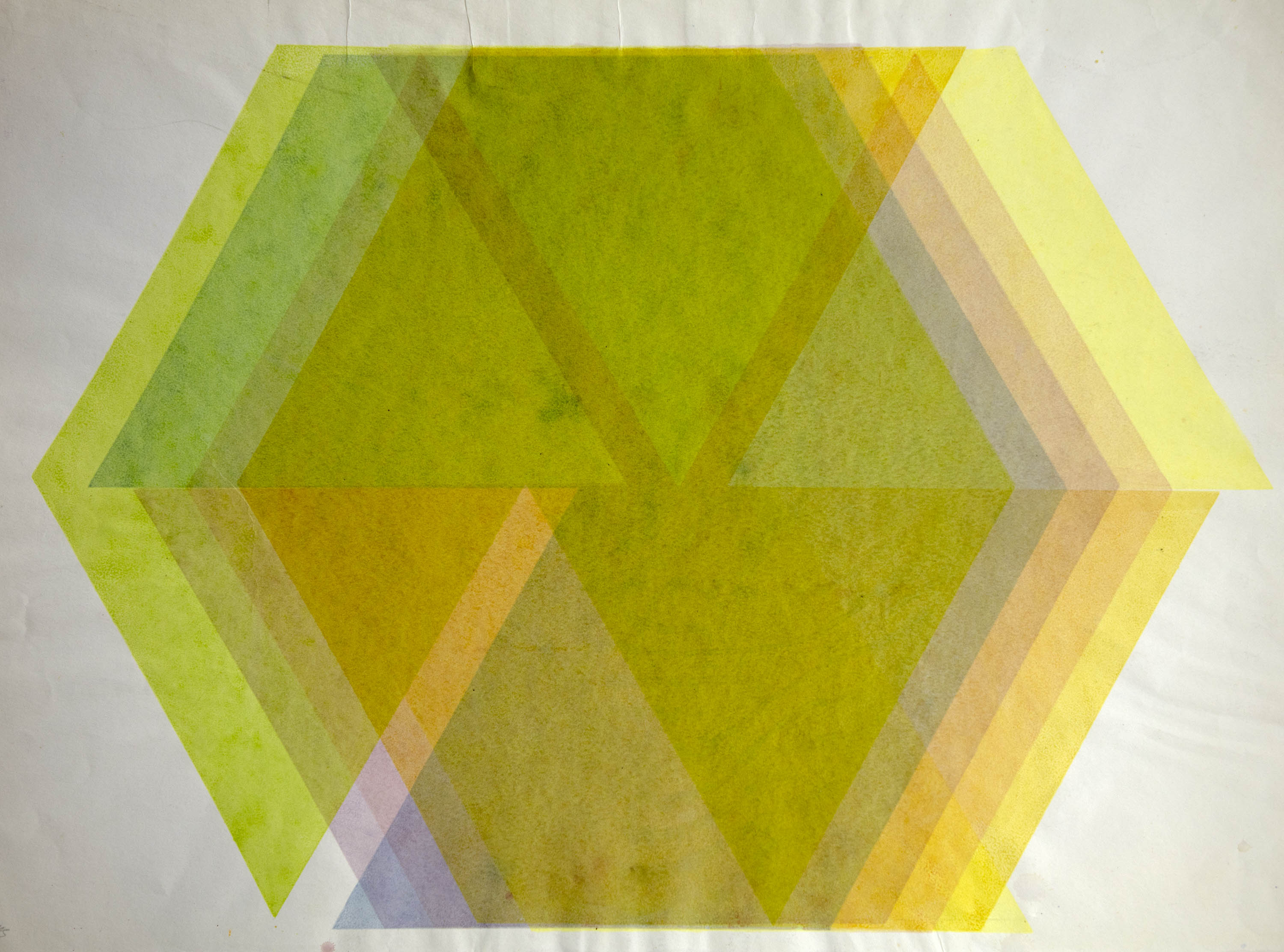
Screenprint from 1967. Made with Stephen Russ, using Japanese seaweed dyes and a hand-built hexagonal silkscreen
Looking back, I am surprised by some of the research I did without knowing of Albers work – I was more influenced by Riley and Vasarely. My guide was initially a painter on foundation called Frank Ryder and then with Michael Kidner and Adrian Heath. Michael in tandem with Malcolm Hughes, introduced us to conundrums in light modulars and atonal colour, spurring me into creative exploration in this area, which I wrote more about in a blog about here. Albers was attempting to work through an intellectual programme of understanding colour, and our tutors in turn were generating an intellectual appreciation of how colour might be used in our painting.
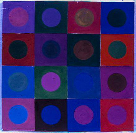
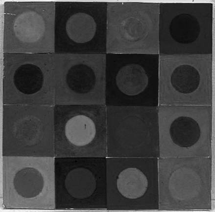
‘light modular’ not, but a colour panel looking for atonal pairs – the parallel b&w image shows which ones worked
 Albers said
“When you really understand that each colour is changed by a changed environment” then ”you eventually find that you have learned about life as well as colour” “Let us be younger with our students…the pupil and his growing into his world are more important than his teacher and his background””
Colour was not a separate area on the Bauhaus curriculum from 1925 on, but Albers used his own students to aid his explorations, having them help to produce his books on colour called ‘Interaction of Colour’ in later years.
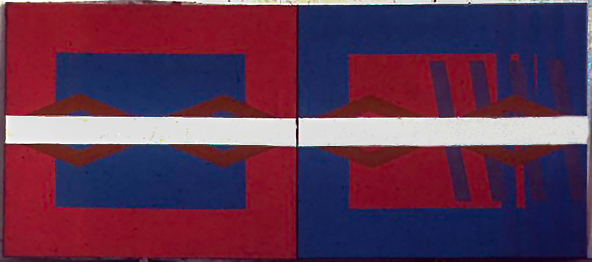
2nd year painting from 1968. Diptych, acrylic on canvas
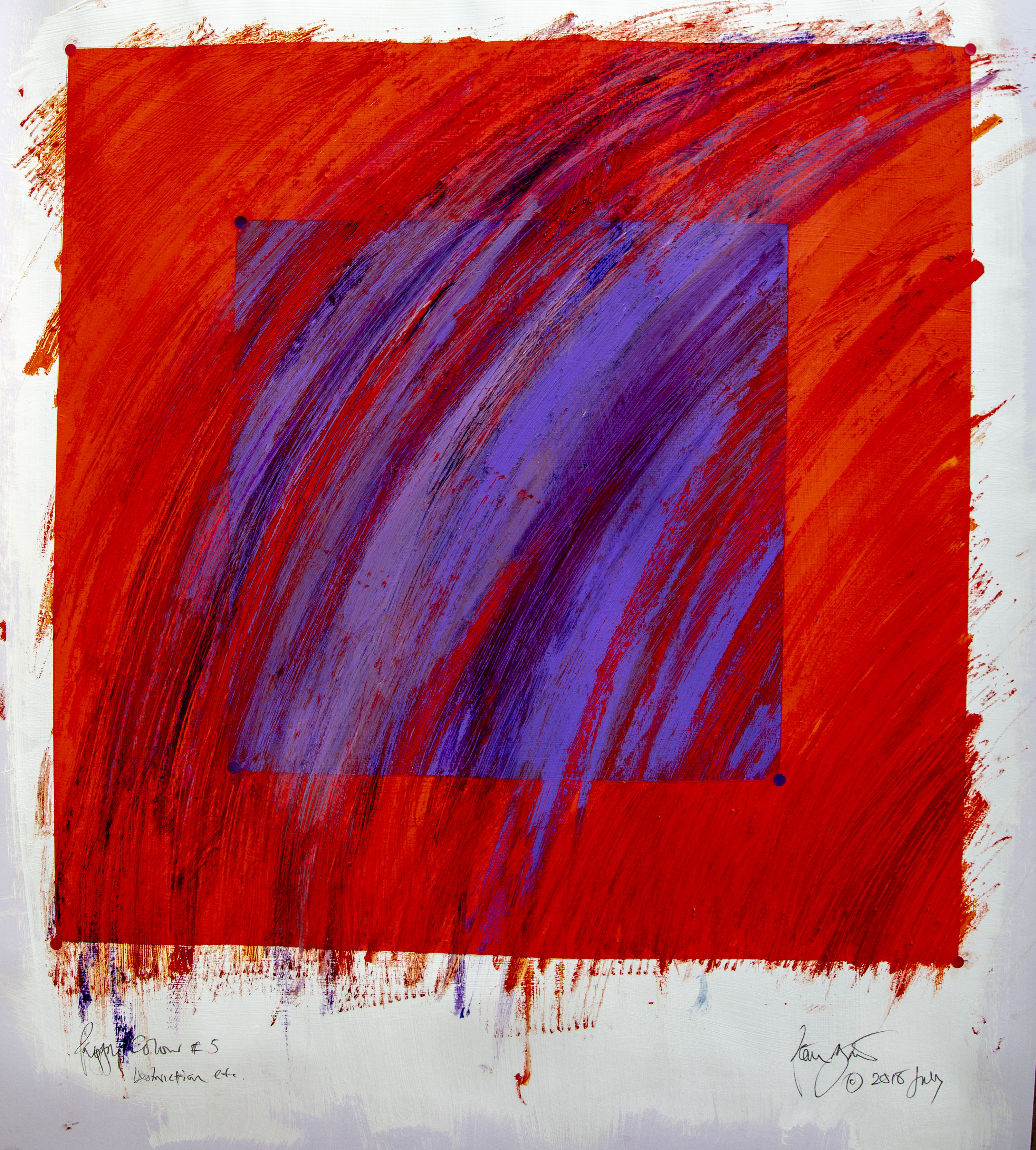
Strangely my own investigations arising from using moveable trellis pieces to create a 3D colour experience led to a series of drawings and some paintings looking at colour relationships which are not far away from the early Albers – and no, I hadn’t seen his then. Mine worked through from trellis to using drinking straws before progressing to canvases. I continue to explore the square too, looking at how colour and texture can beautify and destroy this most stable of structures. This is quite different from Albers concerns, but unlike much of art college teaching now, follows a more intellectual path rather like his. Where we differ is that I believe in the autographic mark and the expressive quality of colour whereas Albers sought to deny the artist’s touch.
Albers used paints straight from the tube showing how colour against colour changed perception of each in juxtaposition. Seeing change in a stable situation suggested that change in life could be seen too when it seemed unchanging. As one critic remarks, when these painting appeared in the 1950’s it marked the end of the Bauhaus revolution. Revolution became evolution. However, the impact on late 20th century art college teaching sprang not just from his work at the Bauhaus but also his work in the US at the famous Black Mountain College after the Bauhaus was hounded out of Germany in 1933 – but more of that in the forthcoming chapters.
Trabant – East German design from Jena circa 1990
Recent Comments