It started, as most paintings do, with a walk. A regular cut down a ginnel (‘ginnel’ is Lancastrian, it’s known as a ‘twittern’ in Sussex speak, I’m told) on my walk into Seaford centre took me under a beautifully coloured buddleia. I took several photographs trying to capture the halo of complementary colour created by its intense magenta against the green of its leaves but found it difficult to catch it in the camera. I took the images into my mind and turned them over and over before sticking them in Photoshop and starting to play with them.
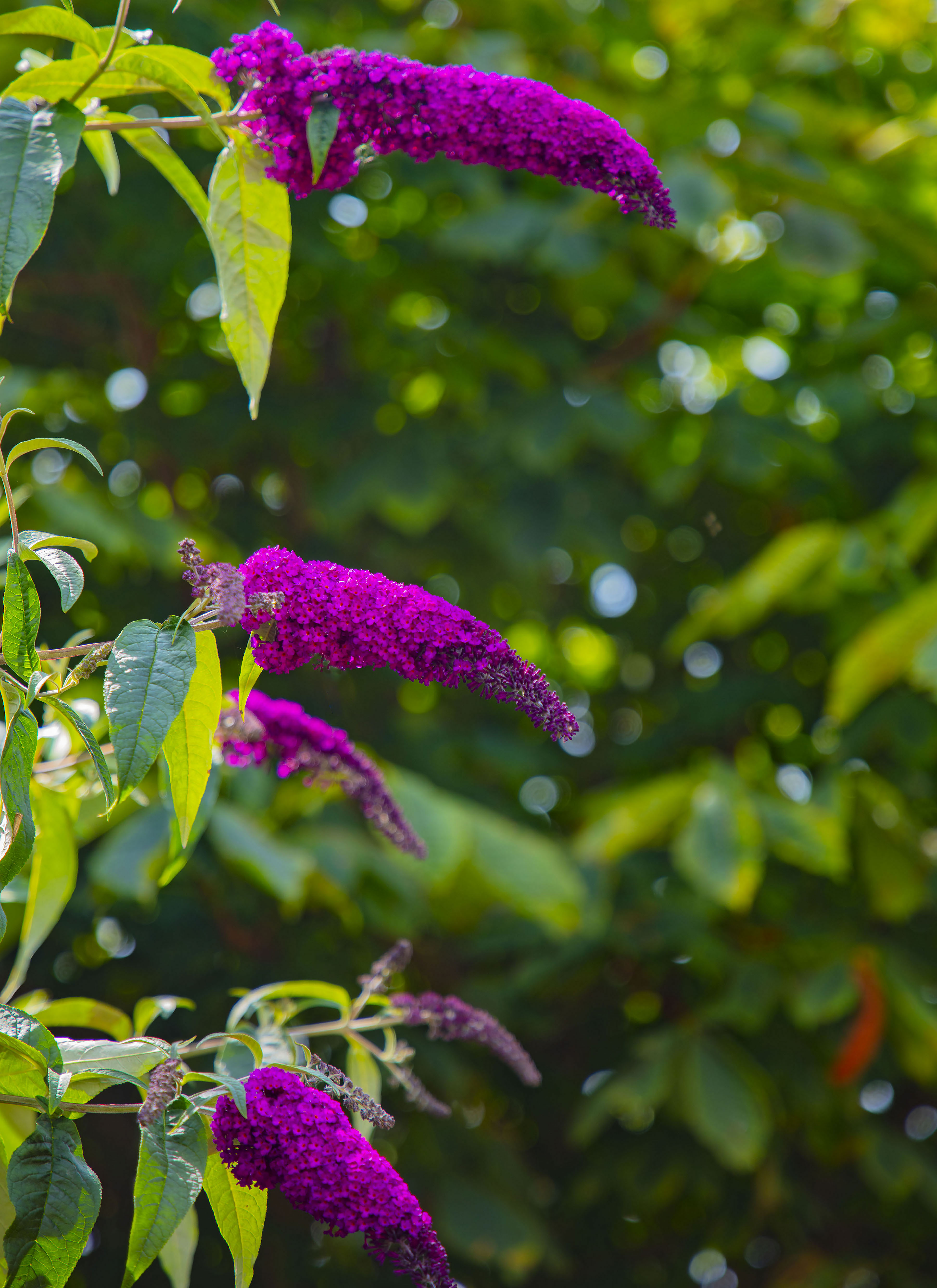
Original photograph
I tired various ways of replicating the colour effect that I had seen without any real success, The problem is that if one isn’t careful the end effect of photoshopping an image is that you move away from the reality of the image and I didn’t want that, simply trying to get the digital image reflective of what my eye was picking up on. As part of this processing I enlarged the image several times, noting more and more reds within the flower – which is really an agglomeration of many small flowers, with increasing intensity of red in their centres.
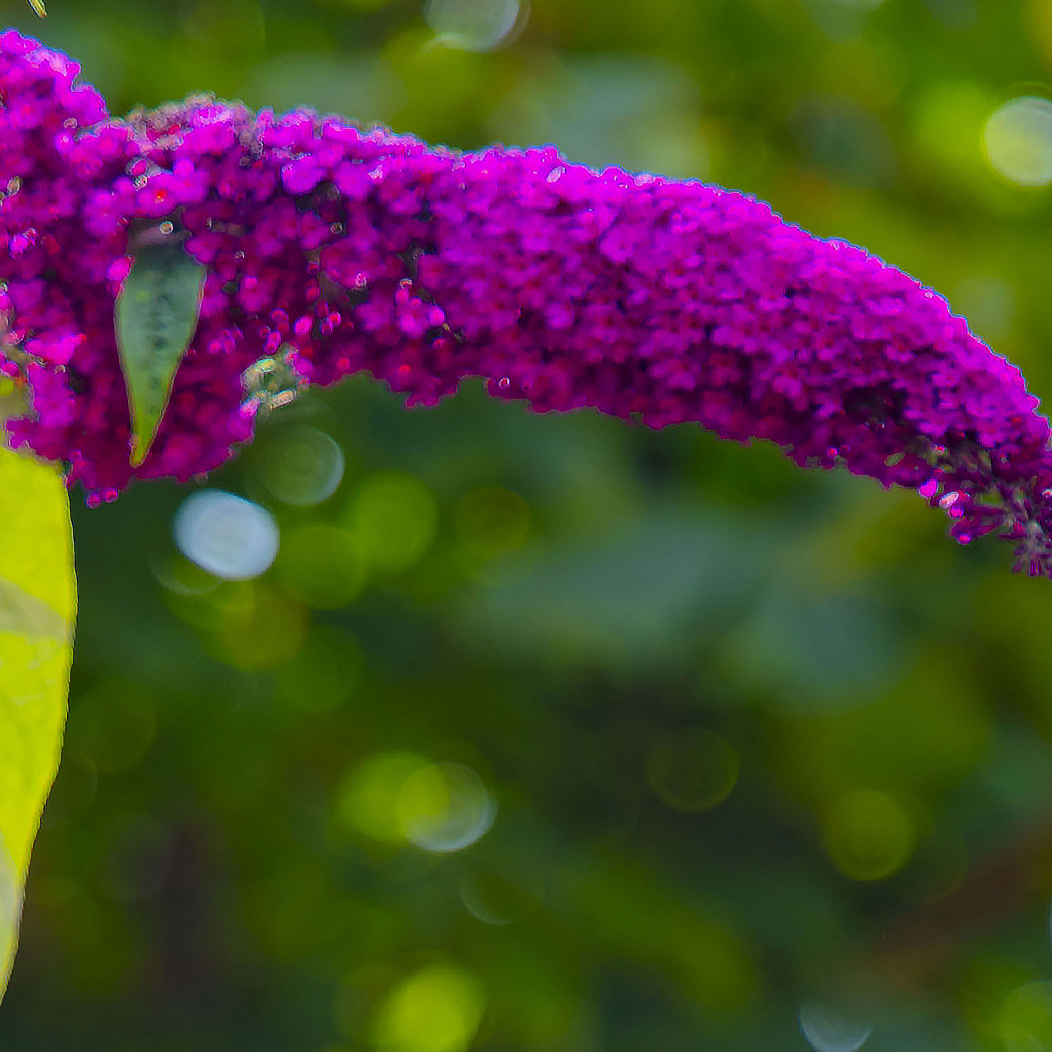
Original photograph enlarged
Printing out the three images closest to what my minds eye had, I took them to the studio and started drawing. I followed the path outlined in ‘Process’, and the original iteration of the drawings can be seen there. They progressed but it reached a point where the drawing started to be a prevarication rather than a help, so I moved on to the canvas. Primed the canvas and decided the square size, partly because of what was happening on paper. Considered a rectangular canvas but went with a square, partly ‘cos it was there but also because I like the idea of the colour splitting the canvas in to two parts and getting a balance between them., and the square is a nice stable shape. The drawings did help to sort out the colour palette as did the large photoprints.
I also tried to take the photoprints forward themselves through a collage process, but the end results were too predictable and ultimately lacked any ‘verve’, so the drawings were the main way forward at the early stages of exploration.
Drawing – oil pastel over acrylic on gesso primed 300grem cartridge paper with graphic additions
The decision to make the colour split and cascade between two halves decided the scale of the image in relation to the square. The flower image had to reach across the full width of the canvas for it to work, the size of the square had to be larger to allow for the movement of the brushstroke, previous images being to ‘tight’. The size of the square also decided the size of the canvas (although which came first – chicken or egg?)
Initially I thought to allow the squares to break down physically allowing the edges to disappear and disintegrate. As I worked the canvas I realised it was more effective to allow the colour and mark to do this instead of simply losing the edges. I ‘m sure this is a lesson I’ve learned before somehow…. The grid allows me to move the colour separately from the image – originally mimicking the knights move in chess, but now simply there to hold the image together, to give structure to my game.
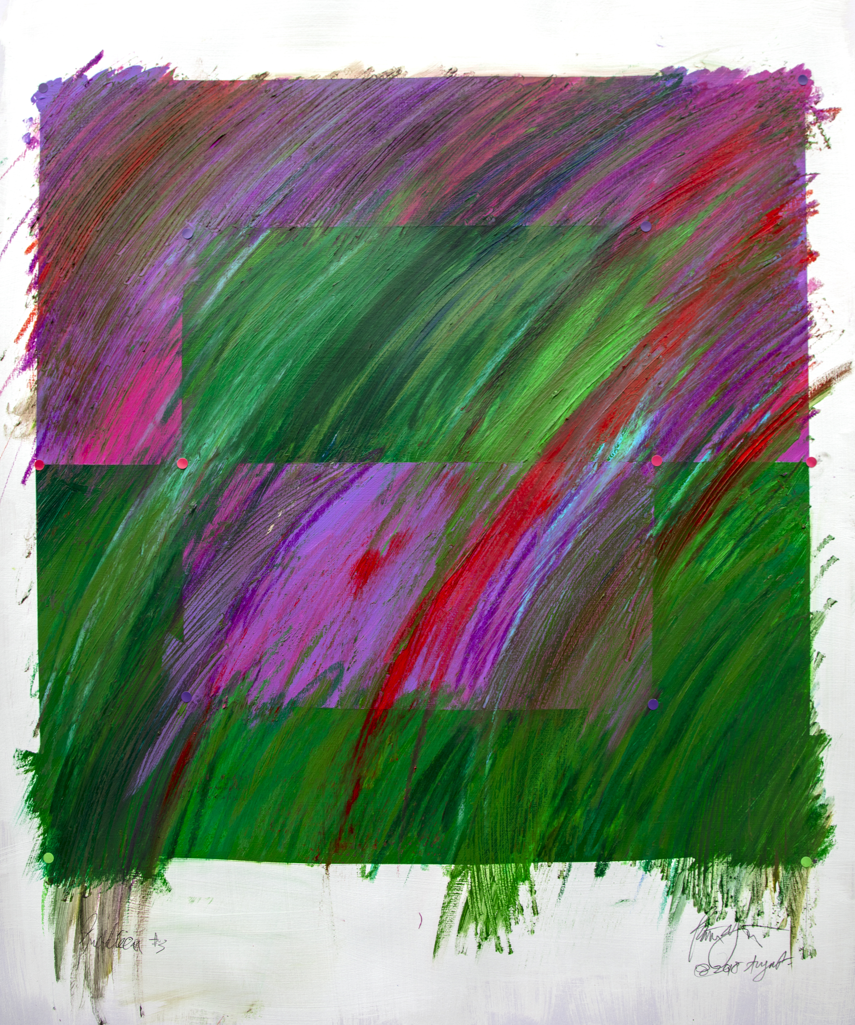
Oil pastel over acrylic on gesso primed 300 gram cartridge paper with graphic additions
The paint colour moves the spaces as does the way the mark breaks against edges. The drawing sets up a space the colour contradicts, resulting a faceted surface, jewel like, in which recognition of image conflicts with spatial colour that is separate from it. Its all a game to challenge the eye and preconception as to how image space works.
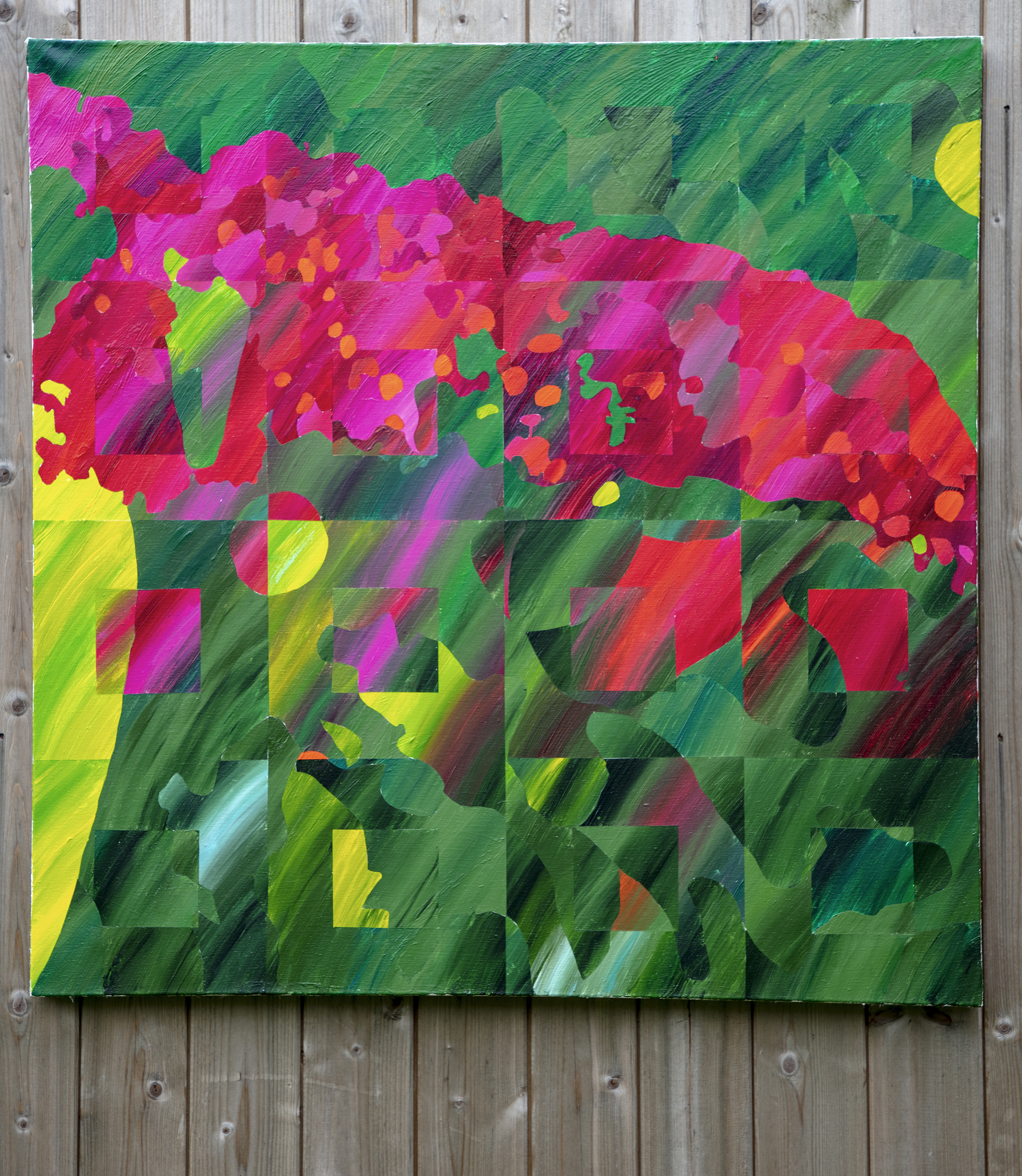
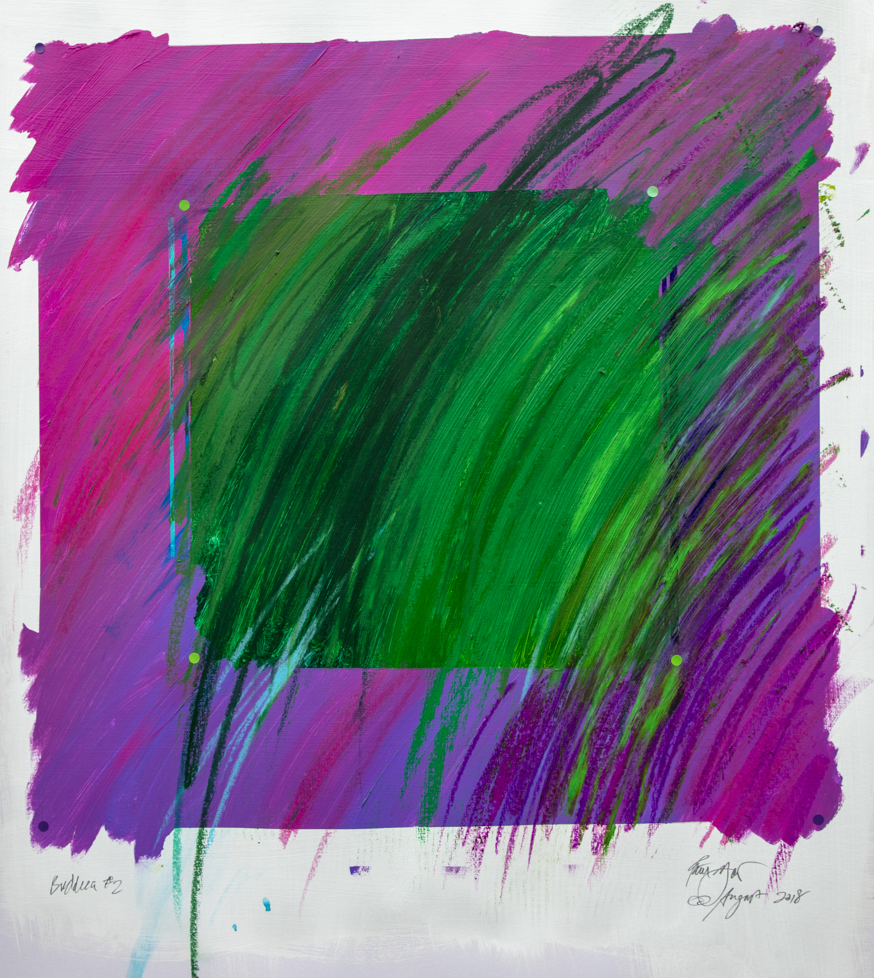
Buddleia – the finished painting. Acrylic on canvas primed with 3 coats of gesso primer. 3 feet square
As the painting developed to I became more convinced by the colour relationships. The painting began to sing to me. Looking back the palette has perhaps moved more into the complementary red/green rather than the deeper magenta of the original image, but the colour contrast works in recreating the after effects in the eye that I first saw on my walk.
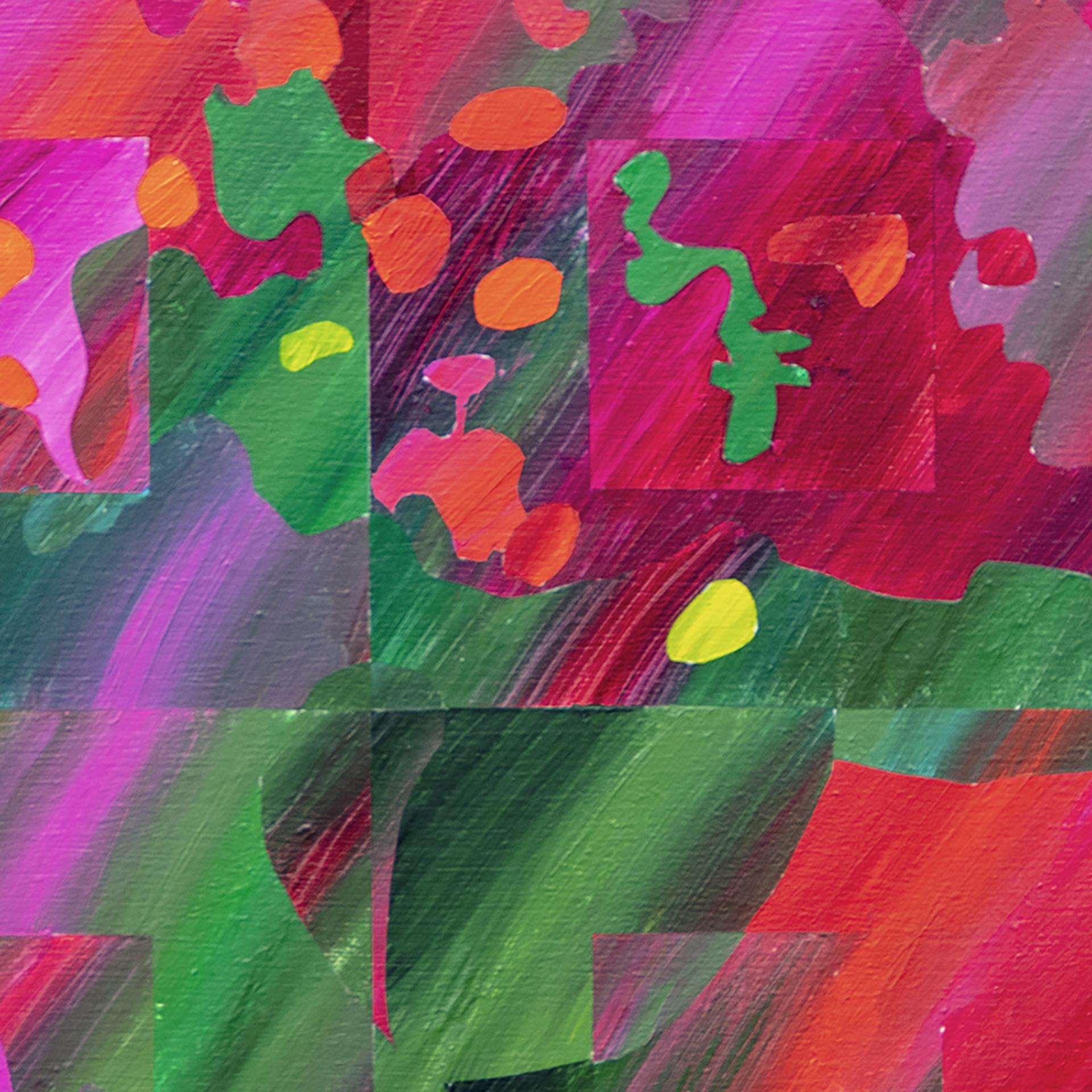
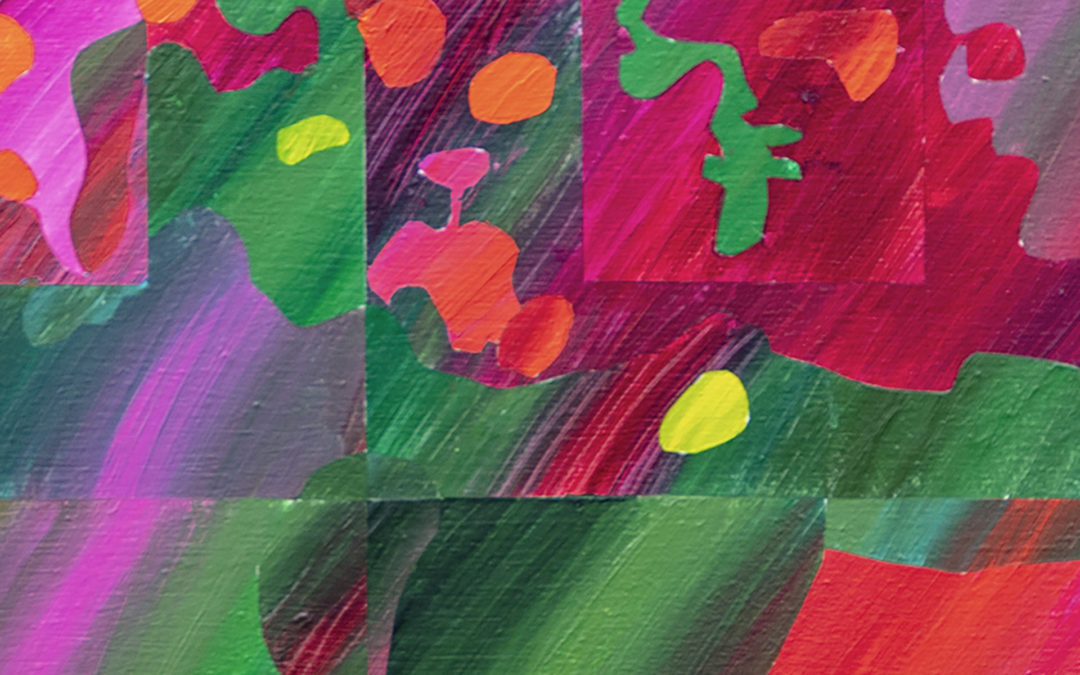
Detail
It’s interesting how the last three paintings have developed ( the Teasel, the Poppy#3 and now this Buddleia) and brought such different results, all starting from a desire to express something seen in each plant.
follow me through my studio page
and don’t forget to see to buy go to the gallery but contact me for sales using the email link
Recent Comments