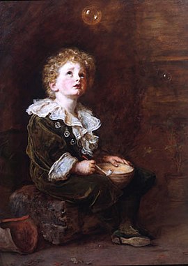
In a previous piece I wrote about Trechikoff’s ‘Green lady’ the unlikely winner of the ‘Most Reproduced Picture of the 21st Century’. Considered by most critics as a piece of kitsch it doesn’t usually feature in lectures on 20th century art, or in learned critical programmes on television. A collector paid a million dollars for it recently. Kitsch defined: noun – art, objects, or design considered to be in poor taste because of excessive garishness or sentimentality but sometimes appreciated in an ironic or knowing way. Showy art or cheap, decorative objects that are attractive to people who are thought to lack any appreciation of style or beauty. So is it peoples lack of knowledge that is the problem – i.e. uneducated people, the great unwashed, common people as opposed to ‘educated’ critics. Is the definition of kitsch just a piece of superiority, sneering by ‘educated experts’, perhaps the same experts who are unable to tell a man from a woman?
I prefer to judge a piece of art by more analytic standards drummed into me over my career both in college and since through my extensive research, reading and creating. Much of my definitions were formed by having to break down creativity into component parts that could be objectively assessed in criteria used to judge student work objectively – examples could be skill in media handling, picture construction, the mark and a host of other criteria that can be used to define ‘good, better, best’ to use the simplistic categorisation of the Antiques Roadshow
In the mid 1960’s ‘Pop Art’ appeared to use kitsch to challenge perceptions as to what made good art. Of course Duchamp’s Urinal started kicking the bucket over according to some – or was it the ‘pleine aire’ painting of the Impressionists that first outraged critic’s standards? In the mid 1960’s the outrage was the arrival of ‘pop’, Warhol’s use of factory production methods that threatened the uniqueness of art objects together with the generation of imagery from comic books used by the likes of Lichtenstein.

‘Fountain’ by Marcel Duchamp 1917
In my view it was the proliferation of print methods and the changes in broadcast technology that broke down the walls of elite art criticism and made everybody a critic. The arrival of multiple copies often impossible to differentiate from originals confused collectors and taste arbiters at the same time as opportunity for artists intervened. Techniques like photography, where every print could be identical to the first if the photographer willed it, or lithography and silkscreen which produced many prints identical, rendering limited editions a matter for commercial or taxation definition, changed collecting. Commercial techniques were used by artists like Lautrec or the inventive Englishman Spencer Pryse, who as a war artist for the Belgian government followed Belgian forces of the First World War in a car laden with litho stones onto which he drew from life, that introduced many to an affordable alternative to collecting original ‘one off’ paintings. Spencer Pryse produced famous imagery for the 1910’s Labour party pamphlets.
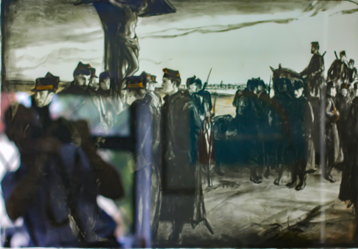
Spencer Pryse lithograph (apologies for the poor photograph) Towner Gallery Collection
Lichtenstein’s work drew on popular imagery from advertising and cartoons involving a degree of appropriation. The artist himself acknowledged that the act is really one of transformation: ‘I am nominally copying, but I am really restating the copied thing in other terms. In doing that, the original acquires a totally different texture.’ (Quoted in Lawrence Alloway, Roy Lichtenstein). By taking the comic strip and using it as he does, he conflates the powerful but so-called ‘low brow’ mass-produced commercial image with the traditionally venerated medium of large-scale easel painting. He is playing a game with the critics by using kitsch (the art in comics) as his starting point, challenging the traditional definitions of what constitutes a suitable subject for a painting.
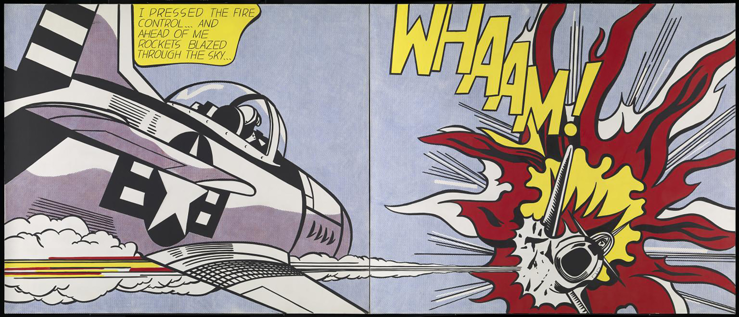
Whaam! 1963 Roy Lichtenstein 1923-1997 Purchased 1966 http://www.tate.org.uk/art/work/T00897
The Tate purchased ‘Whaam’ in 1967 but I remember the first imagery appearing in the mid-sixties as I started at art college causing much amusement as well as enjoyment. Tilson too in the British ‘Pop’ movement (Peter Blake etc.) used imagery from children’s comics, not this time the comic image itself but the free transfer that I remember as a child soaking in warm water and sliding off to adorn the back of my hand like a home-made tattoo, made large in his ‘New York Decals 1 &2’.
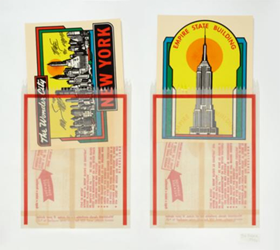
New York Decals 1 & 2. Towner gallery collection
Such imagery was quickly recycled into the commercial work from which it came, with many tongue in cheek adverts re-using art imagery. I remember laughing as a composer friend demonstrated the insularity of art disciplines when he complained of the advertising industry plagiarising classical music forms in advertisements, oblivious of the way in which art imagery was used from the 19th century on (the Constable’s ‘Haywain’ on chocolate and biscuit tins, or the painting ‘Bubbles’ by John Everett Millais used for soap advertising). His complaint was, I think, driven by the way the music was used reduced it from a sublime listening experience to apiece of kitsch. Of course, the argument works two ways, – the use of classical pieces like Rodin’s ‘The Kiss’ in advertising introduced many to great art or great music which their lives or education had not introduced them too.
Bubbles
Although much advertising was turned in to art as with Warhol’s ‘Brillo’ pieces, it was not all a one-way street. Art was also commissioned for many products and campaigns much in the way art of Renaissance was commissioned by the powerful. Ironically considering that Pop art was one of the drivers it was the pop music industry that drove many artworks into production. The world of Surrealism also fitted with the world modified by Huxley’s ‘Doors of Perception’. In 1967, Timothy Leary, American psychologist, and author, spoke at the Human Be-In, a gathering of 30,000 hippies in Golden Gate Park in San Francisco and phrased the famous words, “Turn on, tune in, drop out”. 1967 was my 2nd or 3rd (they say if you were there at that time, you can’t remember it) year at art college and I did follow the advice – except I didn’t drop out. Although I suppose my father might have said I did by being in art college.
Art educated designers drove design in the form of image juxtaposition, collage (think Blake’s Beatles cover for Sgt. Pepper) and surreal imagery in all areas in a burst of creative freedom and excitement (which in turn I believe led to the ’Establishment’, which felt threatened by it, closing the art college system down from 1980 on). Not just the arts but design too, characterised by BIBA’s use of facsimile baked beans tins in their stores interior design. I even bought and wore a red silk lined ex-Admirals cloak from Carnaby street in 1965…
In the mid 60’s the American comic became collector’s items (my collection of Silver Surfer, Thor etc.. thrown out in 1974 by my ex-wife). Surrealism aims to revolutionise human experience. It balances a rational vision of life with one that asserts the power of the unconscious and dreams. The movement’s artists find magic and strange beauty in the unexpected, the disregarded and the unconventional. Its imagery was not just that we are now familiar with in the surrealist Marvel film and TV iterations but widespread through the music underground which had its own graphic artists unacknowledged by the stolid world of high art. A current example of surrealism is the use of zoom into the scale of a chameleon in the puff for the ‘SKY Nature’ TV channel and the influence of Man Ray still seeps through much of advertising.
It is in the world of pop that the imagery strides on. Pop Art was more than just the imagery of Blake or Tilson, it was a legion of illustrators producing art for Album covers that supplemented the surreal videos used to promote individual performers and their music as traditional arts began to take second place to the flickering small screen and then in turn to the computer screen. Leaders include Alan Aldridge and Roger Dean, not forgetting the more subversive Robert Crumb. At the core of their work is the willingness to challenge imposed values and norms, and a search for freedom. In their book published in 1967 (the Penguin Book of Comics, p248) George Perry and Alan Aldridge, well in advance of the arrival of the internet, and just as colour TV and printing were making major impacts, presciently say
“The future is full of exciting possibilities for the visual arts…” “With ever-increasing exposure to visual stimuli and a heightened appreciation of them, the devaluation of pictures to low grade pulp for the masses….or an art so esoteric that only an elect few can understand it, can be reversed”.
They did not have the advantage of a foresight of the world of the mobile phone and digital camera, where drone imagery and low light camera work can completely transform the visual experience of the everyday. It is said that 30billion images are made and shared everyday… a massive exposure to the visual arts. The definition of kitsch is now part of the everyday life for everyone who points their mobile phone to record the beauty/normality of their own world, making judgements on picture construction as they do so.
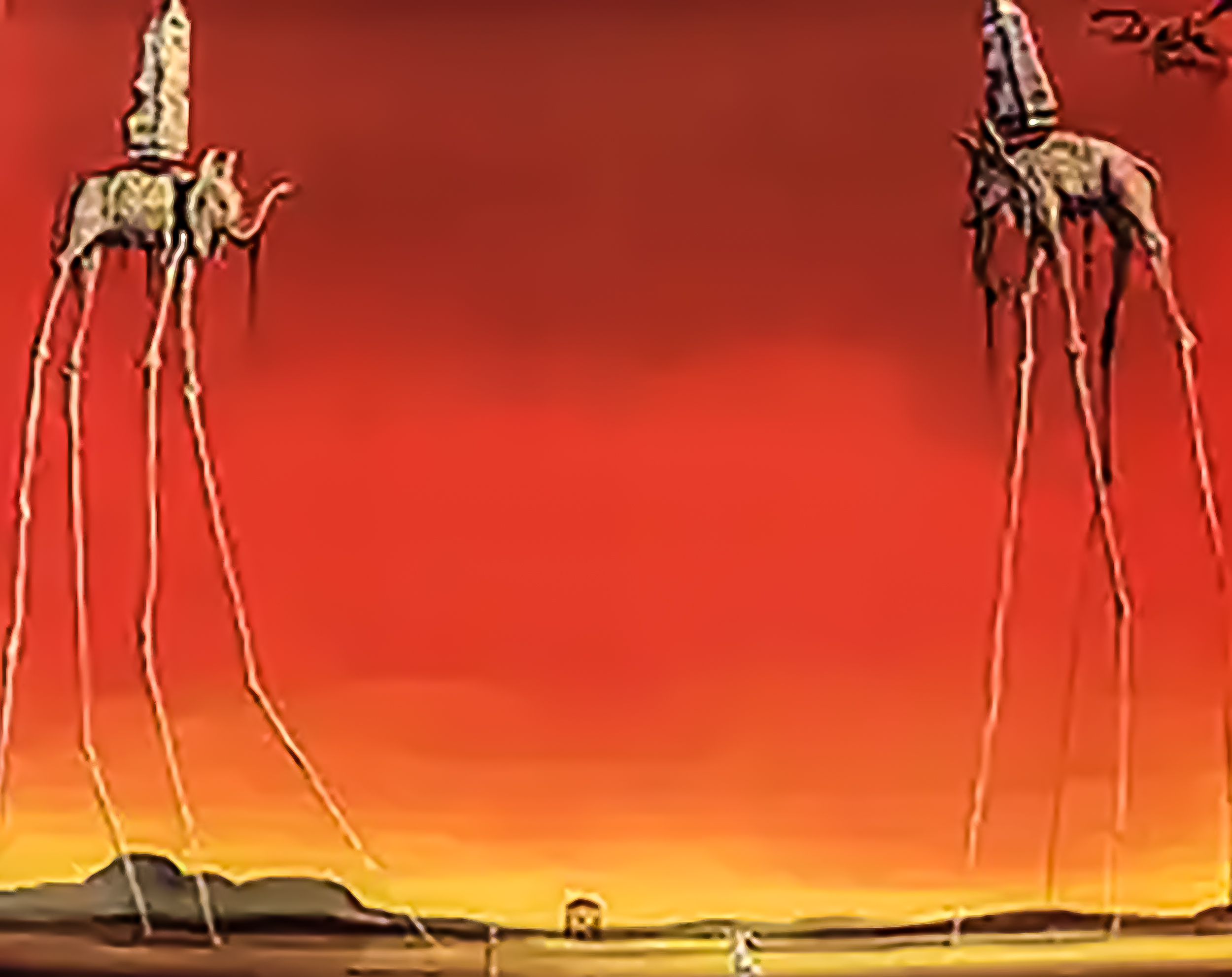
Salvador Dali – surrealist master
For the artist and designer now, there is a need for their vision to be sharper, their brain engaged in the art form in a way not perhaps realised since paintings began to get closer to reflecting reality in the Renaissance with the development of oil paint. Pop art and Surrealism have become mainstream along with many other ‘isms’ such as ‘Super realism’ and the use of film as a recoding medium for art has unleashed the likes of Christo and his wrapped structures or the time referenced art of beautiful films like the Canadian ‘Pas de Deux’ that uses photography so well.
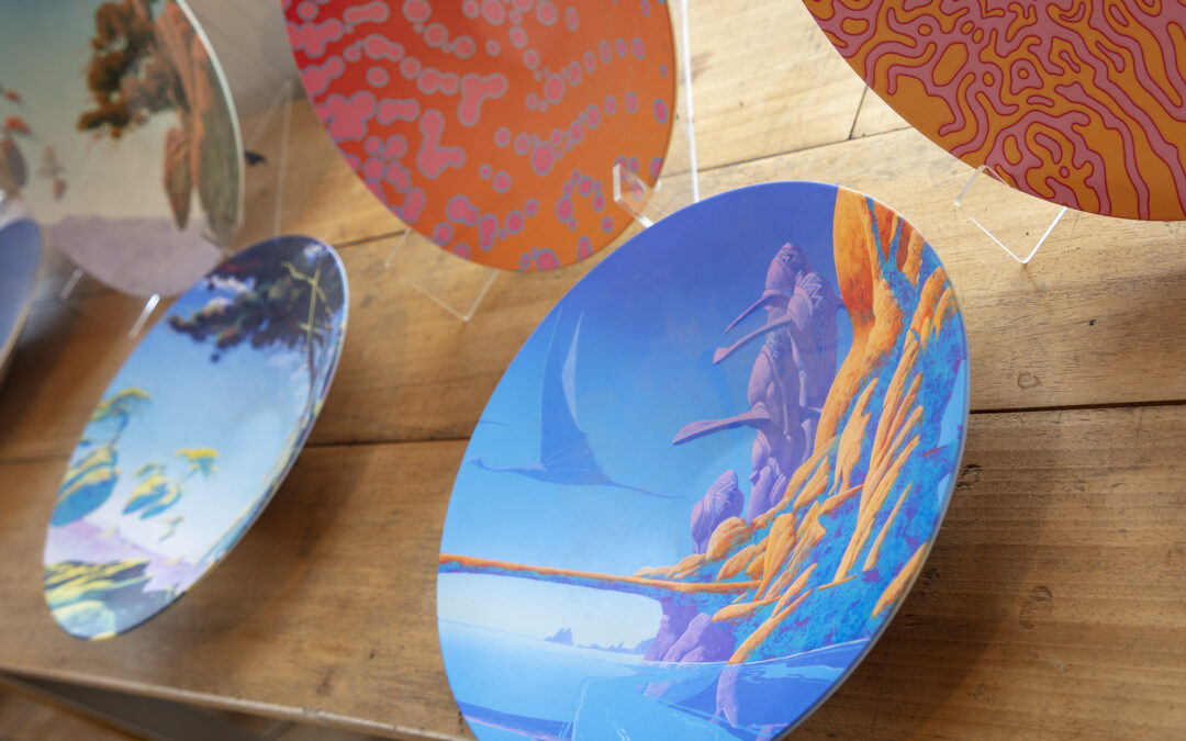
Advertising has grown into a major power in the art world and definitions of what constitutes kitsch and its difference to great art have become more debatable. The music industry that drove my 1960’s youth revolution started with from the 1950’s ‘Rock Around the Clock’ Chuck Berry era and continues to push boundaries. The impact on other media outside the music industry continues much as does the borrowing from other arts. Recently I was reminded and excited by this when after a day out with friends, lunch in a pub outside Lewes brought me up hard with the imagery of Roger Dean and the rock group ‘Yes’. It may be as a friend says
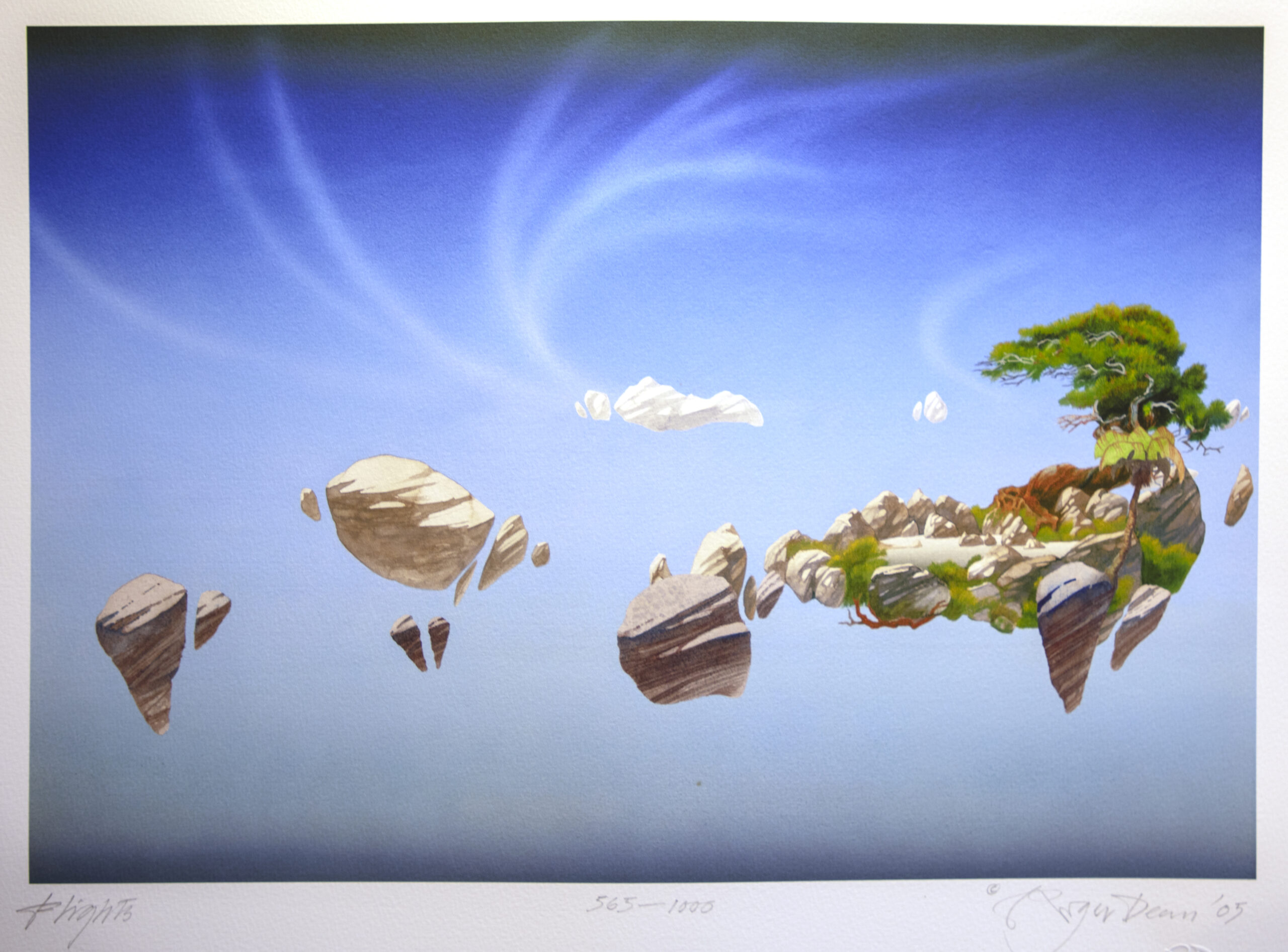
Roger Dean
“Hi, strange phenomena Roger Dean. His art came out of prog rock in the early -mid 70s where he was incredibly successful and appreciated but was there after dismissed as a has-been when the repackaging of rock music covers took a radical turn through Punk’s directness. Personally his work will always be associated with mysticism and otherworldliness, which was the antithesis of punk and graphic design of the period. That’s not to say it’s bad but I find his work difficult to view and appreciate objectively. Maybe now is time for reassessment.”
Pop music buff Prof. Tim Riley of NE London University
Taking Deans work away from the creations of the pop world reveals a consummate master of modern print techniques, mixing silkscreen and giclée as well as a mature surrealist painter with a huge body of work. Like Trechikoff, Dean has sales at the million+ level but unlike Trechikoff he is represented in major galleries as well as revered by fans within the pop industry. Another to contrast with the Turner Prize?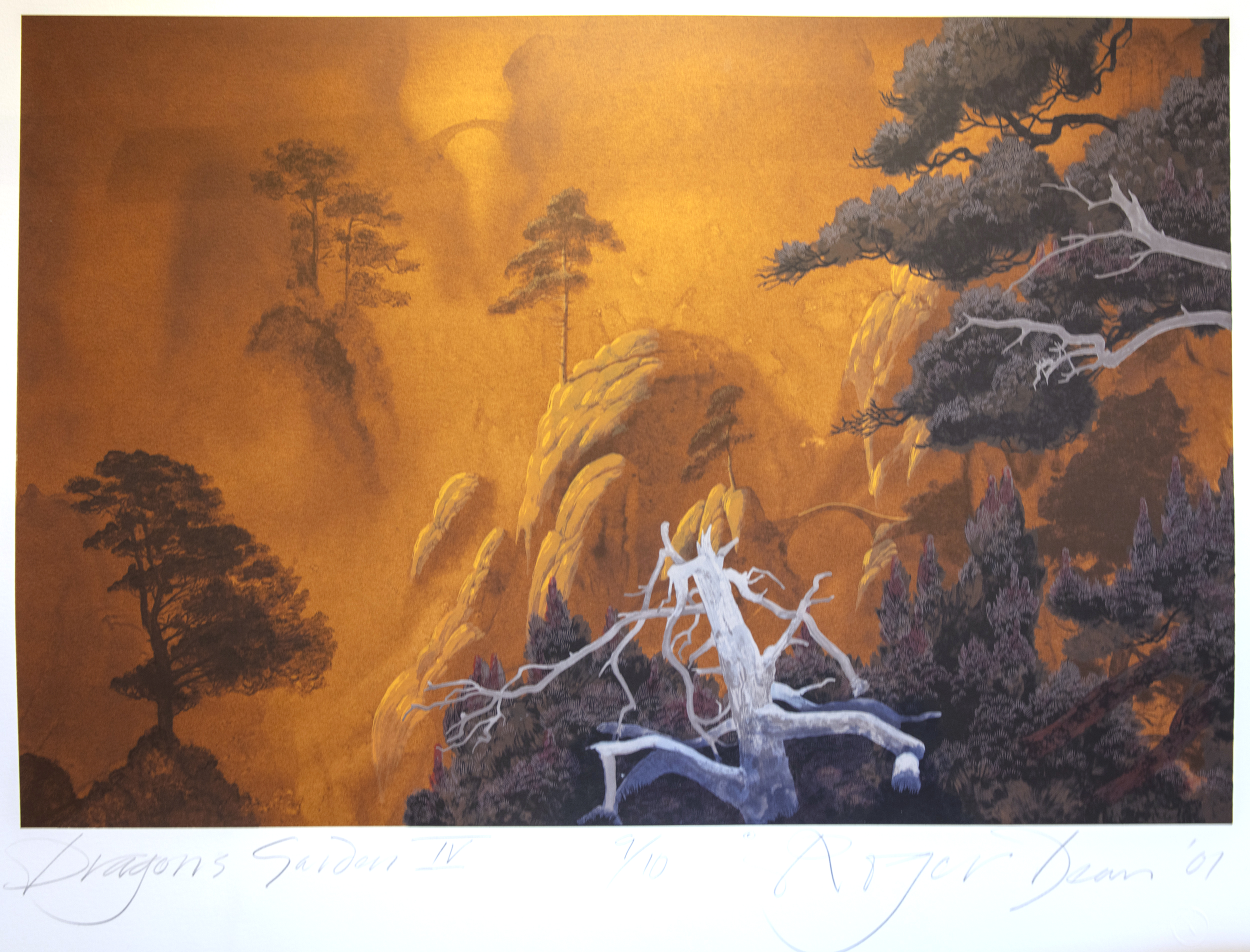
Maybe it is time for professors like Tim Riley to produce a reappraisal of British art and its development as a popular form, in contrast as, Aldridge and Perry described it, to art ”so esoteric that only an elect few can understand it”.
(Roger Deans work can be seen at Trading Boundaries, Shenfield Green in East Sussex not far outside Lewes. It goes on tour with YES in the USA. YES have announced their “Classic Tales Of Yes” tour in the U.S. starting September 21 2023 in Bethlehem, PA and ending November 4 2023 in Riverside, CA. The evening will begin with an on-site presentation by world-renowned English artist and designer Roger Dean, whose masterful artwork of striking other-worldly landscapes has graced classic album covers and posters, most prominently by YES and Asia. Every show will feature a Roger Dean gallery in the venue’s reception/foyer area. His work — which also appears on the cover of MIRROR TO THE SKY — has sold more than one hundred million copies worldwide.)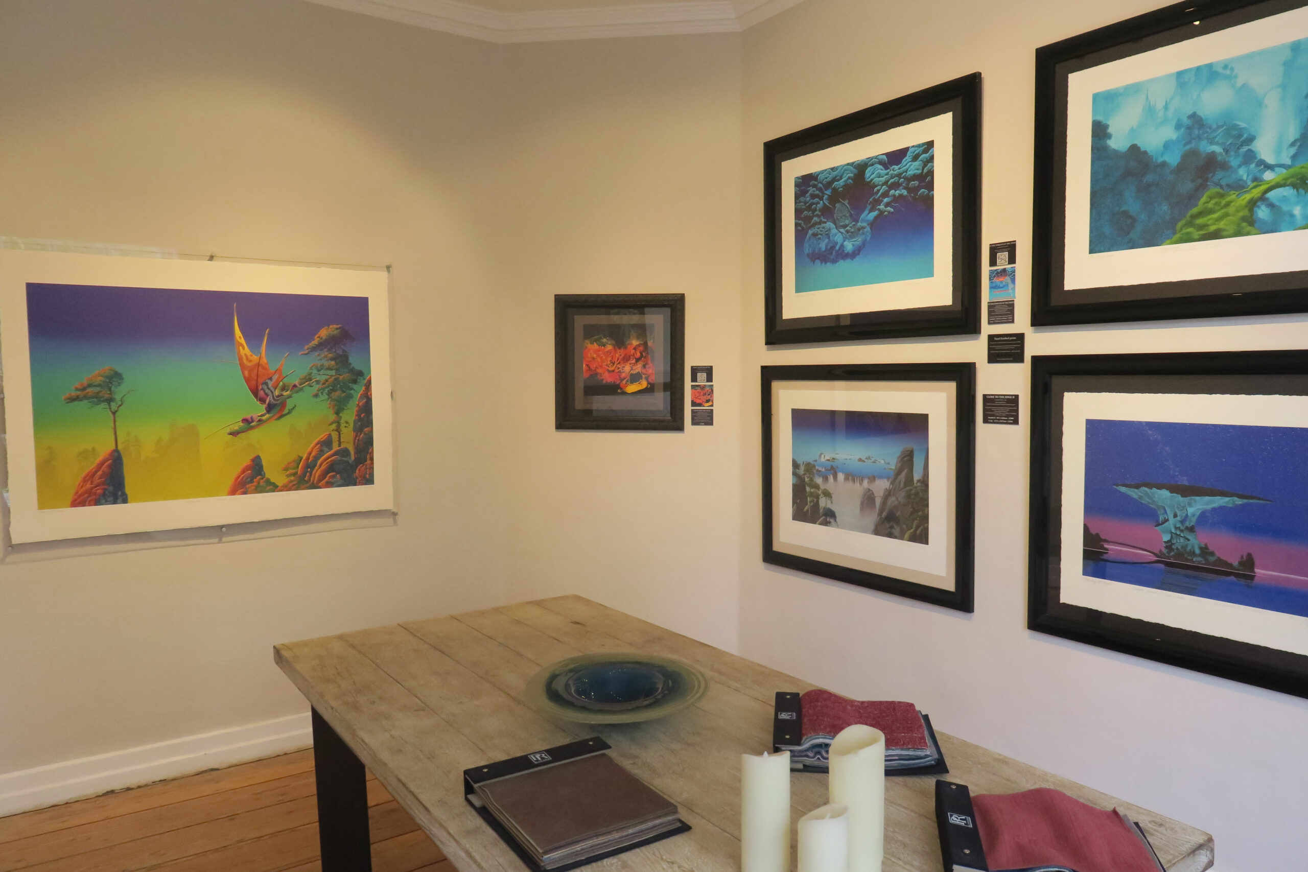
Further Reading if you want more:
The Album Cover Album by Hipgnosis and Roger Dean pub. by Dragons World 1977
The Mechanised Image by Pat Gilmour pub. By the Arts Council 1978
The Penguin Book of Comics by George Perry and Alan Aldridge pub. Penguin Books 1971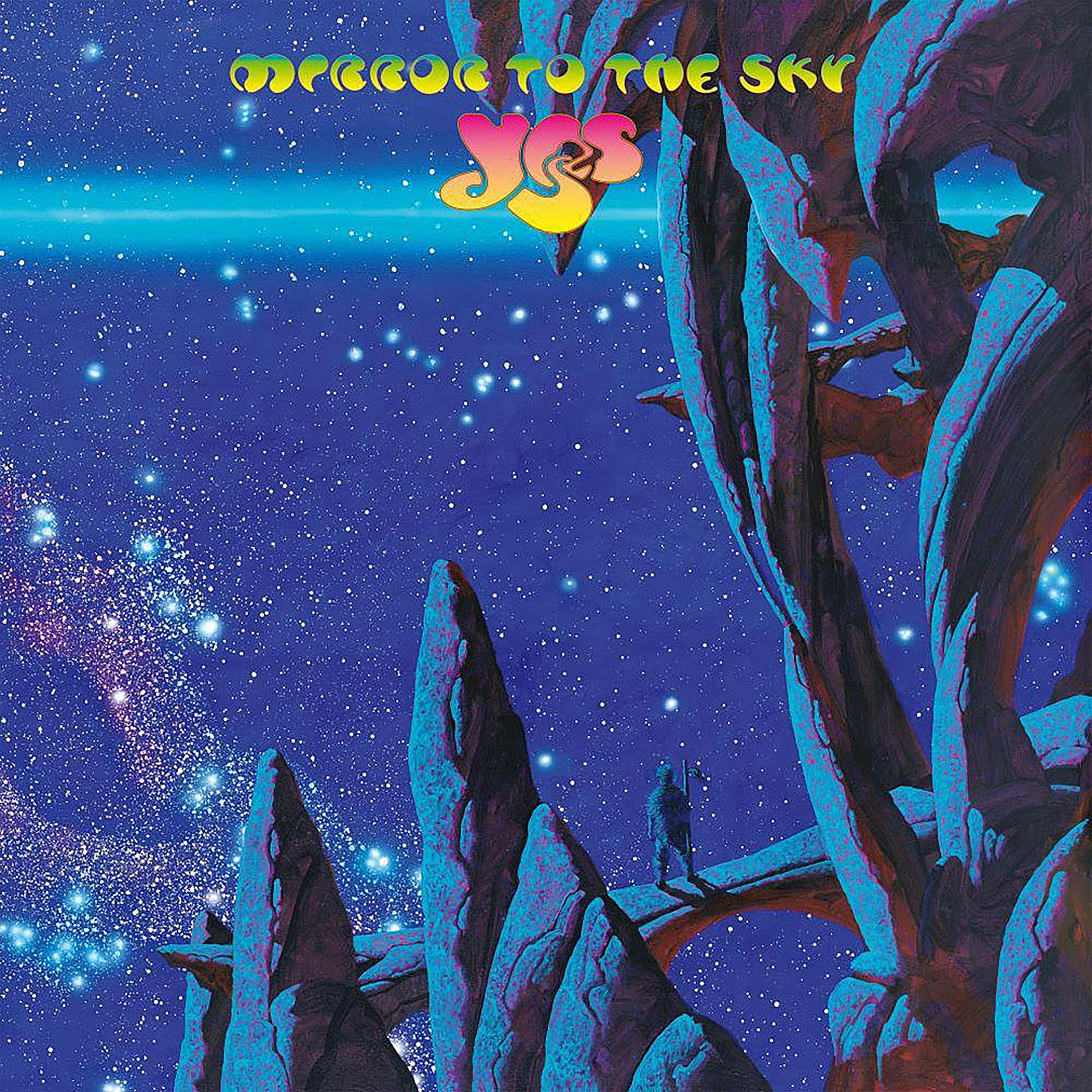
Recent Comments