Abstraction that is not abstraction. Tiptoeing around reality. What exactly do these statements mean? In my mind they mean looking hard and seeing what others do not, seeing the normally unseen, a little like those childhood games where you are challenged to recognise something photographed from an unusual angle. In previous articles I have talked of finding art in nature, drawn parallels and comparisons between artworks and ‘found’ items – ‘objet trouvé’ as it would be in art expert voice. My game is to show reality in a way that is outside normal patterns of visual recognition.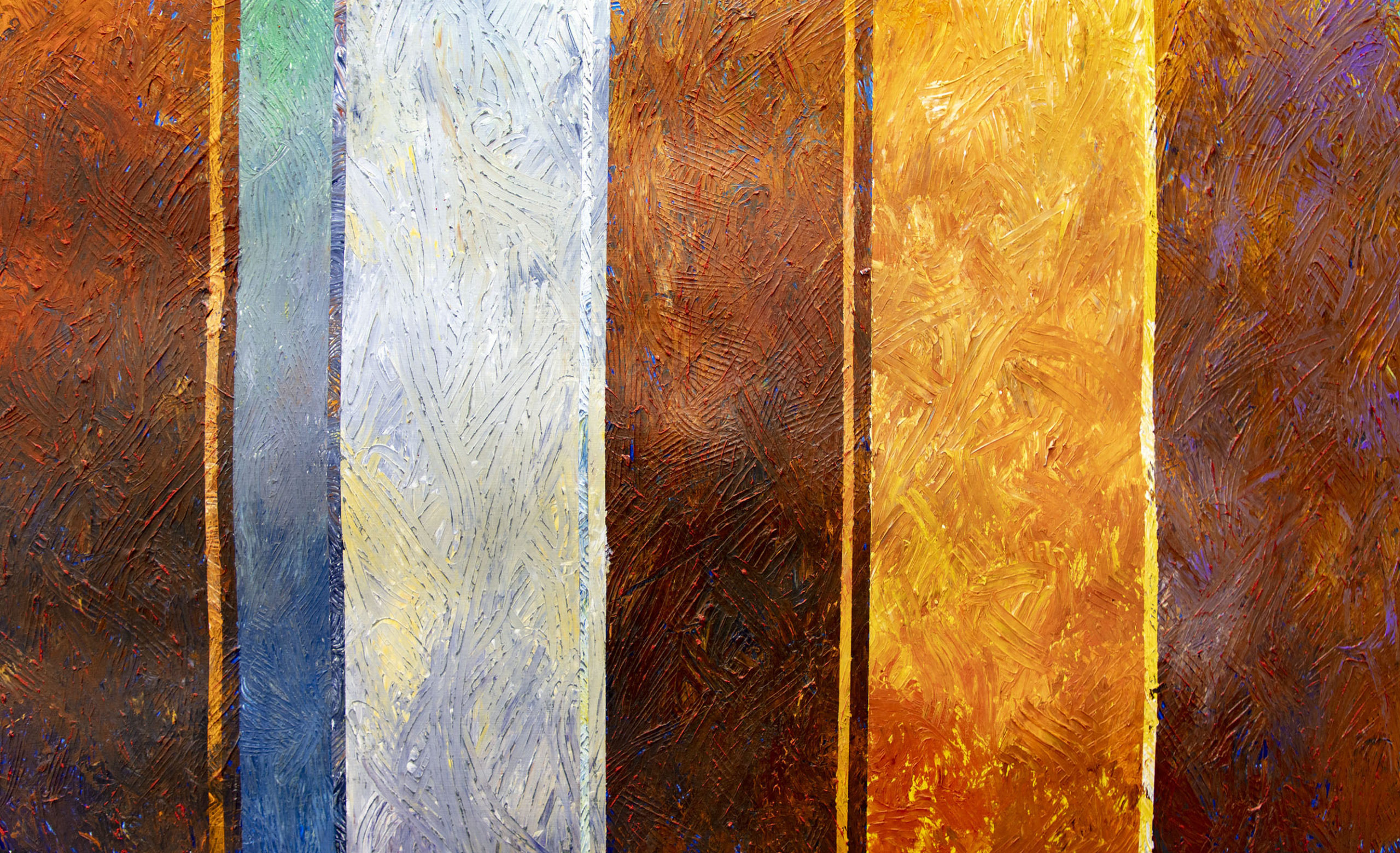
I am also into colour, partly because of my own inabilities in this direction. In my final year on degree, I made a series of light modulars to try to clarify my understanding of advancing and receding colour and tonality. I know I was not alone in ‘going fundamental’ as Francis Pratt, in the same year as I, went on to be a senior research fellow at Stirling University looking at colour and colour mixing and producing in the process what, to my mind, was one of the most beautiful sets of colour paintings I had seen in a long time. Francis has a bigger brain than I and now runs his own art school in a delightful retreat in rural France.
You will know if you have read many of my earlier blogs that I have allowed myself to be buffeted around by the life choices I have made. Not wise choices as they laid a path through life that I have only started to really enjoy in the last 20 or 25 years. I allowed myself to be seduced onto chasing other goals than realising the internal vision that has been the driver of my visual world from day one. Oh, it has been fun, but it has left me now in my later years chasing the same things I was chasing in the late 1970’s with a sense of frustration that there is so little time left.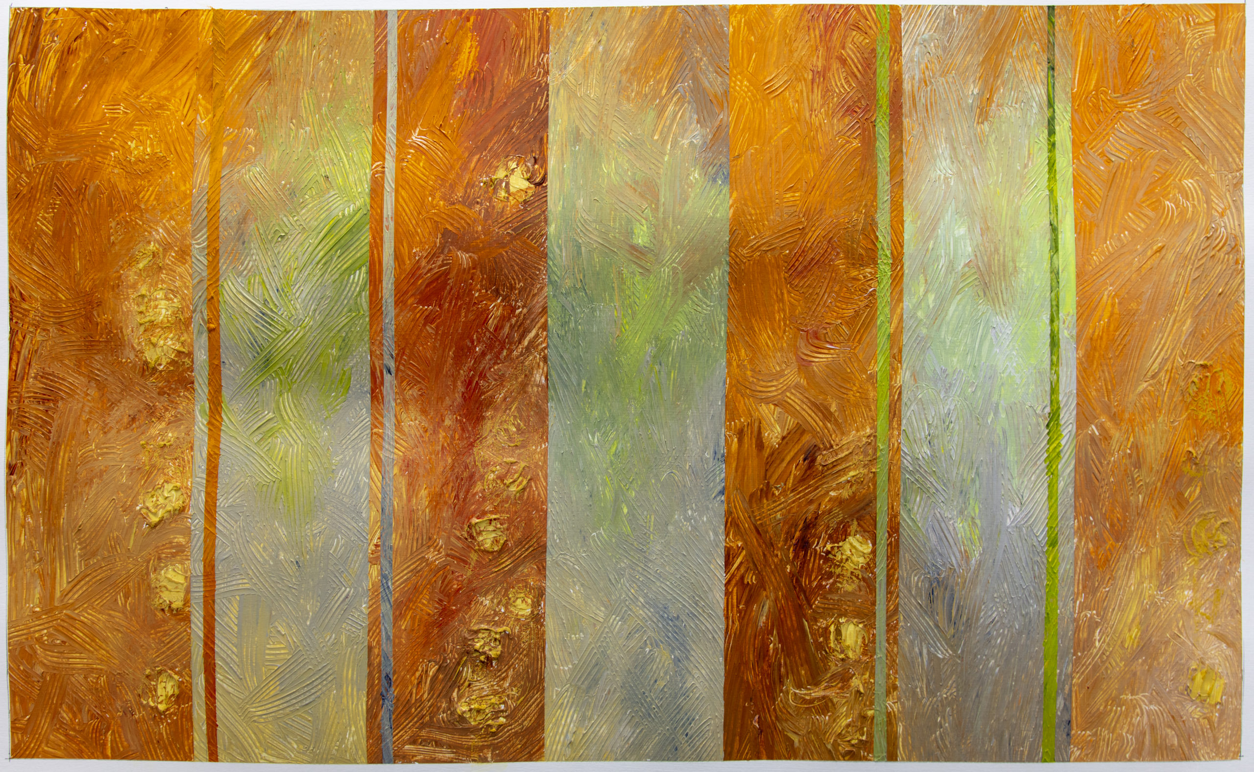
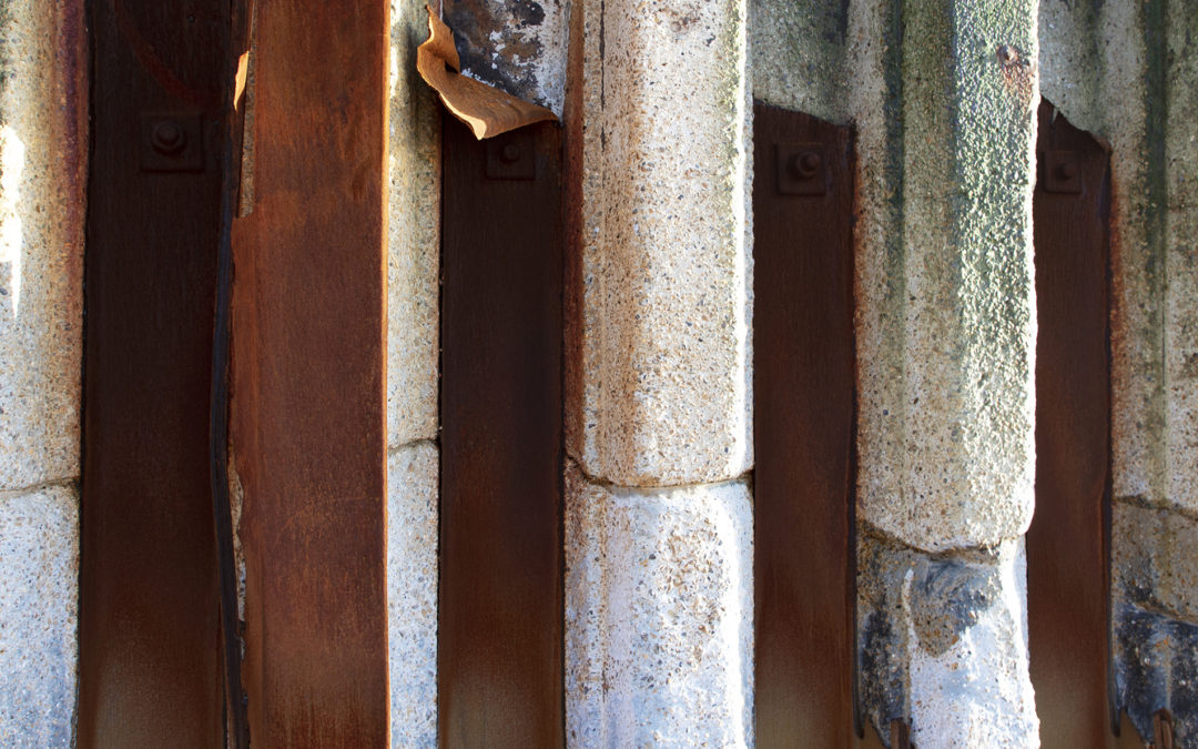
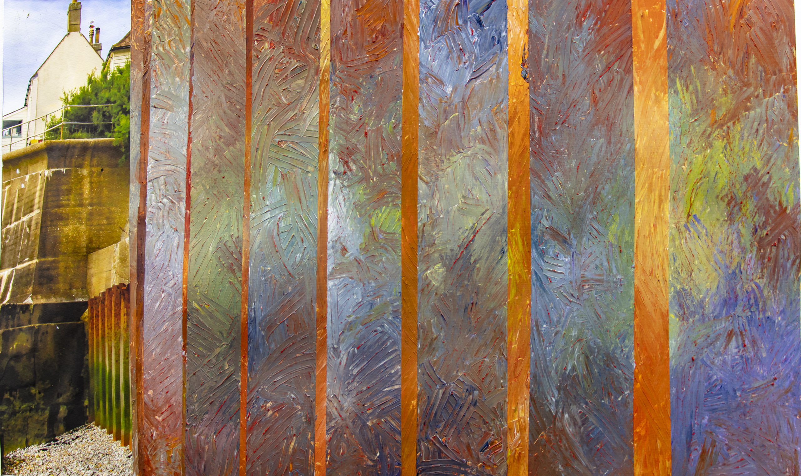
Currently my paintings are looking at the qualities in the rusting iron and concrete sea defence structures, those local to me being Splash Point in Seaford and the Cuckmere Haven defences of the Coastguard Cottages. The strips of colour that I use in the paintings may appear abstract, but they start off as analyses of the plates of the structures, and you will see from the earlier photographs the information that I use to generate both colour and texture when I start using the paint.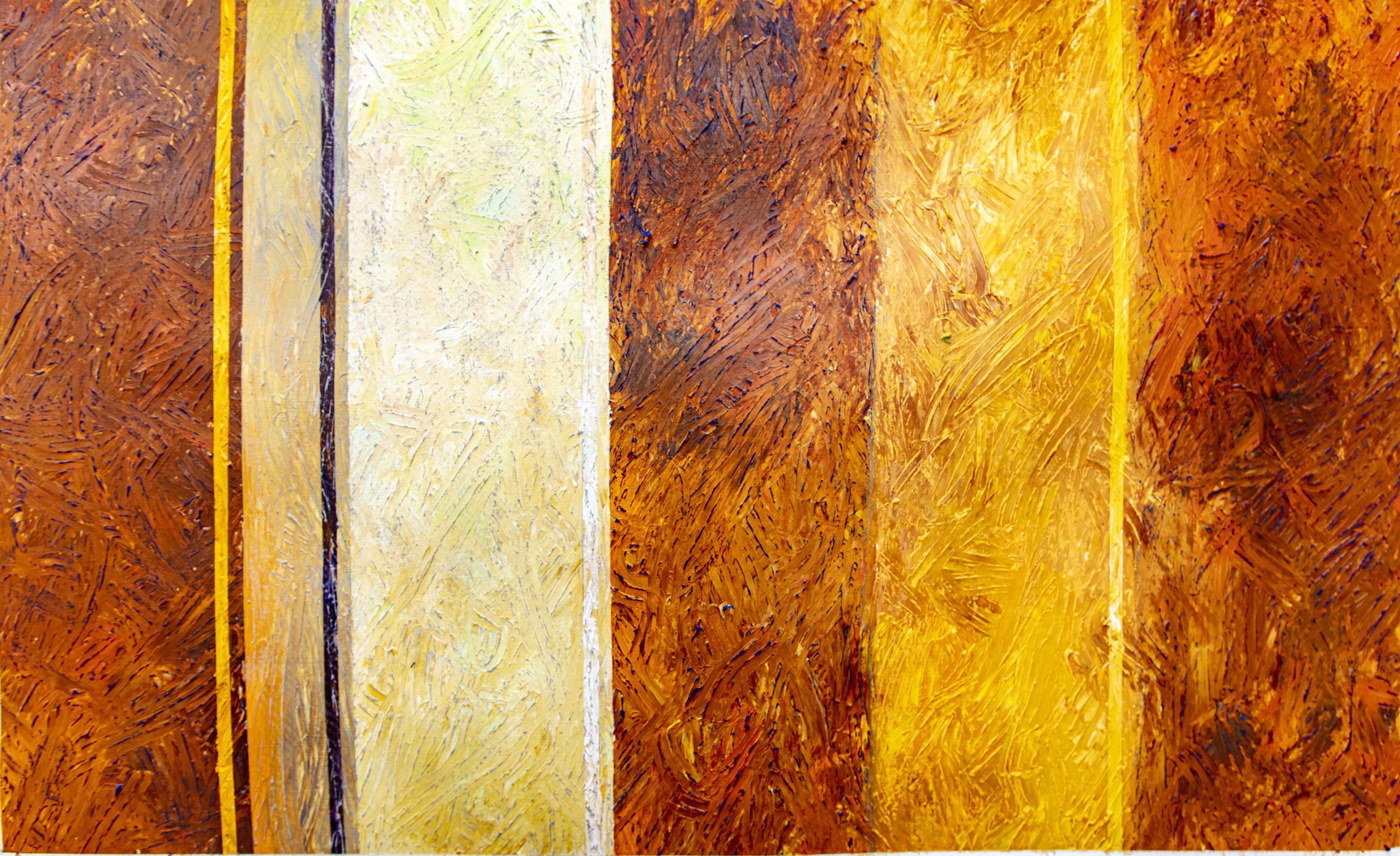
Much as the rust flakes and reveals more colour underneath so I use underpainting to place colour to complicate the surface relationships. This gives a depth of texture and colour that reflects the complexities of decay behind the surface finish. The stripes themselves are based on the metal plates laid over concrete in the structures. Sometimes the metal has completely eroded exposing concrete to the blows of tons of pebble laden water. The strips are reworked in relation to the pictorial rectangle to create visual tensions, but always with an underlying linkage to what has been observed.
Sunlight on concrete and metal
My starting point is photographs mainly, but also drawing/sketches in situ and working out the ‘numbers’, that is the spacing of the areas of colour. I am experimenting with paint applicators of various kinds to create a textured surface onto which I can layer oil pastel or simply to explore variations of colour and density, the play of light and shade across the surface.
Most of the colour variations are on the leeward side of the sea defences mainly because the plates last longer, but recent movements in the shingle exposed the windward side of Seaford ‘pier’ in a different way, catching it at low tide produced a new series of images as well as a note to the authorities which brought engineers to cut off broken metal that might have been dangerous to swimmers. The cut off scrap takes on another life in a sculptor’s yard in nearby Newhaven.
Starting with observation, drawings result. Additional information added by keeping large print (A3+ or A2} colour photographs for colour references on the studio wall, occasionally incorporating photographic prints into the work means that much of the apparent abstractions are just more apparent than they are. Sometimes the photos are collaged to create images that can be around five feet high. In other smaller works I have used collage in addition to colour to show the effects of time. Time also matters and that becomes a concern in the work too, sometimes surfacing in images such as the garden image made from merging a photo from each season to present a picture of a year.
As I get older the concerns of my youth continue – time, place and colour. I am still trying to create that elusive ‘masterpiece’. It eludes me so far, and I will continue, as long as my body allows, to chase the dream. I smile at some results, occasionally chortle with delight, sometimes just swear and struggle, but the words of Michael Kidner still ring true – at least two hours a day working.
I hope you enjoy the end results too, all available through the gallery here, or email me.
Recent Comments