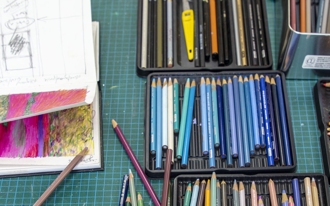
For almost a year I have worked through the paintings on paper and canvas (drawings and canvases?) producing 14 canvases and some 60+ works on paper. Immersed in the process I have changed my techniques and the way I use paint. Strangely I think the initial impulse for this may lie with a pencil drawing I did of Lake Annecy on one of my last jaunts through Europe. I used the pencils to scrub colour onto paper in the large sketchbook, running a couple of pages together. Thoughtless, intuitive, responding to the view, I let my hands and unconscious mind scribble away and was pleasantly surprised by the result.
BRotS #55 Acrylic on 300gsm paper, primed with gesso, 27 x 16.5 inches images size
Now the technique of splodging the paint onto the canvas has started to mature into something a little less intuitive and a little more thoughtful. Working through the latest works on paper was a huge learning curve, not just trying to mature my technique but also beginning to find the limitations of working from the photographs. I have always tried to tread a line between the real and the abstract, to show how abstract the real can appear. With the photographs on the studio wall as well as drawings in the ‘sketch’ books I have gone to and fro between canvas and the images. In this last painting I found that this became a handicap as my brain kept telling me to get closer to reality whilst my painter’s intuition took me in the opposite direction.
BRotS #56 Acrylic on paper with oil pastel additions 27 x 16.5 inches images size
It has worked on the other side of the coin too, as I had begun to make the photographs more abstract, closer to my painterly vision. Unfortunately, my spinal problems have limited my mobility and the photographic expeditions have declined accordingly – hopefully a temporary set-back until the NHS is functioning again and my operation, currently scheduled for November, can go ahead and restore things. For the time being I have enough images to continue working and further explore techniques to render colour.

Photograph available to order, contact me for details
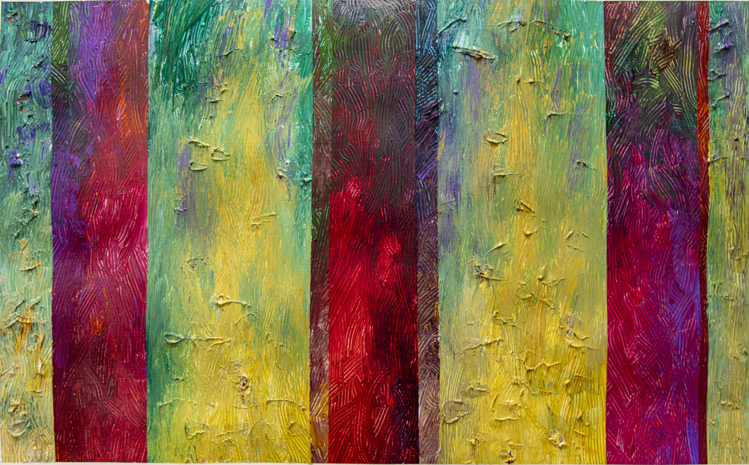
On one of my recent walks I took a series of images of Seaford’s rusting defences as the sun was beginning to set, partly filtered through a sea fret which picked up the rust and concrete changing their appearance and colour. The colouration also changed with distance, so closer to the violet of weed almost looked like oil spilled down the structure, whilst more distantly the green on the white and Naples yellow of the concrete were the dominant factors. Both of these combinations moved me away from the Yellow Ochre/Cadmium Orange combinations that had marked much of the earlier works as in, for example ‘The Weather Side’ or in ‘Trust in Rust’, the latter my show for the September Lewes ‘ArtWave21’ is titled after.

BRotS#61 Acrylic on paper, A1 size sheet, image 27 x 16.5 inches.
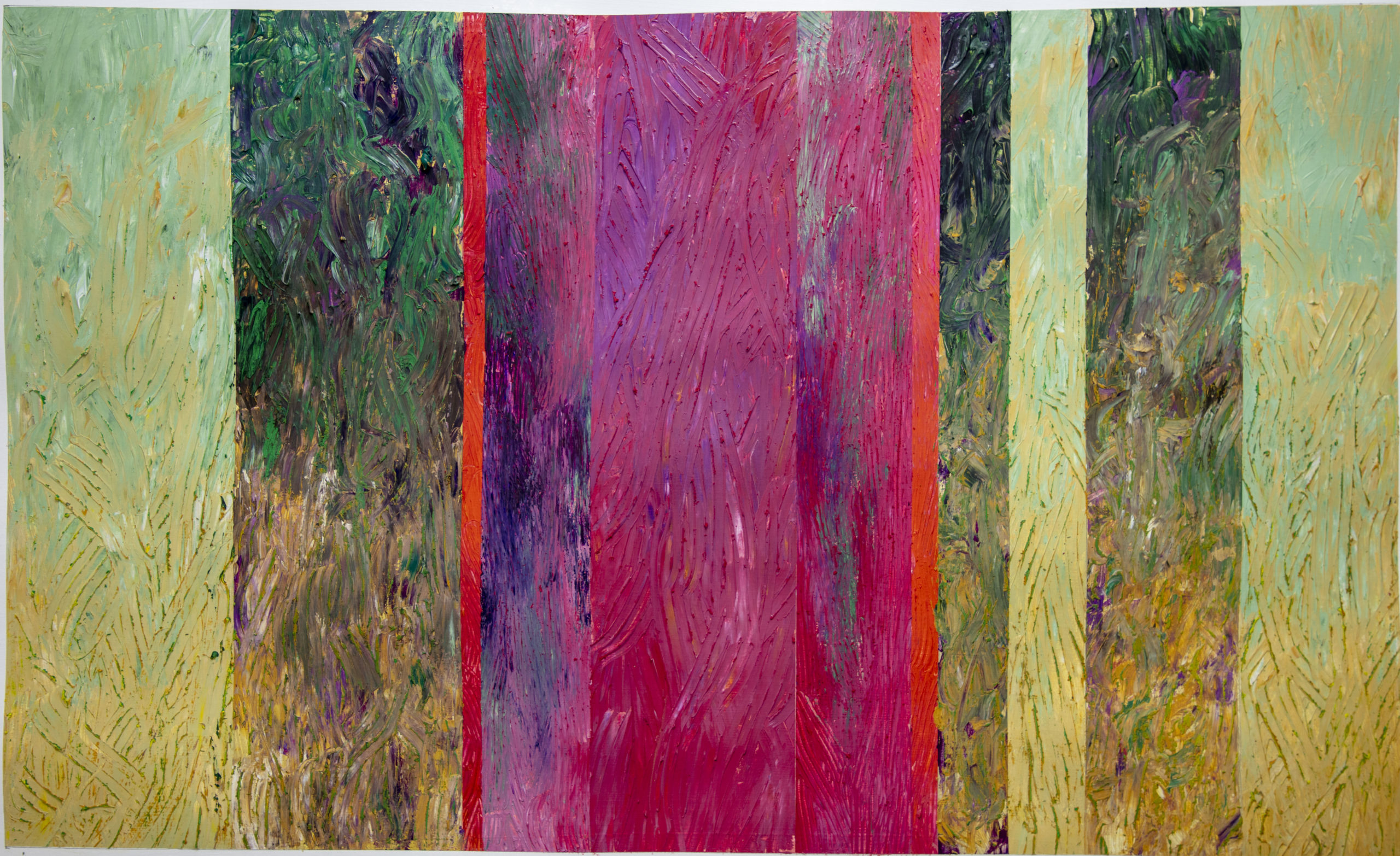
As with the photographs I decided in the paintings to ‘zoom in’ on single panels after for so long just looking at triples which have explored the relationship between sets of metal. Now was time to look closer at the variation on sheets and in the myriad details of the concrete surfaces, exposed, where the seas had ripped the metals away. Whilst at the Cuckmere the sheets were not backed as they are at Seaford and so presented a different picture (see the ‘Chocolate Teapot’ for how useless that makes them) the contrast between concrete mixed it seems with foreshore shingle gave whole sets of different colour interactions depending on how and where they were exposed to tide, wind and waves.
BRotS#58 Acrylic paint on 300gsm paper with oil pastel additions. A1
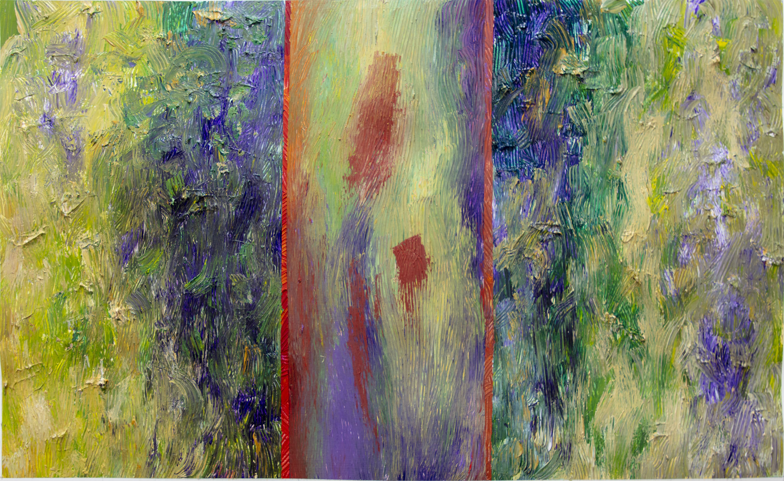
The images that are the base for these paintings were taken when a combination of low tide and sunset time gave the chance to photograph the westerly side low down on the beach. Previously on paper I tried to experiment with the colour but found that the white of the primed undersurface was starting to interfere with what I was trying to do. On some pieces I started to underpaint quite roughly, at that stage a wash of colour to simply tone down the white. The more I underpainted, the more I saw potential in how it could alter perception of the top colours. I began to use the underpainting, still in thin washes, to work with the top colour, topping again sometimes with some further colour of oil pastel.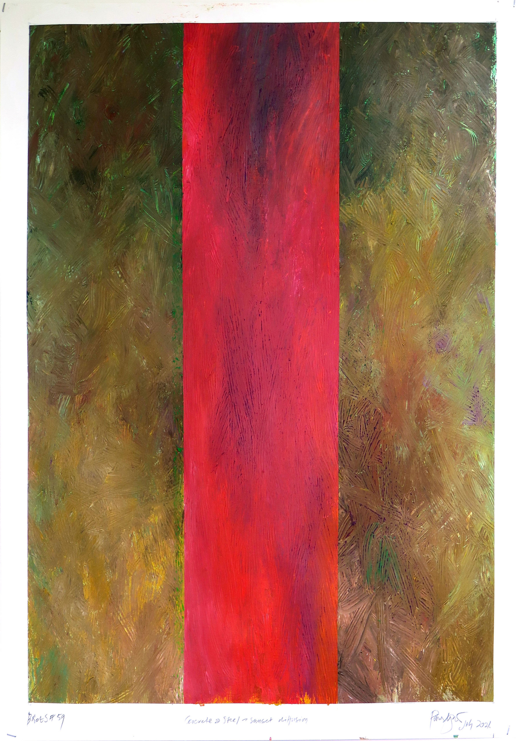
The rough tools I am using leave troughs in colour as if the passing of a plough across a field. The oil pastel was touching the top of these plough lines while at their depth the underpainting was showing through. Almost like a form of pointillism I suppose in the use of visual mixing of different colours. I used some spare strips of canvas to experiment and made a return to the ‘destruction of the square’ series to try and see how effectively this could be made to work. One problem lies in the type and manufacture of the oil sticks. My favourite sticks are no longer made, and most are now manufactured too oily and soft. Trouble is that they then go solid quickly in the air unless wrapped in clingfilm, are often too soft and fill the grooves too deeply and get used up so blooming fast. Expensive! There had to be another way.
BRotS#60 Acrylic on paper with oil pastel additions
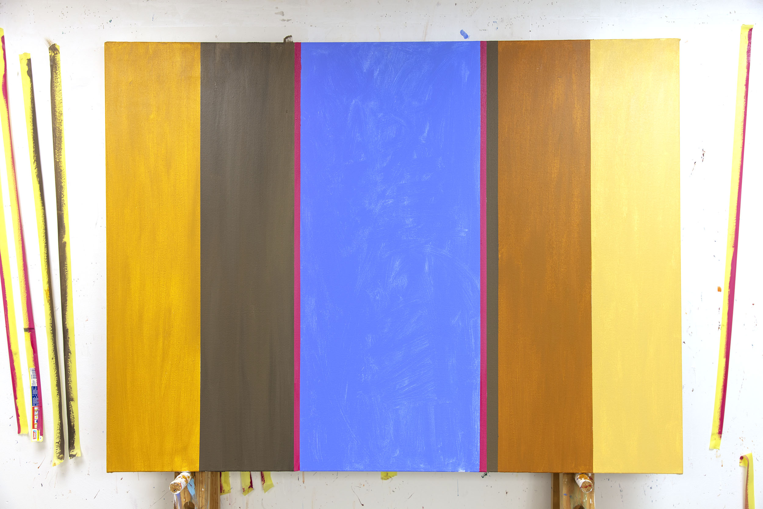
The canvas with the underpainting complete
I made a couple of experiments on paper where the underpainting was thicker, more solid, and again looked at using oil pastel across the top. I used oil pastels on one but not on the other. The result was not entirely satisfactory – partly simply because I didn’t like the portrait format. I tried landscape and finally clicked into my slow mental processes that one of the reasons it wasn’t working was because of the size of the mark I was making in relation to the size of the overall image/canvas. ‘Go large’ a voice said in my head. So, I did.
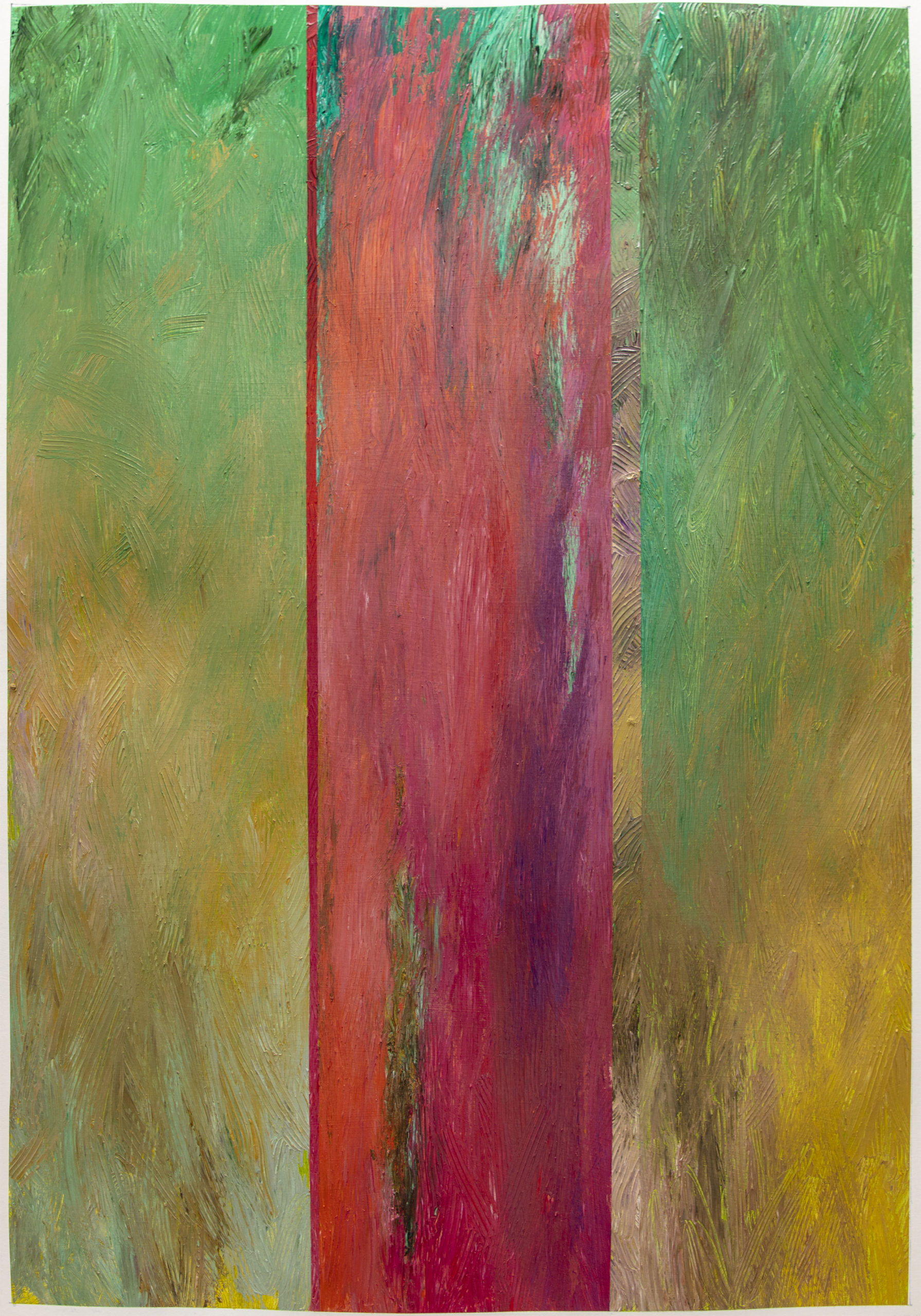
I considered going very large and looked theoretically at going to 12 x 4feet but couldn’t think how I’d store it if I did so settled on doing just one strip on a 4x3foot canvas. The usual 3 coats of gesso primer were applied and then I flat painted the areas looking at creating a colour movement into the centre. I also made the underpainting into a much more considered part of the work itself – no longer just a rough stain but more intense flat areas of colour. Having created my mini-Stella, I then had a wobble about working over its looking complete state but taking in a deep breath I attacked it with the over colour, the central area first.
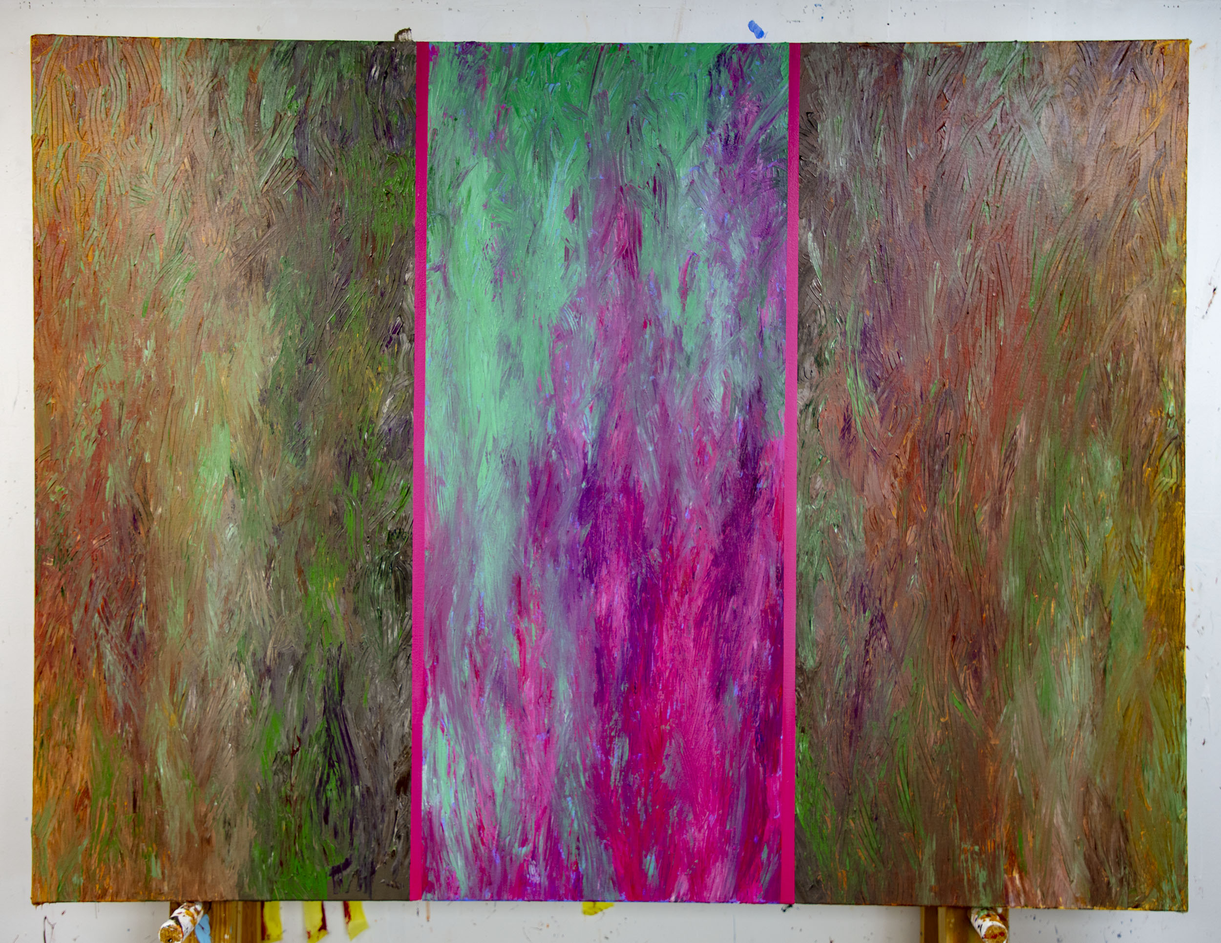
Sunset: Rust and Weed Acrylic on Canvas, 4x3feet
From the centre the two outer areas were tackled in turn. I had to hide the original photographs to stop them interfering with my vision, to stop them distracting me, realism kept forcing itself into my thinking. The moments when the marks started to work together came more frequently, making me smile as I worked. I was careful with tonality – not successfully but more so than in previous pieces. In the end the colour glowed as I had hoped, the sharp machined edge contrasting with the loose ‘weathered’ areas. Normally I step away thinking I have done what I intended, having had a clear idea of the end game. This time I step back wondering what has happened, only gently gathering the realisation that, yes this is what I intended at the start, that the journey was this time better than the arrival.
But I’m still not sure the process is right…
I guess I will have to test it through a series. But then that is what painting is about. Right?
(see more at https://youtu.be/LEaT0ST27aU)
Recent Comments